EmptyState component sets the content that appears when the extension is in an empty state. Use this component when there’s no content or data to help guide users.
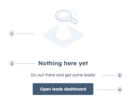
- Image: the default image that comes with the component.
- Title: the title that describes why the component is in an empty state.
- Additional text: an additional Text component to provide further guidance. This does not come with the component by default.
- Additional button: an additional Button component to help users take action. This does not come with the component by default.
Props
Available images

addOnReporting
announcement
api
automatedTesting
beta
building
callingSetUp
companies
components
cone
contacts
contentStrategy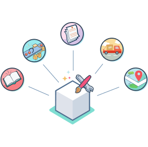
customObjects
customerExperience
customerSupport
deals
developerSecurityUpdate
electronicSignature
electronicSignatureEmptyState
emailConfirmation
emptyStateCharts
idea
integrations
leads
lock
meetings
missedGoal
multipleObjects
object
productsShoppingCart
registration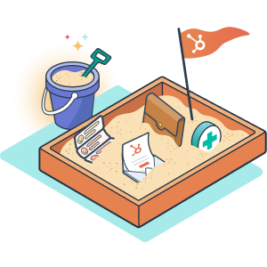
sandboxAddOn
social
store
storeDisabled
successfullyConnectedEmail
target
task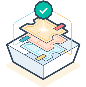
tickets
voteAndSearchUsage examples
- Display when it’s the first use of a feature.
- Show when the user is required to take action in order to populate the card with information.
Guidelines
- DO: make empty states informative so that users understand what will appear when the extension is not empty.
- DO: make empty states actionable. If relevant, explain the benefits of this area and how to add content or data.
- DON’T: make empty states too long.