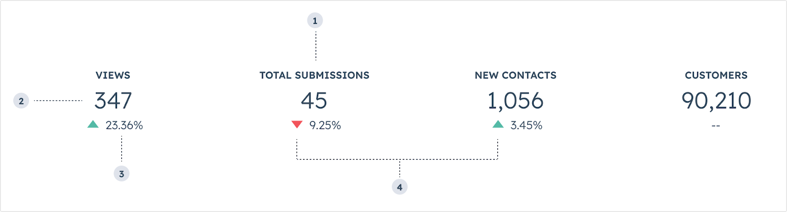
The Statistics component renders a visual spotlight of one or more data points. Includes the StatisticsItem and StatisticsTrend subcomponents.
StatisticItem label: the statisticItem’s label text.StatisticItem number: the statisticItem’s primary number.StatisticTrend value: the percentage trend value.StatisticTrend direction: the direction if the trend arrow (up or down).
Props
<StatisticsItem> props
<StatisticsTrend> props
Variants
In StatisticsTrend components, use the direction prop to describe whether the data is trend upwards or downwards.
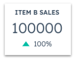
increase: for additions or positive progression for a given time period.
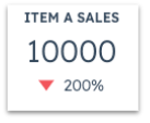
decrease: for subtractions or negative progression for a given time period.
Note that the positive or negative movement of a given statistic is intended solely to represent the increase or decrease in numerical value. Be mindful of how these movements can communicate sentiment. For example, a decrease in support volume can be a net positive, which can be confusing when represented by a red, downward arrow.
Usage examples
- Calling out the progress of quarterly sales for a company.
- Monitoring the amount of traffic and social media engagement that a contact has for the month.
Guidelines
- DO: keep statistics labels short and concise.
- DO: place statistics components towards the top of a card when possible to enable users to more easily scan information without scrolling.
- DON’T: include more than three statistics components per card if possible.
- DON’T: use more than four statistics components side by side.
- DON’T: include sensitive data that you don’t want all users to see.
Last modified on March 29, 2026