import React, { useState } from "react";
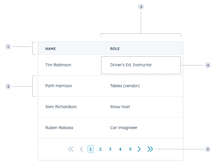
import { Table, TableHead, TableRow, TableHeader, TableBody, TableCell, TableFooter } from "@hubspot/ui-extensions";
import { hubspot } from "@hubspot/ui-extensions";
hubspot.extend(() => <Extension />);
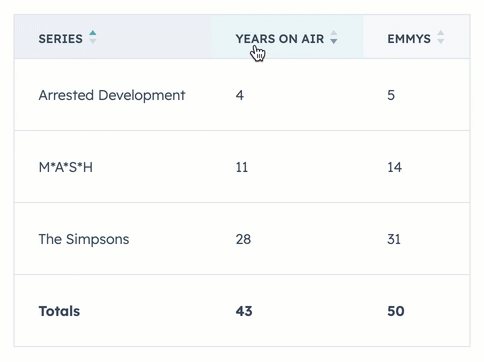
const ORIGINAL_DATA = [
{
name: "The Simpsons",
yearsOnAir: 28,
emmys: 31,
},
{
name: "M*A*S*H",
yearsOnAir: 11,
emmys: 14,
},
{
name: "Arrested Development",
yearsOnAir: 4,
emmys: 5,
},
];
// Initial sort state: all columns are sortable but unsorted
const DEFAULT_SORT_STATE = {
name: "none",
yearsOnAir: "none",
emmys: "none",
};
function Extension() {
const [data, setData] = useState(ORIGINAL_DATA);
const [sortState, setSortState] = useState({ ...DEFAULT_SORT_STATE });
function handleOnSort(fieldName, sortDirection) {
const dataClone = [...data];
dataClone.sort((entry1, entry2) => {
if (sortDirection === "ascending") {
return entry1[fieldName] < entry2[fieldName] ? -1 : 1;
}
return entry2[fieldName] < entry1[fieldName] ? -1 : 1;
});
setSortState({ ...DEFAULT_SORT_STATE, [fieldName]: sortDirection });
setData(dataClone);
}
return (
<Table>
<TableHead>
<TableRow>
<TableHeader sortDirection="none" onSortChange={sortDirection => handleOnSort("name", sortDirection)}>
Series
</TableHeader>
<TableHeader sortDirection="none" onSortChange={sortDirection => handleOnSort("yearsOnAir", sortDirection)}>
Years on air
</TableHeader>
<TableHeader sortDirection="none" onSortChange={sortDirection => handleOnSort("emmys", sortDirection)}>
Emmys
</TableHeader>
</TableRow>
</TableHead>
<TableBody>
{data.map(({ name, yearsOnAir, emmys }) => {
return (
<TableRow key={name}>
<TableCell>{name}</TableCell>
<TableCell>{yearsOnAir}</TableCell>
<TableCell>{emmys}</TableCell>
</TableRow>
);
})}
</TableBody>
<TableFooter>
<TableRow>
<TableHeader>Totals</TableHeader>
<TableHeader>43</TableHeader>
<TableHeader>50</TableHeader>
</TableRow>
</TableFooter>
</Table>
);
}