Tile component renders a square tile that can contain other components. Use this component to create groups of related components.
Props
Variants
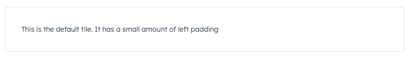
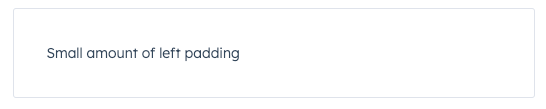
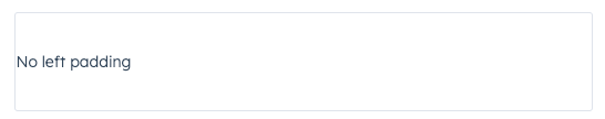
Using theflush prop, you can remove left and right padding from the tile contents.
flush={false}(default)
flush={true}
Usage examples
- Group a form and its inputs together.
- Group a bulleted text summary and statistics components together.