App pages are a newer extension point and provide additional functionality compared to the older app home page feature. While app home pages are still supported, it’s recommended you try out app pages to leverage new components and features such as page routing and passing parameters between pages.
Key features
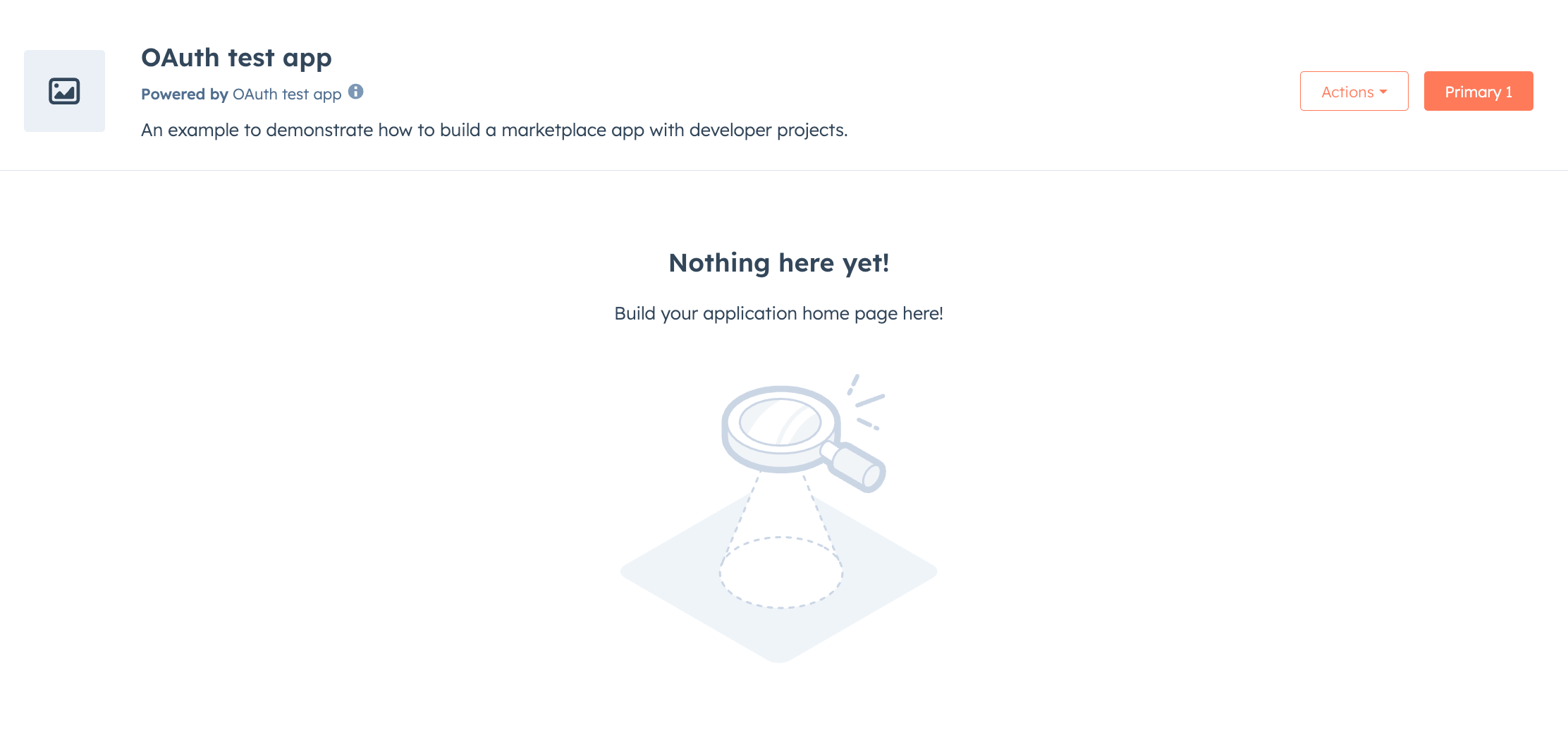
- Main page: create a custom landing experience for users when they navigate to your app.
- Multiple pages: build multiple pages within your app that users can navigate between.
- Layout components: wrap groups of routes with shared UI such as navigation bars or sidebars.
- Page header actions: add primary and secondary action buttons to the page header.
- Deep linking: link directly to specific pages in your app.
- Wildcard routes: match hierarchical paths for file browsers or documentation structures.
- Built with React: use the same UI components and data fetching utilities available for app cards and settings pages.
Start building out app pages
- Follow the quickstart guide to start with a new app, or check out the app creation guide to customize the features and configuration of a new app.
- Learn how to create app pages.
- Define routes for your pages.
- Link between pages.
- Consult the app pages reference.