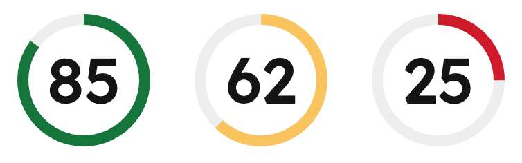
ScoreCircle component displays a score value (0-100) as a circular progress indicator with color-coded status. Color is automatically applied based on the score value.
Use this component to provide data visualization for use cases such as:
- Completion percentages for tasks or projects.
- Quality scores or performance metrics.
- Health scores or ratings.
Props
Score values
The component automatically validates score values and applies color-coded statuses based on the score value:- Success (green): score >= 66
- Warning (yellow): score >= 33 and < 66
- Alert (red): score < 33
- If the score is less than 0 or greater than 100, an error is logged and the component displays
–instead of the score. - If the score is a decimal value, it is automatically rounded down to the nearest integer and a warning is logged.
Accessibility
The component includes the following accessibility features:- Uses the
meterARIA role to indicate a scalar measurement. - Provides
aria-valuenow,aria-valuemin, andaria-valuemaxattributes for screen readers. - Includes an accessible label describing the score value or error state.
Guidelines
- DO: provide context around the score with additional text or labels.
- DO: use the automatic color coding to communicate status at a glance.
- DON’T: use
ScoreCirclefor values outside the 0-100 range.