fields.json file, which will then translate to the theme and content editors.
Creating and managing fields
You can add fields to a module’sfields.json file locally through the HubSpot CLI and in the in-app module editor. To add fields to a theme, you must update the theme’s fields.json file locally using the CLI.
HubSpot CLI
When building via the CLI, module and theme fields can be edited through afields.json file inside of the module or theme’s folder. For modules, this file will automatically be created when using the hs create module command. All of the field options available in the module editor are available as properties you can add or edit in the fields.json file. This includes repeater fields, groups, and conditions. One of the benefits of editing locally is that it makes it easier to include your modules in version control systems like git.
Module editor
The design manager has a built-in module editor that enables you to create, group, and edit module fields. The module editor contains a module preview which enables you to see what the module looks like on its own, as well as test your fields. Since modules do not live in a vacuum you should always test them on a template you plan to use, to see what template level styles may affect it. Be aware if a module is contained in a locked folder it cannot be edited this way.
Side by side fields
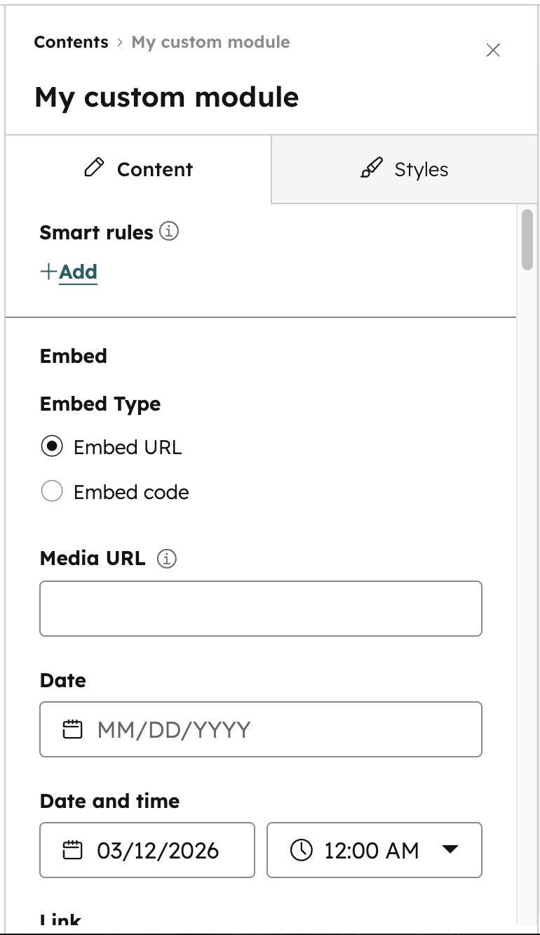
By default, module fields in content editors stack vertically. However, you can place module fields side by side by adding adisplay_width property to fields in the fields.json file with a value of half_width.
display_width of half_width will appear as half-width in the content editor. When the field above or below that field in the fields.json file is set to half_width, they’ll be placed side by side.
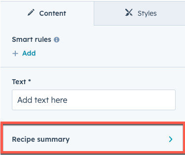
Field groups
When fields are related to each other, it often makes sense for them to be grouped together visually. You can do so by creating field groups, which are supported in both modules and themes. To create a field group locally, infields.json create an object with the type of "group". Then, include a children array to contain the fields you want to group together.
"group" type object within the first children parameter. Then, build the field group in the same way as above, using children to contain the fields. You can nest field groups up to a depth of three.
Field group display options
You can customize the following field group display behavior:- Expansion: by default, field groups will display as collapsed in the editor. Groups that contain nested groups will display as drilldown buttons that open the group in its own view with the innermost group displaying dividers.
- Display type: by default, groups that don’t contain nested groups will display as collapsible sections with visual dividers around its children. Groups that do contain nested groups will display as drilldown buttons that open the group in its own view with the innermost group displaying with dividers.
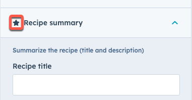
- Group icon: if desired, you can include a Font Awesome icon that displays to the left of the label.
Outputting field values within field groups
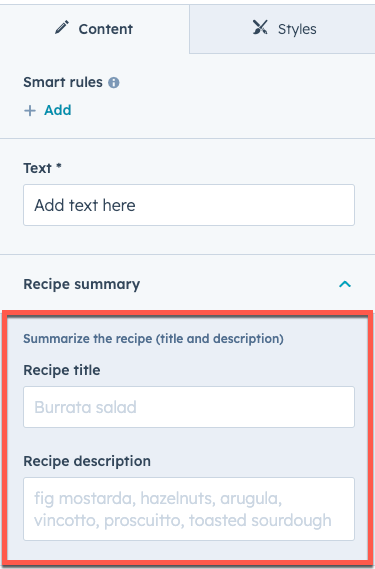
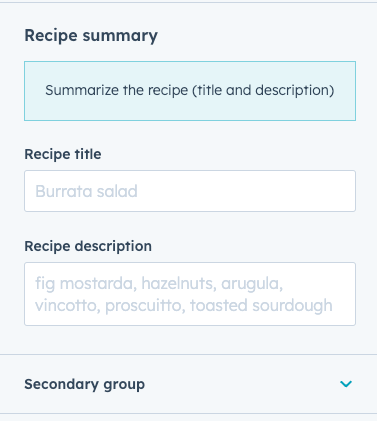
Field groups create dicts that contain the field values you want to output. If you nest field groups the nested field group is a dict inside of the outside field group dict. To access that data you will traverse the tree from either the root theme or module variable depending on your context.Featured items in field groups
For situations where a field group is repeated, you can specify one or more of those occurrences as featured, enabling you to style the item separately to make it stand out. For example, this can be particularly useful for a product page where you might have a featured product that you want to highlight. You can specify a maximum number of featured items per field group. In the editor, content creators can then mark items as featured as needed..png)
group_occurrence_meta property in the field group configuration. This property stores the following properties:
featured_enabled: set totrueto enable featured items.featured_limit: the maximum number of featured items to allow.
occurrence property.
hs_meta property. The code below uses a for loop to check for field group items that are set to featured, then displays the title of each as an h3 header.
{{ repeated_group_item.hs_meta.occurrence.featured }}
Style fields
Style fields are a special field group type in a module or theme’sfields.json file that give content creators control over a module or theme’s styling in the page and theme editor. Below, learn how to add style fields to a module or theme. Learn about best practices for using and organizing style fields.
Module style fields
Style fields added to a module will appear on the Styles tab of the page editor when editing the module:
fields.json file, you add them within one styles group. That group, however, can contain multiple groups within it, as shown below:
- Alignment
- Gradient
- Spacing
- Background Image
- Border
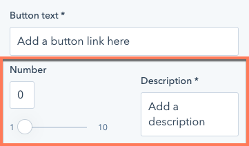
- Boolean
- Choice
- Number
- Color
- Icon
- Image
- Font
- Text Alignment
fields.json file.
Theme style fields
Style fields added to a theme will appear in the left sidebar of the theme editor: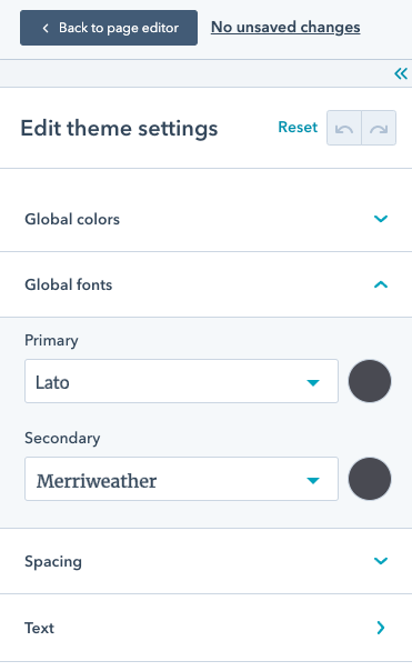
fields.json file will be added to the left sidebar of the theme editor, as opposed to needing to put them under a styles group, as shown below:
fields.json file.
Generated CSS
Some style fields provide a way to output css directly based on the field’s value. This is especially helpful with fields that can control more complicated styling like gradients. The following style fields have a generated.css property:
Repeaters
When creating modules that format information, often there are types of information that repeat. A recipe module for example, might have a field for “Ingredient”. Well, most recipes have more than 1 ingredient. You could give them a rich text field, but then you lose your ability to force consistent styling and add functionality around each ingredient. That’s where repeaters come in, HubSpot has two forms of repeaters: Repeating fields, and Repeating groups.Repeating fields
Repeating fields are normal fields but content creators can add, remove, and re-arrange instances of the field. Using the recipe module example above, each ingredient could be a repeating text field.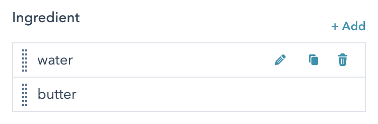
Repeating fields in fields.json
Loop through items in module HTML+HubL
Repeating groups
Repeating groups are field groups with the repeating option enabled. Repeating groups allow content creators to add, remove, and re-arrange groups of fields. Using the recipe module example, say that you want to integrate your ingredients list with a shopping list functionality.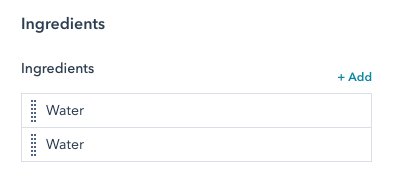
Repeating groups in fields.json
Looping through repeating fields in modules
Repeater options
To make the editing experience better and prevent content editors from providing values that you have not programmatically accommodated for, we allow you to set minimum and maximum values for how many items content creators can add to a repeating field or repeating group. For repeating groups you can also set which field acts as the label for that item when viewing the repeater.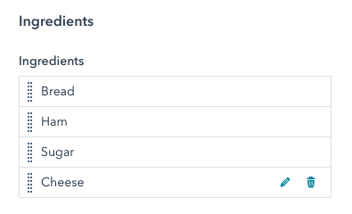
Inherited fields
Theinherited_value property can be configured to make a field inherit its default value from other fields. To set a field’s entire default value from another field’s value, set the default_value_path to the field name path of the target field. When default_value_path is set, it’ll ignore any default set on the field.
To access values from other fields, the paths must include module. at the beginning, similar to when accessing the value in the module’s HubL code.
Because font family is determined by a combination of
font and font_set, you must include both for font field inheritance. Learn more about the font field.property_value_path. Any paths referred in inherited_value can also include keys from a field’s value for complex fields.
For example, color fields have object values that contain the color itself as well as opacity. So to get a color’s actual color value without the opacity, the path would end in .color. For example, a font field can inherit just its color from a separate color field:
default_value_path and property_value_paths to inherit a default value from one field while inheriting a specific property value from a different field:
default_value_path or property_value_paths will no longer affect the value of the field.
Field visibility
When defining custom module and theme fields, you can configure when a field appears by adding thevisibility object to the field in the fields.json file. For example, you can set a form module to display a rich text area when the thank you message is selected, but a page selector when a redirect is selected.
You can set visibility based on the value of a controlling_field_path, or based on a specific property within that field using the property parameter. You can also apply visibility to an individual field, or to a group of fields to control visibility for all elements in the group.
You can also include an
occurrence_options object inside the visibility object to target a repeated field’s value count. This object should include the count to compare with and an operator definition. For example, to show a text field only when another repeated field has at least two items, you could define visibility as follows:
operator values:
"NOT_EQUAL""EQUAL""EMPTY""NOT_EMPTY""GREATER_THAN""GREATER_THAN_OR_EQUAL""LESS_THAN""LESS_THAN_OR_EQUAL"
Advanced visibility
Thevisibility attribute can support only one criteria at a time. To include multiple criteria with multiple operators, as well as order of operations, you can use advanced_visibility.
As an example, below is the first portion of code from the default payments module. To review the full code, you can clone the module in HubSpot, then download into your local environment to view the module’s
fields.json file.
- The first field (
payment) is a required field (dropdown menu) that lets the content creator select a specific payment link. In HubSpot, a content creator will see the following when first adding the module to the page:
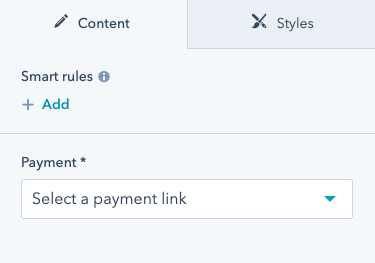
- Once a payment link is selected, the three fields that follow (
checkout_location,button_text, andicon) will appear. This is because the fields have avisibilityattribute which is controlled by thepaymentfield and requires an ID value in the payment field’sidparameter.
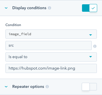
icon field itself uses advanced_visibility to appear only when there’s a payment link present in the payment field AND when the add_icon checkbox is selected.
In addition to setting visibility within fields.json, You can also set visibility in the design manager by editing a field’s Display conditions options.
visibility attribute in the module’s fields.json file.
Conditional field disabling
You can add conditions to a field to prevent editing when the specified conditions are met. You can also set a message to display above the field when disabled to provide context in the content editor.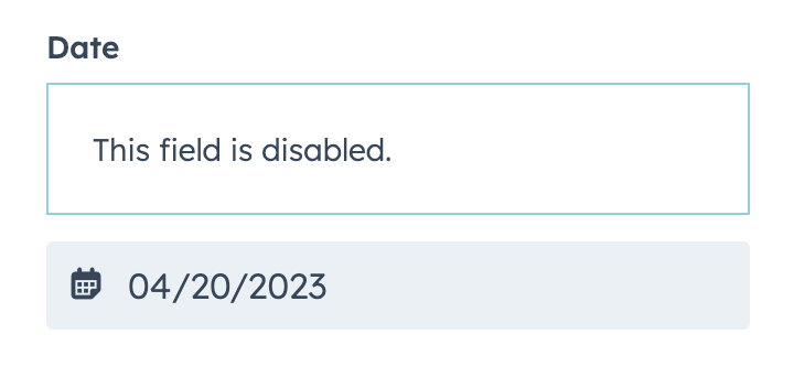
disabled_controls object. The conditions for making a field editable are set within the rules object, which follows the same format as advanced_visibility.
The code below shows both a simple and advanced implementation of rules criteria:
- The
simple_pagefield includes logic to disable the field if thetext_fieldis set totesting. - The
fancy_pagefield includes logic to disable the field if eithertext_fieldortext_field_2is set to any value not equal totestingandtesting2respectively.
Theme editor field highlighting
When in the theme editor, preview highlighting can help content creators understand which fields are controlling which page elements. Preview highlighting works by mapping the theme fields to the CSS selectors that they affect, adding a box around those elements when hovering over the field in the theme editor. To configure preview highlighting for theme fields, you’ll include aneditor-preview.json file in the root directory of the theme to map theme fields to a list of CSS selectors. In the file, you’ll include an array for each style field you want to highlight containing the relevant CSS selectors, using the following format:
editor-preview.json file of the default Growth theme.
After running the command, you’ll need to review and refine the
editor-preview.json file to ensure that fields and selectors are mapped properly. While the generate-selectors command will make a rudimentary guess about which fields affect which selectors, you’ll need to make corrections based on how your theme is built. For example, this command cannot detect when modules are overriding styling or when you’re using macros.
To test these mappings, upload the theme to an account, then view the theme editor in that account (Settings > Website > Themes > View theme).