Documentation Index
Fetch the complete documentation index at: https://developers.hubspot.com/docs/llms.txt
Use this file to discover all available pages before exploring further.
Below, learn about the default modules that HubSpot provides for building templates for website pages, blog posts, and blog listing pages.
When developing locally, you can fetch a specific default module using the module path (e.g. hs fetch @hubspot/linked_image.module).
To view a default module’s code, you can view and clone the module within the @hubspot folder of the design manager. In the code, some default modules use the default account ID 7052064, rather than the one belonging to the current account.
Supported in blog posts and blog listings.
{% module "blog_comments" path="@hubspot/blog_comments" %}
Blog email subscription
Supported in pages, blog posts, and blog listings.
{% module "blog_subscribe" path="@hubspot/blog_subscribe" %}
| Parameter | Type | Description | Default |
|---|
select_blog | Blog | The blog to use for the module. | |
title | String | Title for the module (wrapped in a h3 tag) | "Subscribe Here!" |
response_message | Rich Text | The message that is shown upon submitting the form. | Thanks for subscribing! |
Blog posts
Add this module to blog listing pages to display blog post previews containing each post’s title, featured image, author, publish date, and more with a clickable button that navigates to the post.
This default module has built using React, and you can view its source code on GitHub.
Please note:
- This module cannot be accessed from the design manager. The module can be referenced with HubL in coded templates and added within the blog listing page editor.
- This module replaces the previous
blog_listing module, which has been deprecated.
{% module "blog_posts"
  path="@hubspot/blog_posts"
  layout="grid",
  columns=4,
  displayForEachListItem=[
   "image",
   "title",
   "authorName",
   "tags",
   "publishDate",
   "description",
   "button"
  ]
%}
| Parameter | Type | Description | Default |
|---|
layout | Choice | The content layout for each blog post preview.grid (default): aligns posts in a basic grid.singleColumn: aligns posts in a single column. with featured images on their own row above the rest of the post content.sideBySide: aligns posts in a column with featured images aligned horizontally with the post content.
| grid |
columns | Number | When using the grid layout, the number of posts per row. Can be 2, 3, or 4. | 3 |
alternateImage | Boolean | When using the sideBySide layout, set to true to align the featured image on the right and left side of the post preview, alternating. | false |
fullImage | Boolean | When using the grid or singleColumn layouts, set this field to true to make the featured image the background of the post preview. | false |
displayForEachListItem | Array | The content to include in each blog post preview. Choices include:image: the post’s featured image.title: the post’s title.authorImage: the post author’s image.authorName: the post author’s name.tags: the post’s blog tags.publishDate: the post’s publish date.description: the post’s meta description.button: the read more button that links to the blog post.
| [ 'image', 'title', 'authorImage', 'authorName', 'tags', 'publishDate', 'description', 'button' ] |
buttonText | String | The text that displays on the read more button, if included. | Read more |
Blog post filter
Supported in pages, blog listings, and blog posts.
{% module "post_filter" path="@hubspot/post_filter" %}
| Parameter | Type | Description | Default |
|---|
select_blog | Blog | Select a blog to display. Default will use the current blog when used in a blog template or the primary blog when used elsewhere. | |
filter_type | Choice | Type of filtering links to show. Choices include: | tag |
order_by | Choice | Ordering for the values of filter links. Choices include: | post_count |
list_title | Text | An H3 heading. | "Posts by Tag" |
max_links | Number | Number of filter links to show. Leave blank to show all. | 5 |
expand_link_text | Text | Text to display if more than the max_links value to display are available. | "See all" |
Blog post listing
Supported in pages, blog listings, and blog posts.
{% module "post_listing" path="@hubspot/post_listing" %}
| Parameter | Type | Description | Default |
|---|
select_blog | Blog | Select a blog to display. Default will use the current blog when used in a blog template or the primary blog when used elsewhere. | |
listing_type | Choice | The type of listing for your posts. Choices include:recent: most recent.popular_all_time: most popular of all time.popular_past_year: most popular the past year.popular_past_six_months: most popular the past six months.popular_past_month: most popular the past month.
| recent |
list_title | Text | An H3 heading. | "Recent Posts" |
max_links | Number | Maximum number of posts to display. | 5 |
{% module "button" path="@hubspot/button" %}
| Parameter | Type | Description | Default |
|---|
link | Link | The URL that the button redirects to. | { "url": { "type": "EXTERNAL", "href": "www.hubspot.com", "content_id": null }, "open_in_new_tab": false, "no_follow": false } |
button_text | Text | Text that will be displayed on the button. | "Add a button link here" |
style | Object | override_default_style (Boolean)
button_font (Font)
button_color (Color)
text_hover_color (Color)
button_hover_color (Color)
| { "override_default_style": false, "button_font": { "color": "#FFFFFF", "size_unit": "px" }, "button_color": { "color": "#000000", "opacity": 100 }, "text_hover_color": { "color": "#000000", "opacity": 100 }, "button_hover_color": { "color": "#CCCCCC", "opacity": 100 } } |
Call-to-Action
Supported in pages, blog listings, and blog posts.
{% module "cta" path="@hubspot/cta" %}
| Parameter | Type | Description |
|---|
guid | String | Globally Unique Identifier of the CTA. |
Delete data
As of May 26th, 2025, this module has been deprecated in favor of the data privacy request page feature.
Reference information for this module has been moved to the deprecated modules documentation.
Divider
Supported in pages. There’s a new version of this module available in accounts created after August 25th, 2022. Learn more about this change.
{% module "divider" path="@hubspot/divider" %}
| Parameter | Type | Description | Default |
|---|
height | Number | Pixel (px) height of the divider line. | 1 |
width | Number | Percentage (%) width of the divider line. | 50 |
color | Color | Color (hex) and opacity (number) of the divider line. | { "color": "#000000", "opacity": 100 } |
line_type | Choice | Line type. Choices include: | solid |
alignment | Choice | Horizontal alignment of divider line. Choices include: | center |
show_padding | Boolean | Show/hide top and bottom margining on the divider. | false |
padding | Number | Pixel (px) value for the margining on top and bottom of divider line. Option available when show_padding equals true. | 5 |
Download data
As of May 26th, 2025, this module has been deprecated in favor of the data privacy request page feature.
Reference information for this module has been moved to the deprecated modules documentation.
Supported in pages, blog posts, and blog listings.
{% module "form"
 path="@hubspot/form"
 form={
  "form_id": "9e633e9f-0634-498e-917c-f01e355e83c6",
  "response_type": "redirect",
  "message": "Thanks for submitting the form.",
  "redirect_id": null,
  "redirect_url": "http://www.google.com"
 }
%}
| Parameter | Type | Description | Default |
|---|
title | Text | H3 heading | |
form | Object | Form object including:form_id: ID for form to useresponse_type: what the visitor will see after submitting the form:message: inline message if response_type is set to inlineredirect_id: ID of page to be redirected to if response_type is set to redirect.redirect_url: URL to be redirected to if response_type is set to redirect
| |
{ "form_id": "", "response_type": "redirect", "message": "Thanks for submitting the form.", "redirect_id": null, "redirect_url": "http://www.google.com" } | | | |
notifications_are_overridden | Boolean | Email to send form notification to instead of form defaults. | false |
notifications_override_email_addresses | Email | Comma-separated list of emails to send to when notifications_are_overridden equals true. | |
follow_up_type_simple | Boolean | Enabled sending a follow up email. | false |
simple_email_for_live_id | Followupemail | ID of the follow-up email. Available when follow_up_type_simple equals true. | |
sfdc_campaign | Salesforcecampaign | When Salesforce integration is active, the campaign ID. | |
{% module "header" path="@hubspot/header" %}
| Parameter | Type | Description | Default |
|---|
value | Text | Text for the heading. | "A clear and bold header" |
header_tag | Choice | Choose a heading level. Choice include h1 through h6. | h1 |
Horizontal spacer
Supported in pages, blog listings, blog posts, and emails.
{% module "horizontal_spacer" path="@hubspot/horizontal_spacer" %}
Icon
Supported in pages, blog listings, and blog posts. Icons can be pulled from the Font Awesome 5.0.10 and 5.14.0 icon sets.
{% module "icon" path="@hubspot/icon" %}
| Parameter | Type | Description | Default |
|---|
name | String | The name of the icon. | "hubspot" |
purpose | Choice | An accessibility option that categorizes the purpose of the icon for screen readers. Available values are:decorative: ignored by the screen reader.semantic: read by the screen reader.
| "decorative" |
title | String | An accessibility option that assigns the icon a title. | |
style | String | The type of icon. Can be one of solid, regular, light, thin, or duotone. | "solid" |
unicode | String | The icon’s unicode value. | f3b2 |
Image
Supported in pages, blog listings, and blog posts.
{% module "linked_image" path="@hubspot/linked_image" %}
| Parameter | Type | Description | Default |
|---|
img | Image | Image object containing:src: image urlalt: alt text for imageloading: lazy loading options include:width: px valueheight: px value
| { "src": "https://static.hubspot.com/final/img/content/email-template-images/placeholder_200x200.png", "alt": "placeholder_200x200", "loading": "disabled", "width": 200, "height": 200 } |
link | Text | Optional link for the image. | |
target | Boolean | Opens link in a new tab. | false |
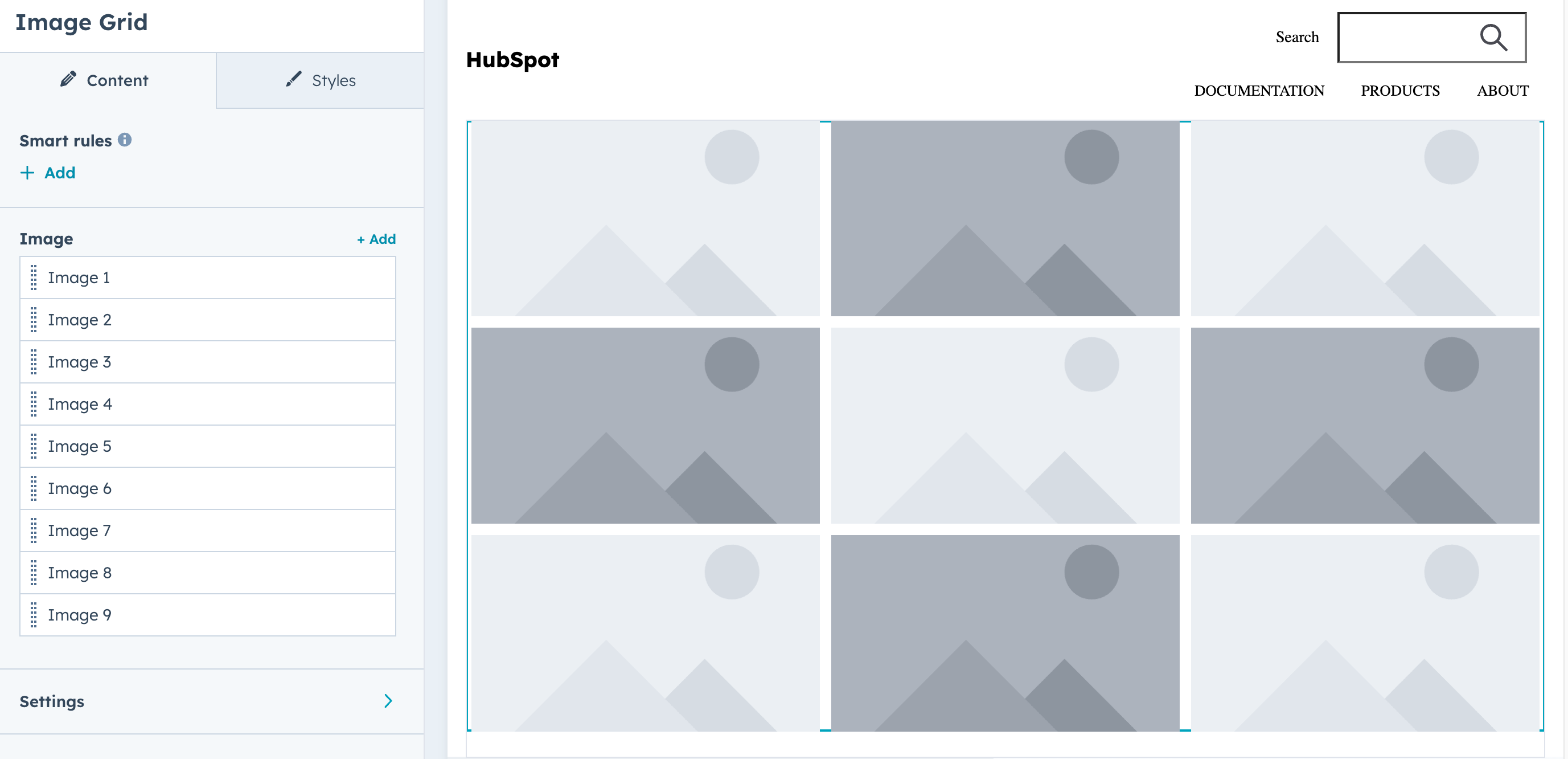
Image grid
Display a grid of images (9 images by default). Includes fields for selecting images, configuring grid settings, and styling. Keep in mind the following guidelines when using this module:
- Use images with similar aspect ratios for visual consistency.
- Alt text should be provided for all images. Default text is available as a fallback.
Supported in pages, blog listings, and blog posts.
{%
  module "image_grid"
  path="@hubspot/image_grid",
  label="image_grid.module"
  slides=[
    {
      "img": {
        "src": "",
        "alt": ""
      },
      "hover_message": "Hover message"
    },
    {
      "img": {
        "src": "",
        "alt": ""
      },
      "hover_message": "Hover message"
    },
    {
      "img": {
        "src": "",
        "alt": ""
      },
      "hover_message": "Hover message"
    },
  ],
  grid_settings={
    "group_image_click" : {
      "image_click_functionality" : "navigate"
    },
    "group_image_hover" : {
      "image_hover_functionality" : [ "blur" ]
    },
    "group_uniform_display_options" : {
      "mobile_columns" : true
    }
  }
%}
| Parameter | Type | Description |
|---|
slides | Field group | An array of image objects for the grid. Includes the following fields:img: The image URL. link_url: Optional URL for image navigation.hover_message: Rich text content displayed on hover, with rich text field options.
|
grid_settings | Field group | Contains field groups for configuring image grid settings. |
group_image_click | Field group | Contains the image_click_functionality field for configuring image click behavior, which can be set to:lightbox (default): Open image in a lightbox.navigate: Navigate to link URL.nothing: No action.
|
group_image_hover | Field group | Contains the following fields for configuring image hover behavior:image_hover_functionality: Sets the visual effects applied on hover. Options include:zoom_out: Zoom out effect.blur: Blur effect.grayscale: Grayscale effect.
overlay_show_on: When to display hover overlay text. Options include:always: Always visible.hover (default): Show on hover only.never: Never show.
|
group_uniform_display_options | Field group | Contains the following fields for configuring the number of columns in the grid: number_of_columns: The number of columns in the grid (1-10).mobile_columns: a boolean for configuring a different number of columns for mobile device display.mobile_number_of_columns: The number of columns for mobile device display (when mobile_columns is true).
|
group_aspect_ratio | Field group | Contains the aspect_ratio field for setting the aspect ratio for grid images. Options include:1/1: Square3/2: Landscape2/3: Portrait4/3: Standard3/4: Portrait standard16/9: Widescreen
|
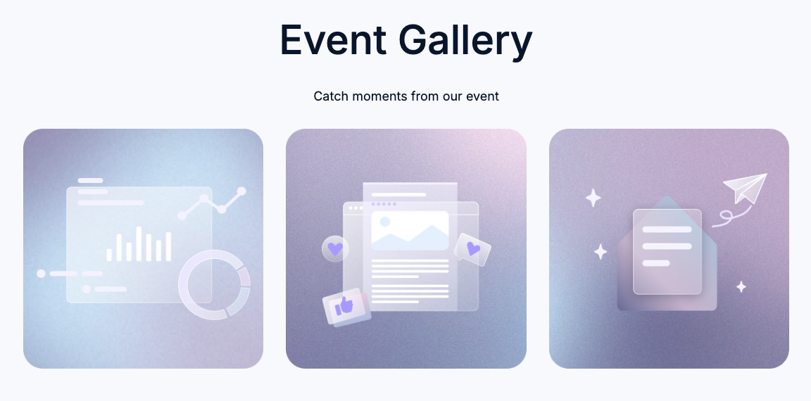
Mobile responsive grids
To configure an image gallery to be mobile responsive, include the mobile group_uniform_display_options fields within grid_settings. You’ll first need to set mobile_columns to true, then set the number of columns for mobile devices with mobile_number_of_columns.
Below is an example of an image grid that’s configured to be mobile responsive, taken from the Event Signup Two template in the default Elevate theme. Based on the width of the viewport, the grid will either display the three images horizontally in one row (desktop) or vertically in three rows (mobile).
{% dnd_module
  path="@hubspot/image_grid",
  grid_settings={
    "group_uniform_display_options": {
      "number_of_columns": 3,
      "mobile_columns": true,
      "mobile_number_of_columns": 1
    },
    "group_aspect_ratio": {
      "aspect_ratio": "1/1"
    },
    "group_image_click": {
      "image_click_functionality": "nothing"
    },
    "group_image_hover": {
      "overlay_show_on": "never"
    }
  },
  styles={
    "grid_images": {
      "group_gap": {
        "gap": 32
      }
    }
  },
  slides=[
    {
      "img": scaffold_content.group_gallery.image_1 or {
        "alt": "",
        "src": get_asset_url("../images/gallery-1.png")
      }
    },
    {
      "img": scaffold_content.group_gallery.image_2 or {
        "alt": "",
        "src": get_asset_url("../images/gallery-2.png")
      }
    },
    {
      "img": scaffold_content.group_gallery.image_3 or {
        "alt": "",
        "src": get_asset_url("../images/gallery-3.png")
      }
    }
  ]
%}
{% end_dnd_module %}
Image gallery
Supported in pages, blog posts, and blog listings.
{% module "gallery" path="@hubspot/gallery" %}
| Parameter | Type | Description | Default |
|---|
slides | Object | Object containing information for each slide. Object contains:img: image URL.show_caption: boolean to show slide caption.caption: rich text for caption.link_url: URL where the slide should link.open_in_new_tab: boolean to direct if the link should open in a new tab.
| [ { "show_caption": false, "open_in_new_tab": false } ] |
display_mode | Choice | Display mode of the Image Gallery. Choices include:standard: standard slider.thumbnail: thumbnail navigator.lightbox: lightbox gallery.
| standard |
lightboxRows | Number | Number of rows in the Lightbox gallery when display_mode equals lightbox. | 3 |
loop_slides | Boolean | Enables looping through the slides with next/prev when display_mode equals standard or thumbnail. | true |
auto_advance | Boolean | Automatically advances to the next slide when display_mode equals standard or thumbnail. | true |
num_seconds | Number | Amount of time (seconds) between advancing to the next slide when display_mode equals standard or thumbnail. | 5 |
show_pagination | Boolean | Show navigation buttons when display_mode equals standard or thumbnail. | true |
sizing | Choice | Sets the height of the slides when display_mode equals standard or thumbnail. Choices include:static: fixed height.resize: variable height.
| static |
transition | Choice | Slide transition styles when display_mode equals standard or thumbnail. Choices include:slide: slide transition.fade: fade transition.
| slide |
caption_position | Choice | Position of the slide captions when display_mode equals standard or thumbnail. Choices include:below: always keep captions below the image.superimpose: superimpose captions on top of images.
| below |
Image slider gallery
Supported in pages, blog posts, and blog listings.
{% module "unique_name"
    path="@hubspot/image_slider_gallery",
    slides=[
        {
        "img": {
            "src": "",
            "alt": "Default image alt text"
        },
        "caption": "<strong>1</strong> An optional caption for the image that will be added to the gallery. Enter any descriptive text for this image that you would like visitors to be able to read.",
        "link_url": ""
        },
        {
        "img": {
            "src": "",
            "alt": "Default image alt text"
        },
        "caption": "<strong>2</strong> An optional caption for the image that will be added to the gallery. Enter any descriptive text for this image that you would like visitors to be able to read.",
        "link_url": ""
        }
    ]
    slideshow_settings={
        "slides": {
        "per_page": 1,
        "sizing": "natural",
        "aspect_ratio": "16/9",
        "show_captions": true,
        "caption_position": "below"
        },
        "movement": {
        "transition": "slide",
        "loop_slides": false,
        "auto_advance": false,
        "auto_advance_speed_seconds": 5
        },
        "navigation": {
        "show_main_arrows": true,
        "show_thumbnails": false,
        "show_dots": false
        }
    }
%}
| Parameter | Type | Description |
|---|
slides | Field group | A field group containing the following fields:img: image URL.caption: rich text for image caption.link_url: URL that the slide links to.
|
slideshow_settings | Field group | The image slider settings field group. Includes the following field groups:slides: slide settings, including:per_page: number of slides per page.sizing: image sizing.aspect_ratio: image aspect ratio.show_captions: a boolean
movement: image sliding behavior settings.navigation: image navigation settings.
|
default_text | Field group | The module’s default text elements, including:default_caption: image caption.default_image_alt_text: image text.slider_aria_label: the module’s default aria label.arial_label_thumbnails: the module’s default aria thumbnail.slider_nav_aria_label: the module navigation’s default aria label.prev: previous slide text.next: next slide text.first: go to first slide text.slideX: go to X slide text.pageX: go to X page text.play: start autoplay text.pause: pause autoplay text.carousel: carousel text.select: text for selecting a slide to show.slide: slide text.slidelabel: slide label.
|
Language switcher
Supported in pages.
{% module "language_switcher" path="@hubspot/language_switcher" %}
| Parameter | Type | Description | Default |
|---|
display_mode | Choice | The language of the text in the language switcher. Options include:pagelang: the names of languages will display in the language of the page the switcher is on.localized: the name of each language will display in that language.hybrid: a combination of the two.
| localized |
Logo
Supported in pages, blog listings, and blog posts.
{% module "logo" path="@hubspot/logo" %}
| Parameter | Type | Description | Default |
|---|
img | Image | Image object containing:override_inherited_src: override the default logo from settingssrc: image urlalt: alt text for logo
| { "override_inherited_src": false, "src": null, "alt": null } |
link | Text | Optional link for the logo. If no URL is specified, your logo will link to the Logo URL set in your brand settings. | |
open_in_new_tab | Boolean | Opens link in a new tab. | false |
suppress_company_name | Boolean | Hide the company name when an image is not selected. | true |
heading_level | Choice | Choose a heading level when no image is selected and suppress_company_name equals false. Choices include h1 through h6. | h1 |
Logo grid
A customizable grid of containers to display logos uniformly. Supported in pages, blog listings, and blog posts.
{% module "logo grid"
  path="@hubspot/logo_grid"
  group_logos=[
    {
      "logo": {
        "loading": "lazy",
        "alt": "company_logo",
        "src": "https://www.example.com/Logos/color/logo.png"
      }
    },
    {
      "logo": {
        "loading": "lazy",
        "alt": "company2_logo",
        "src": "https://www.example.com/Logos/color/logo2.png"
      }
    },
    {
      "logo": {
        "alt": "lorem-logo",
        "height": 40,
        "loading": "lazy",
        "max_height": 40,
        "max_width": 175,
        "src": "https://www.example.com/Logos/color/logo3.png",
        "width": 175
      }
    }
  ],
  styles={
    "group_logo": {
      "group_background": {
        "aspect_ratio": "1/1",
        "background_color": {
          "color": "#8E7CC3",
          "opacity": 100
        }
      },
      "group_spacing": {
        "padding": {
          "padding": {
            "bottom": {
              "units": "px",
              "value": 75
            },
            "left": {
              "units": "px",
              "value": 75
            },
            "right": {
              "units": "px",
              "value": 75
            },
            "top": {
              "units": "px",
              "value": 75
            }
          }
        }
      },
      "max_logo_height": 85
    },
    "group_logo_grid": {
      "column_count": 3,
      "grid_gap": 54
    }
  }
%}
| Parameter | Type | Description |
|---|
group_logos | Array | An array containing an object for each logo in the grid. |
logo | Object | In group_logos, an object for each logo in the grid. Each logo can include the following parameters:src: the file path of the logo.loading: the lazy load behavior of the logo.alt: the logo’s alt text.height: the logo’s height.width: the logo’s width.max_height: the logo’s maximum height.max_width: the logo’s maximum width.
|
styles | Array | An array containing the style fields that affect the grid layout, logo containers, and logo images. This array contains the following style groups:group_logo: styles that affect the logo containers and logo images. Contains the following:group_background: styles that set the aspect ratio and background color of the grid containers. Aspect ratios include: 1/1, 4/3, 16/9.group_spacing: styles that set the inner padding of the logo container. For wider logos, higher padding value may decrease logo width.max_logo_height: the maximum height of each logo.
group_logo_grid: styles that set the grid layout, including:column_count: the number of columns in the grid.grid_gap: the spacing between grid items.
|
Meetings
Supported in pages, blog posts, and blog listings.
{% module "meetings" path="@hubspot/meetings" %}
| Parameter | Type | Description |
|---|
meeting | Meeting | Select a meeting link. |
Membership social logins
This module provides Google and Facebook login capability to memberships sites. The user must sign-in with an account linked to the email for the contact in the CRM. You can choose which social logins to enable.
Supported in membership login pages.
{% module "social" path="@hubspot/membership_social_logins",
        clientid=""
        appid=""
        facebook_enabled=true
        google_enabled=true
        %}
| Parameter | Type | Description | Default |
|---|
facebook_appid | String | Your facebook app ID. | |
facebook_enabled | boolean | Enable the button for Facebook login. facebook_appid is required**.** | False |
google_clientid | String | Your Google client ID. | |
google_enabled | Boolean | Enable the button for Google login. google_clientid is required**.** | False |
{% module "menu" path="@hubspot/menu" %}
| Parameter | Type | Description | Default |
|---|
id | Menu | ID of the menu. | |
root_type | Choice | Advanced menu type. Choices include:site_root: always show top-level pages in menu.top_parent: show pages in menu that are related to section being viewed.parent: show pages in menu that are related to page being viewed.breadcrumb: breadcrumb style path menu (uses horizontal flow).
| site_root |
max_levels | Choice | Determines the number of menu tree children that can be expanded in the menu. Choices include 1 through 10 | 2 |
flow | Choice | Orientation of the menu. Choices include: | horizontal |
flyouts | Boolean | Enabled hover over functionality for child menu items. | true |
{% module "page_footer" path="@hubspot/page_footer" %}
Password prompt
Supported in pages, blog posts, and blog listings.
{% module "password_prompt" path="@hubspot/password_prompt" %}
| Parameter | Type | Description | Default |
|---|
submit_button_text | Text | Text that appears on the submit button. | "Submit" |
password_placeholder | Text | Placeholder text for the password field. | "Password" |
bad_password_message | Rich Text | Message to show when a password is entered incorrectly. | "Sorry, please try again. " |
Payments
Supported in pages, blog posts, and blog listings.
{% module "payments" path="@hubspot/payments" %}
| Parameter | Type | Description | Default |
|---|
payment | String | To set the module to use a specific payment link, include the ID of the payment link. You can find the ID in the URL while editing the payment link. | |
checkout_location | String | Set whether the payment form opens in a new tab or in an overlay. Available values are:new_tab: opens the payment form in a new tab.overlay: opens the payment form in a sliding overlay.
| "new_tab" |
button_text | String | Sets the text of the checkout button. | "Checkout" |
button_target | Choice | Whether the button uses a HubSpot payment link or an external link. Choices include: | "payment_link" |
button_link | Link | When button_target is set to custom_link, sets the destination of the external link. Supported link types include: | EXTERNAL |
Product
Displays a product from the account’s product library. Supported in pages, blog posts, and blog listings.
{% module
  path="@hubspot/product",
  product={
    "id" : 2124070179
  },
  group_button={
    "button_text" : "Buy",
    "override_product_button" : true,
    "button_override" : {
      "no_follow" : false,
      "open_in_new_tab" : false,
      "sponsored" : false,
      "url" : {
        "href" : "https://www.test.com",
        "type" : "EXTERNAL"
      }
  },
  group_description={
    "description_override" : "Monthly gym membership with access to shared locker facilities.",
    "override_product_description" : true
  },
  group_name={
    "heading_level" : "h3",
    "name_override" : "Gym membership",
    "override_product_name" : true
  },
  group_image={
    "image_override" : {
      "alt" : "360_F_317724775_qHtWjnT8YbRdFNIuq5PWsSYypRhOmalS",
      "height" : 360,
      "loading" : "lazy",
      "src" : "https://2272014.fs1.hubspotusercontent-na1.net/hubfs/2272014/360_F_317724775_qHtWjnT8YbRdFNIuq5PWsSYypRhOmalS.jpg",
      "width" : 640
    },
    "override_product_image" : true
  }
%}
| Parameter | Type | Description |
|---|
product | Product | The product to display, specified by product ID. |
group_button | Field group | By default, the module includes a button that directs users to the product’s set URL. To customize the button destination, include this optional field group along with the following fields:button_text: a string that sets the button’s text.override_product_button: set to true to override the default button link settings. Then, include a button_override object. Learn more about button_override below.
|
button_override | Object | In the group_button field group, this sets the button’s URL behavior when override_product_button is set to true.Includes the following fields:no_follow: boolean field for the link’s no_follow behavior.open_link_in_new_tab: boolean field for the link’s open behavior.url: an object that specifies the button’s destination.
In the url field, you can set the type of destination through the type field, which supports the following content types:EXTERNAL: a standard URL. Include the URL in an href field.CONTENT: a HubSpot page. Include the page ID in a content_id field.PAYMENT: a payment link. Include the payment link in an href field.EMAIL_ADDRESS: an email address. Include the address in an href field.
|
group_name | Field group | By default, the module will display the product name at the top of the module as an h3. To customize the name, include this optional field group along with the following fields:heading_level: the heading size. Can be h1 - h6.override_product_name: set to true to specify text rather than the product name.name_override: the string that you want to display at the top of the module.
|
group_description | Field group | By default, the module will display the product’s set description. To customize the description, include this optional field group along with the following fields:override_product_description: set to true to customize the product description.description_override: a string containing your new description.
|
group_image | Field group | By default, the module will display the product’s set image. To customize this image, include this optional field group with the following fields:override_product_image: set to true to specify a new image. image_override: an object that specifies the new image, including the following properties:
|
Legacy quote modules
The following modules can be used in legacy quote templates. For building quote templates, learn how to create quote templates in HubSpot.
Quote download
Supported in legacy quote templates.
{% module "download" path="@hubspot/quote_download" %}
| Parameter | Type | Description |
|---|
button_text | String | The text displayed on the download button.
Default is Download. |
download_error | String | Error message displayed if the download fails.
Default is There was a problem downloading the quote. Please try again. |
Quote payment
Supported in legacy quote templates.
{% module "payment" path="@hubspot/quote_payment" %}
| Parameter | Type | Description |
|---|
heading_text | String | The heading displayed above the payment section of a quote template.
Default is Payment. |
heading_tag | Choice | The type of heading used to display heading_text. Values include h1, h2, h3, h4, h5, h6.
Default is h3. |
checkout | String | The payment button text.
Default is Pay now. |
needs_signature | String | Button text when a signature is required.
Default is Payment can't be made because the quote isn't fully signed.. |
checkout_error | Rich text | Message that displays when there’s an error during checkout.
Default is There was a problem setting up checkout. Please contact the person who sent you this quote. |
payment_status_error | Rich text | Message that displays when there’s an error when trying to make a payment.
Default is There was a problem loading the payment status for this quote. Please try refreshing the page. |
paid | String | A successful payment status indicator.
Default is Paid. |
payment_processing | String | A payment processing status indicator.
Default is Payment processing. |
Quote signature
Supported in legacy quote templates.
{% module "signature" path="@hubspot/quote_signature" %}
esignature object:
| Parameter | Type | Description |
|---|
pretext | Rich text | E-signature explanation text.
Default is Before you sign this quote, an email must be sent to you to verify your identity. Find your profile below to request a verification email.. |
verify_button | String | Text that displays on the verification button.
Default is Verify to sign. |
failure | String | Alert text that displays when the signature information can’t be retrieved.
Default is There was a problem retrieving the signature information. Please reload the page.. |
verification_sent | String | A status indicator that appears when the verification request has been successfully sent to the quote signer.
Default is Verification sent. |
signed | String | Text that displays when the quote has been successfully signed.
Default is Signed. |
print_signature object:
| Parameter | Type | Description |
|---|
header | Rich text | Text displayed at the top of the signature section.
Default is Signature. |
signature | String | Text that displays next to the signature field.
Default is Signature. |
date | String | Text that displays next to the date field.
Default is Date. |
printed_name | String | Text that displays next to the printed name field.
Default is Printed name. |
countersignature | Object | An object containing content for the countersignature section. This object can contain the following fields:header: text that displays at the top of the countersignature section.countersignature: Text that displays next to the countersignature field.date: text that displays next to the date field.printed_name: text that displays next to the printed name field.
Default is Signed. |
Line items
Supported in legacy quote templates. This module also includes the default text used on custom quotes.
{% module "module_165350106057652" path="@hubspot/line_items", label="line_items.module" %}
| Parameter | Type | Description |
|---|
title | Text | The title of the line item column.
Default is Column description. |
use_additional_product_property | Boolean | Display checkbox to allow users to select additional line item columns from product properties.
Default is False. |
additional_product_properties | Choice | A product property. Choices include: price: price of line item. item_description: description of line item. quantity: number of line items. amount: total cost of line items. hs_recurring_billing_start_date: billing start date for recurring line items. discount: discount amount applies to the line item.
|
crm_product_property | CRM object property | Select any product property to appear as a line item column header. |
Rich text
Supported in all template types.
{% module "rich_text" path="@hubspot/rich_text" %}
| Parameter | Type | Description | Default |
|---|
html | Rich Text | HTML block. | ## Something Powerful \n ### Tell The Reader More \n The headline and subheader tells us what you're [offering](https://developers.hubspot.com/docs\"#\"), and the form header closes the deal. Over here you can explain why your offer is so great it's worth filling out a form for. \n Remember: \n<ul>\n<li>Bullets are great</li>\n<li>For spelling out [benefits](https://developers.hubspot.com/docs\"#\") and</li>\n<li>Turning visitors into leads.</li>\n</ul> |
{% module "rss_listing" path="@hubspot/rss_listing" %}
| Parameter | Type | Description | Default |
|---|
title | Text | An H3 heading. | "Test" |
rss_feed_type | Choice | Type of RSS feed. Choices include:blog - HubSpot hosted blog.external - An external RSS feed.
| blog |
rss_url | Text | RSS URL to use when rss_feed_type equals external. | |
content_group_id | Blog | Id of the blog to use when rss_feed_type equals blog. | |
topic_id | Tag | (optional) Id of the tag to filter by when rss_feed_type equals blog. | |
number_of_items | Number | Maximum number of posts to display. | 5 |
include_featured_image | Boolean | Include the featured image. | false |
show_author | Boolean | Show the author name. | true |
attribution_text | Text | Text that attributes an author to a post. Displayed when show_author equals true. | "by" |
show_detail | Boolean | Show post summary text. | true |
limit_to_chars | Number | Limits the length of the summary text when show_detail equals true. | 200 |
click_through_text | Text | The text which will be displayed for the clickthrough link at the end of a post summary when show_detail equals true. | "Read more" |
show_date | Boolean | Show publish date. | true |
publish_date_format | Choice | Format for the publish date when show_date equals true. Choices include:short (ex: 06/11/06 12:00PM)medium (ex: Jun 6, 2006 12:00:00 pm)long (ex: June 6, 2017 12:00:00 pm EDT)MMMM d, yyyy 'at' h:mm a (ex: June 6, 2006 at 12:00 pm)h:mm a 'on' MMMM d, yyyy (ex: 12:00 pm on June 6, 2006)
| short |
publish_date_text | Text | The text that indicates when a post was published when show_date equals true. | "posted at" |
{% module "search_input" path="./local-search_input"
  placeholder="Search"
  include_search_button=true
  results={
   "use_custom_search_results_template": "true",
   "path_id": "77977569400"
  }
%}
| Parameter | Type | Description | Default |
|---|
field_label | Text | Search input label text | |
placeholder | Text | Placeholder text for the input field. | "Search" |
include_search_button | Boolean | Include a search button. | false |
content_types | Object | Which content types to include in search results. Object contains the following keys with boolean values:website_pageslanding_pagesblog_postsknowledge_articles
| { "website_pages": true, "landing_pages": false, "blog_posts": true, "knowledge_articles": false } |
results | Object | An object that enables controls for using a custom search results page. Includes the following properties:
use_custom_search_results_template (boolean): when set to true, users can select a custom search results page. Default is false.path_id (string): the ID of the page that will be used for search results. The referenced page must contain the search results module.
| |
Search results
Supported in pages, blog posts, and blog listings.
{% module "search_results" path="@hubspot/search_results" %}
| Parameter | Type | Description | Default |
|---|
display_featured_images | Boolean | Display featured images for items. | false |
{% module "section_header" path="@hubspot/section_header" %}
| Parameter | Type | Description | Default |
|---|
header | Text | Section header content. | "A clear and bold header" |
heading_level | Choice | Heading level for the header. Choices include h1 through h6. | h1 |
subheader | Text | Subheading paragraph text for the section. | "A more subdued subheader" |
{% module "simple_menu" path="@hubspot/simple_menu" %}
| Parameter | Type | Description | Default |
|---|
menu_tree | Simple Menu | Simple menu object. | [] |
orientation | Choice | Orientation of the menu. Choices include: | horizontal |
Social follow
Add links to your social media profiles, with drag and drop reordering in the content editor. Automatically inserts icons based on the social URL, but icons can be overridden.
Supported in pages, blog listings, and blog posts.
{% module "social_follow" path="@hubspot/social_follow" %}
| Parameter | Type | Description | Default |
|---|
link | Text | The destination link for the social page added in the editor. | |
open_in_new_window | Boolean | When set to false, link will open in the same browser tab. | true |
is_podcast | Boolean | Set to true to display a podcast icon instead of a default or custom icon. | false |
customize_alt_text | Boolean | By default, alt text is automatically generated. When set to true, you can override the default alt text with a custom value using the aria_label field. | false |
aria-label | String | When customize_alt_text is true, this field sets the icon alt text (e.g., Follow us on Facebook). This is used by screen readers to describe the icon to users who are visually impaired. | False |
customize_icon | Boolean | By default, icons are auto-populated based on the link URL. When set to true, you can use the custom_icon field to select one of the other provided icons (Font Awesome 6.4.2). | false |
custom_icon | Icon | When customize_icon is true and is_podcast is false, use this field to specify a custom icon from the provided set. Available icons are from Font Awesome 6.4.2. | |
Social sharing
Supported in pages, blog listings, and blog posts.
{% module "social_sharing" path="@hubspot/social_sharing" %}
social_link_url in the default column below is the same value as the link parameter.
| Parameter | Type | Description | Default |
|---|
link | Text | This is the destination link that will be shortened for easier sharing on social networks. | |
facebook | Object | Object containing:enabled: boolean to enable social itemcustom_link_format: custom URL for socials sharer URL
| { "enabled": false, "custom_link_format": "http://www.facebook.com/share.php?u={{ social_link_url }}" } |
twitter | Object | Object containing:enabled: boolean to enable social itemcustom_link_format: custom URL for socials sharer URL
| { “enabled”: false, “custom_link_format”: “https://twitter.com/intent/tweet?original_referer=\{\{ social_link_url }}&url={{ social_link_url }}&source=tweetbutton&text={{ social_page_title|urlencode }}” } |
linkedin | Object | Object containing:enabled: boolean to enable social itemcustom_link_format: custom URL for socials sharer URL
| { "enabled": false, "custom_link_format": "http://www.linkedin.com/shareArticle?mini=true&url={{ social_link_url }}" } |
pinterest | Object | Object containing:enabled: boolean to enable social item.custom_link_format: custom URL for socials sharer URL.pinterest_media: image object including:src: image URL.alt: alt text for the image.
| { "enabled": false, "custom_link_format": "http://pinterest.com/pin/create/button/?url={{ social_link_url }}&media={{ pinterest_media }}", "pinterest_media": { "src": "", "alt": null } } |
email | Object | Object containing:enabled: boolean to enable social itemcustom_link_format: custom URL for socials sharer URL
| { "enabled": false, "custom_link_format": "mailto:?subject=Check out {{ social_link_url }} &body=Check out {{ social_link_url }}" } |
Tabbed card
Supported in pages, blog listings, and blog posts.
{% module
  path="@hubspot/tabbed_card",
  tabs=[
   {
    "content" : "<p>This is the descriptive text contained in tab 1.</p>",
    "tab_label" : "Tab 1 label"
   },
   {
    "content" : "<p>This is the descriptive text contained in tab 2.</p>",
    "tab_label" : "Tab 2 label"
   }
  ],
  fixed_height=false
%}
| Parameter | Type | Description | Default |
|---|
tabs | Field group | A field group that contains the tab label and text content of each tab. Contains the following fields:tab_label: the label of the tab.content: the tab’s rich text content.
| "Some additional information in one line" |
fixed_height | Boolean | By default, the tabs will be set at a fixed height so that the container height stays the same when switching between tabs. You can set this to false if you want the tabbed card container height to be based on the active tab’s content. | False |
One line of text
Supported in pages, blog listings, and blog posts.
{% module "text" path="@hubspot/text" %}
| Parameter | Type | Description | Default |
|---|
value | Text | Add your text to this parameter. | "Some additional information in one line" |
Video
Supported in pages, blog listings, and blog posts.
{% module "video" path="@hubspot/video" %}
| Parameter | Type | Description | Default |
|---|
video_type | Choice | Type of video. Choices include:embed: embed code from an external source.hubspot_video: HubSpot hosted video.
| embed |
hubspot_video | Video Player | HubSpot hosted video. Used when video_type equals hubspot_video. | |
embed_field | Embed | Supports embed types:oembedhtml: embed code for video.
| |
oembed_thumbnail | Image | Override oembed thumbnail image when video_type equals embed and embed_field equals oembed. | |
style_options | Object | Object containing oembed_thumbnail_play_button_color - Color field. | {"oembed_thumbnail_play_button_color":"#ffffff"} |
placeholder_fields | Object | Object containing:placeholder_title: text field.placeholder_description: text field.
| {"placeholder_title":"No video selected", "placeholder_description":"Select a video type in the sidebar."} |
Video embed (landing page)
Supported in pages.
{% module "video_embed_lp" path="@hubspot/video_embed_lp" %}
| Parameter | Type | Description | Default |
|---|
url | Text | URL for video. URLs from Vimeo and YouTube are supported. | "https://www.youtube.com/watch?v=X1Rr5BFO5rg" |
is_full_width | Boolean | Sets the video to full width (true) or manually set width and height (false). | true |
max_width | Number | Max width (px) | 800 |
max_height | Number | Max height (px) | 450 |
WhatsApp link
Supported in pages, blog posts, and blog listing pages. Requires a connected WhatsApp channel.
{% module "whatsapp_link" path="@hubspot/whatsapp_link", label="whatsapp_link" %}
| Parameter | Type | Description | Default |
|---|
whatsapp_number | URL | Select from the WhatsApp channels connected to the account. | |
optin_text | Choice | The opt-in and opt-out text. | |
whatsapp_display | Choice | Select whether the button displays text, a WhatsApp icon, or both. Choices include: | text_and_icon |
icon_position | Choice | The position of the icon on the button. Choices include left and right. | left |
button_text | String | The button’s text. | Chat on WhatsApp |
whatsapp_icon_title | String | The icon text for screen readers. | WhatsApp Icon |