Last modified: August 22, 2025
The List component renders a list of items. Each item in List will be wrapped in <li> tags. A list can be styled as inline, ordered, or unordered with the variant prop.
ui-components-list-example
import { List } from '@hubspot/ui-extensions';

const Extension() {
  return (
    <List variant="unordered-styled">
      <Link href="www.hubspot.com">List item 1</Link>
      <Link href="www.developers.hubspot.com">List item 2</Link>
      <Link href="www.knowledge.hubspot.com">List item 3</Link>
    </List>
   );
}
PropTypeDescription
variant'unordered' (default) | 'unordered-styled' | 'ordered' | 'ordered-styled' | 'inline' | 'inline-divided'The type of list to render. See variants section below for examples.

Variants

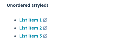
By default, lists will be configured as vertically stacked list items without bullets. To customize the styling, use the variant prop, as shown below. 
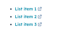
To create a bulleted unordered list:
ui-components-list-variants_2
<List variant="unordered-styled">
  <Link href="www.hubspot.com">List item 1</Link>
  <Link href="www.developers.hubspot.com">List item 2</Link>
  <Link href="www.knowledge.hubspot.com">List item 3</Link>
</List>
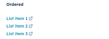
To create a numbered list without styling:
ui-components-list-variants_3
<List variant="ordered">
  <Link href="www.hubspot.com">List item 1</Link>
  <Link href="www.developers.hubspot.com">List item 2</Link>
  <Link href="www.knowledge.hubspot.com">List item 3</Link>
</List>
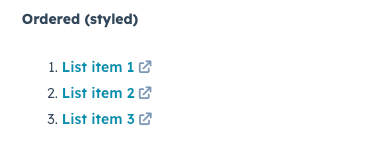
To create a numbered list with styling:
ui-components-list-variants_4
<List variant="ordered-styled">
  <Link href="www.hubspot.com">List item 1</Link>
  <Link href="www.developers.hubspot.com">List item 2</Link>
  <Link href="www.knowledge.hubspot.com">List item 3</Link>
</List>
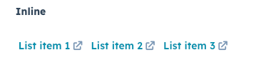
To stack list items horizontally:
ui-components-list-variants_5
<List variant="inline">
  <Link href="www.hubspot.com">List item 1</Link>
  <Link href="www.developers.hubspot.com">List item 2</Link>
  <Link href="www.knowledge.hubspot.com">List item 3</Link>
</List>
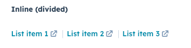
To stack list items horizontally with a divider between each item:
ui-components-list-variants_6
<List variant="inline-divided">
  <Link href="www.hubspot.com">List item 1</Link>
  <Link href="www.developers.hubspot.com">List item 2</Link>
  <Link href="www.knowledge.hubspot.com">List item 3</Link>
</List>