Documentation Index
Fetch the complete documentation index at: https://developers.hubspot.com/docs/llms.txt
Use this file to discover all available pages before exploring further.
The TimeInput component renders an input field where a user can select a time of day. Includes options for customizing the selectable time range, timezone display, and more.
Below is an example of using both TimeInput and DateInput together to allow users to schedule appoints by date and time. Note the setValidAppointmentTimes logic to set the available time ranges based on the selected date.
import React, { useState } from "react";
import { Button, DateInput, Flex, Form, Heading, TimeInput, hubspot } from "@hubspot/ui-extensions";
hubspot.extend(() => <Extension />);
function Extension() {
const [dateRange] = useState({
start: { year: 2025, month: 6, date: 7 },
end: { year: 2025, month: 6, date: 11 },
});
const [timeRange, setTimeRange] = useState({
start: { hours: 7, minutes: 15 },
end: { hours: 16, minutes: 0 },
});
const [selectedDate, setSelectedDate] = useState({ year: 2025, month: 6, date: 9 });
const [selectedTime, setSelectedTime] = useState({ hours: 10, minutes: 30 });
const areDatesEqual = (firstDate, secondDate) => {
return (
firstDate.date === secondDate.date && firstDate.month === secondDate.month && firstDate.year === secondDate.year
);
};
const setValidAppointmentTimes = date => {
console.log({ date });
console.log({ dateRangeStart: dateRange.start });
// Rudimentary "don't allow early on Monday and late on Friday" logic
if (areDatesEqual(date, dateRange.start)) {
console.log("selected start of date range");
setTimeRange({ start: { hours: 12, minutes: 0 }, end: { hours: 16, minutes: 30 } });
} else if (areDatesEqual(date, dateRange.end)) {
console.log("selected end of date range");
setTimeRange({ start: { hours: 8, minutes: 15 }, end: { hours: 12, minutes: 0 } });
} else {
console.log("selected another date");
setTimeRange({ start: { hours: 8, minutes: 15 }, end: { hours: 16, minutes: 30 } });
}
};
return (
<>
<Form>
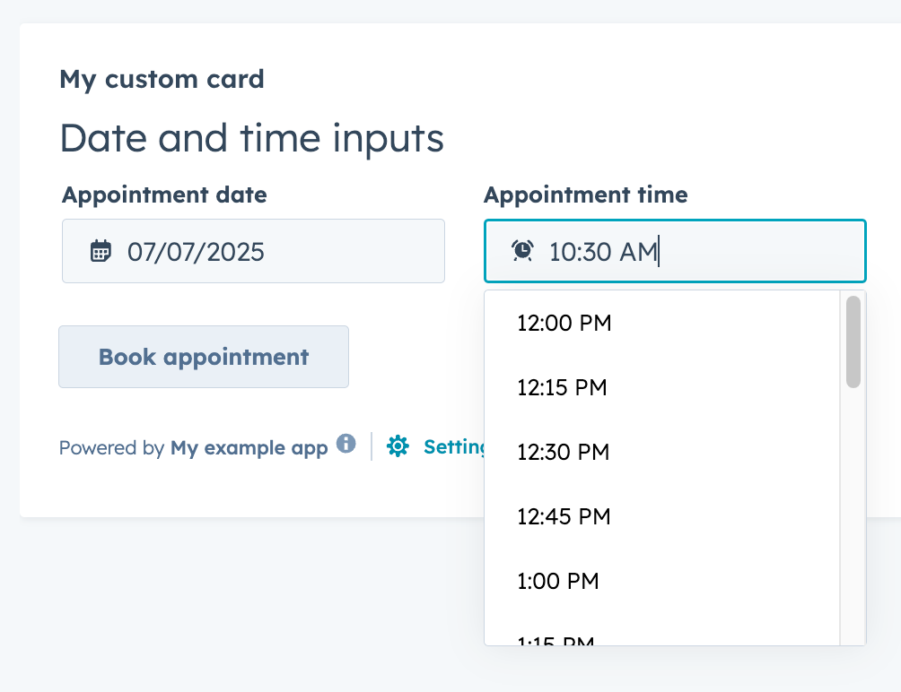
<Heading>Date and time inputs</Heading>
<Flex gap="medium" align="start" direction="column">
<Flex direction="row" justify="start" gap="medium">
<DateInput
value={selectedDate}
label={"Appointment date"}
name={"appointment-date-selection"}
min={dateRange.start}
max={dateRange.end}
onChange={value => {
console.log({ value });
setSelectedDate({ year: value.year, month: value.month, date: value.date });
setValidAppointmentTimes({ year: value.year, month: value.month, date: value.date });
}}
timezone="portalTz"
/>
<TimeInput
value={selectedTime}
label={"Appointment time"}
name={"appointment-time-selection"}
min={timeRange.start}
max={timeRange.end}
interval={15}
onChange={value => {
setSelectedTime(value);
}}
/>
</Flex>
<Button
onClick={() => {
console.log({ selectedDate, selectedTime });
}}
>
Book appointment
</Button>
</Flex>
</Form>
</>
);
}
Props
| Prop | Type | Description |
|---|
defaultValue | Object | The default time value. Uses the same format as the value field. |
description | String | Text that describes the field’s purpose. |
error | Boolean | When set to true, validationMessage is displayed as an error message if provided. The input will also render its error state to let the user know there’s an error. If left false (default), validationMessage is displayed as a success message. |
interval | Number | Sets the interval (in minutes) between the dropdown options. |
label | String | The text that displays above the input. |
max | Object | A Sets the latest valid time available. |
min | Object | Sets the earliest valid time available. |
name | String | The input’s unique identifier. |
onBlur | (value: TimeInputEventsPayload) => void | A function that is called and passes the value when the field loses focus. |
onChange | (checked: boolean, value: string) => void | A callback function that is invoked when the value is committed. Currently, this occurs on onBlur of the input and when the user submits the form. |
onFocus | (value: TimeInputEventsPayload) => void | A function that is called and passed the value when the field gets focused. |
readOnly | Boolean | When set to true, the input cannot be edited. |
required | Boolean | When set to true, displays a required field indicator. |
timezone | 'userTz' (default) | 'portalTz' | Sets the timezone that the component will use to calculate valid times.userTz (default): the user’s time zone.portalTz: the account’s default time zone.
|
tooltip | String | The text that displays in a tooltip next to the label. |
validationMessage | String | The text to display if the input has an error. |
value | Object | The value of the input. |