clearButtonLabel | String | Sets the label of the button that clears the date. |
defaultValue | Object | The default date value. Uses the same format as the value field. |
description | String | Text that describes the field’s purpose. |
error | Boolean | When set to true, validationMessage is displayed as an error message if provided. The input will also render its error state to let the user know there’s an error. If left false (default), validationMessage is displayed as a success message. |
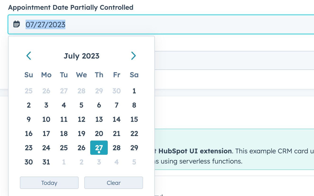
format | 'short' (default) | 'long' | 'medium' | 'standard' | 'YYYY-MM-DD' | L | LL | ll | The date format.short: 09/04/1986long: September 4, 1986medium: Sep 4, 1986standard: 1986-09-04YYYY-MM-DD: 1986-09-04L: 09/04/1986LL: September 4, 1986ll: Sep 4, 1986
|
label | String | The text that displays above the input. |
max | Object | A Sets the latest valid date available using the following format:{ year: number;``month: number;``date: number } |
maxValidationMessage | String | Sets the message that users will see when the hover over dates after the max date. |
min | Object | Sets the earliest valid date available using the following format:{ year: number;``month: number;``date: number } |
minValidationMessage | String | Sets the message that users will see when they hover over dates before the min date. |
name | String | The input’s unique identifier. |
onBlur | (value: DateInputEventsPayload) => void | A function that is called and passes the value when the field loses focus. |
onChange | (checked: boolean, value: string) => void | A callback function that is invoked when the value is committed. Currently, this occurs on onBlur of the input and when the user submits the form. |
onFocus | (value: DateInputEventsPayload) => void | A function that is called and passed the value when the field gets focused. |
readOnly | Boolean | When set to true, the checkbox cannot be selected. |
required | Boolean | When set to true, displays a required field indicator. |
timezone | 'userTz' (default) | 'portalTz' | Sets the timezone that the component will user to calculate valid dates.userTz (default): the user’s time zone.portalTz: the portal’s default time zone.
|
todayButtonLabel | String | Sets the label of the button that inserts today’s date. |
tooltip | String | The text that displays in a tooltip next to the label. |
validationMessage | String | The text to display if the input has an error. |
value | Object | The value of the input. Must include the year, month, and day:
{ year: number; month: number; date: number }year: the four-digit year (e.g., 2023).month: starting at 0, the number of the month (e.g., 0 = January, 11 = December).date: the number of the day (e.g., 1 = the first day of the month).
|