
This article was authored by a member of the HubSpot developer community, Jennifer Nixon.
When developing a HubSpot theme, it’s crucial to have a clear understanding of website design and layout, which is when Figma comes in handy.
Figma is a collaborative design tool that makes it simple to create wireframes and mockups –helpful in creating a cohesive design for your theme’s components.
Choosing the right software tool for your website mockup depends on your team’s preference, budget, and whether you’ll offer any of these design as part of your theme listing.
Due to its ease-of-use, accessibility, and interoperability, Figma is an excellent tool for designing a website theme. This article will cover three stages in the theme development process where you can use Figma.
- Using the HubSpot CMS Boilerplate to create the grid system for your theme design and conceptualize each component
- Creating low-fidelity wireframes as an initial outline to map out the custom components for your theme
- Creating high-fidelity mocks to showcase your different theme components for end-users
Getting Started with Figma
To start, head to Figma.com and click Get Started to sign up for a free account. A free account is limited to 3 files, but a single file can include multiple frames where you can create your theme’s components.
If you don’t have experience with Figma or other design tools, their help center is a great place to start.
Initial Design Phase: Outlining Your Theme’s Components in Figma
Just like you would use the HubSpot CMS Boilerplate as a starting point for your coded files when building a theme, you can also use the boilerplate live demo to create your initial design file in Figma.
Before creating outlines for your custom modules and page templates, it helps to establish a grid system so you have a foundation to design from.
If you don’t have a designer on your team, you can make quick work of this in Figma by capturing a screenshot of the boilerplate pages and adding them to frames in your file. During this initial stage, it helps to capture the desktop layout and one common mobile layout to plan accordingly for responsiveness.
Using a tool like Shottr for Mac or the Awesome Screenshot and Screen Recorder extension for Chrome is an easy way to take screenshots of the entire page (not just the portion that’s visible). To see this in action, check out the video below.
You can use the Chrome Developer Console to adjust the browser width to capture the mobile screenshot.
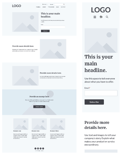
Previews of the HubSpot CMS Boilerplate live demo on desktop (left) and mobile (right).
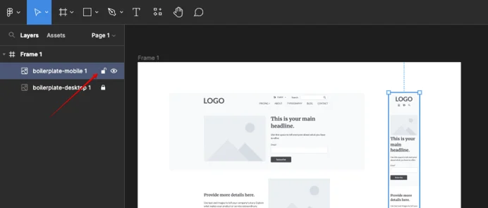
Locking a layer within Figma.
Once you’ve added the screenshots to the file, you can lock the layer to keep it in place while you recreate the objects in Figma.
It’s up to you how many pages from the boilerplate you want to create; this is simply a foundation you’ll build upon.
Trace over the screenshot to recreate each of the elements in the layout. This will be a combination of the Rectangle tool and the Text tool to apply basic colors and placeholder content to recreate the elements. For the image placeholder, save the image or a cropped screenshot to easily place it in your wireframes. To see this in action, check out the video below.
To speed up common elements, use this free wireframe kit from Figma.
Figma has a snap to grid feature that ensures everything is aligning properly. Either use a website template to quickly create a 12 column grid (the basis of the boilerplate), or create a grid layout based on your theme’s design criteria.
With the basic building blocks from the boilerplate and grid, you can now start mapping out custom modules and page templates for your theme.
Low Fidelity Wireframes: Designing Modules and Page Templates in Figma
One of the easiest ways to map out your modules is to create a low-fidelity wireframe to show the basic elements and their position, style, padding, etc. using grayscale components. Another Figma feature you can use to speed up this process is Auto Layouts.
The goal of your lo-fi wireframe is to create and outline a rough draft of your modules and templates to decide what will be included in your theme. You’ll also need to create the components for the header and footer layouts, especially if you’ll offer different variations.
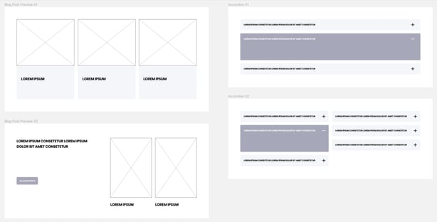
Figma wireframe examples from POWER Pro theme by maka Agency created during the concept phase of the theme development project.
High Fidelity Mockup: Creating a Resource for Designers
A high-fidelity wireframe looks like a screenshot of a website with all of the components represented in full-color images and elements.
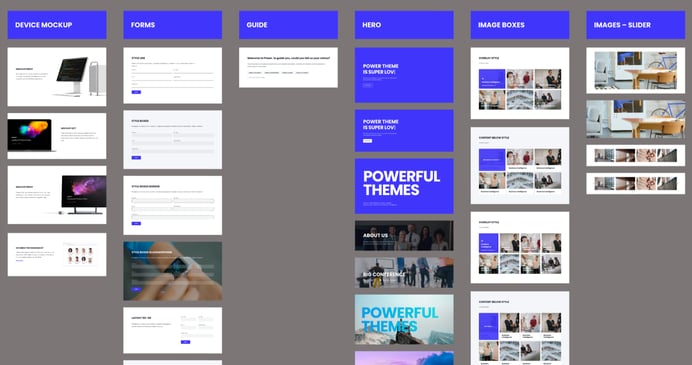
Figma hi-fi wireframe showing examples POWER Pro module layouts.
Where the lo-fi wireframe outlines basic structure, the hi-fi mockup helps to visualize details, like colors and branding, and will be easier to code from.
There are two primary use cases for theme developers to create a hi-fi mockup:
- To create a cohesive design language for developing the theme
- To provide a downloadable asset for designers to use when creating their own websites
If you’re only planning to use your hi-fi mocks as part of the design process, save time by focusing on the major elements that repeat rather than building out every single element of every single module and page template. While the end result may look similar, there are a few major considerations to take into account.
- Design System - creating theme settings in Figma using styles where the colors, fonts, etc. can be updated globally and apply to all modules and templates, leveraging components
- Naming Convention - just like you’ll want to have clear names in your coded files, it’s important that you label your layers and assets clearly
- Groups - for easy module-to-page transfer, all of the elements in the module should be grouped and organized
Happy Building
Using Figma throughout the theme development process will make your designs more cohesive and improve collaboration with your team. Once mocks are created, you can extend the use of Figma by adding interactivity with the prototyping feature to illustrate how the elements interact.
