
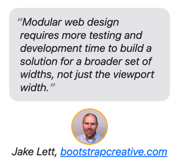
This article was authored by a member of the HubSpot developer community, Jake Lett.
The HubSpot website builder gives marketers and content creators a lot of control over the layout of their pages. Users can add pre-configured sections and modules into various grid structures and layouts. As a HubSpot developer, how can you build your modules to adapt to the array of column widths your modules could be inserted into?
In this article, I will introduce you to CSS container queries which are similar to media queries but instead of responding to the viewport size, they respond to a container you name and dimensions you specify.
The Problem This Helps to Solve
Imagine you have just built a module that is designed to be full width like a carousel slider, hero banner, etc. How would your module look if it was inserted into a very narrow column or duplicated on a page? Would the text wrap look awkward, images break the layout, or become extremely tall? You can never know, or control, where your module will be placed in a layout. So, you need to build your modules to “respond” to some of the possible scenarios.
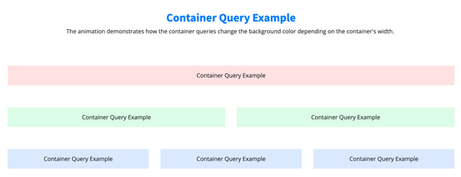
I created a demo page with a HubSpot module added to various column grid layouts. The module has container queries to change the background color depending on the container's width. As you can see in this example, a content editor can use your module in various configurations impacting how your module content is displayed.
Modular web design requires more testing and development time to build a solution for a broader set of widths, not just the viewport width.
How do your modules adapt to the worst-case scenario?
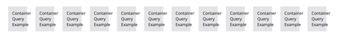
The example at the bottom of the demo page shows a worst-case scenario of a module being used in very narrow columns. The example container has the style property word-break: normal preventing words from breaking apart when the container is less wide than the word. This causes a design layout bug with the text extending the container's bounds.
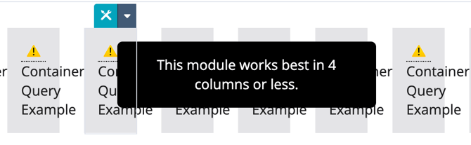
How should the module adapt to this scenario?
One idea is to use {% if is_in_editor %} to write some guidance visible only inside the editor. You could then display a tooltip if the container width is super narrow and if in the content editor.
Next, write some CSS to display the tooltip if the container width breaks the layout.
I know this is an extreme example but modular web design requires more testing and development time to build a solution for a broader set of widths, not just the viewport width.
How Container Queries Work
Do you remember going on long road trips and asking your parents, "are we there, yet?" over and over. Media and container queries do the same thing, continually asking the browser the question you specify. For example, ‘Is the card container 500px yet?’ ‘Is the viewport width 768px?’ Once the condition is met, your style is then applied to the document.
Ok, now let's walk through the steps of writing a container query.
First, specify what element is the container.
Add container-type:inline-size to your CSS ruleset.
Next, add a unique name.
Add container-name: "your unique name"; to your CSS ruleset. This name should be unique and easy to remember. In my examples, I have named my containers the same name as my class names. Think of these like you would an ID.
Shorthand example
There is also a shorthand version of this that makes it easier to read and write the style rule.
Create a Container Query.
Finally, create a container query using @container instead of @media and then the name of your container. In this case, card is our container name. We then want to increase the paragraph font size when the card is larger than 500px side. Below is the rule that would do that.
Use Case: Quotation List
To further demonstrate the concept, I created a code example of a list of quotations with the following design requirements:
- If a quote is featured change the width to 100% so it is more prominent
- If the quote list container width is < 500px (
@containerquery) make quotes one column and stack the profile image citation - If a quote item width is > 500px (
@containerquery) increase the font size and bold the text of every quote - If a quote item width is > 960px (
@containerquery) change the background color to light blue and increase the font size some more to make it visually different from the rest of the quotes - If the viewport window width < 500px (
@mediaquery) increase the font size to make it easier to read.
In this example, I want to visually change the style of quotes depending on their widths. I also created a class .testimonial__list-item--featured that allows me to make an important quote 100% wide to make it more prominent. You will notice on mobile I also stacked and centered the author profile images instead of horizontally aligning them on larger widths.
Additionally, the demo includes buttons to start and stop the animation so you can experiment with how the styles are being applied by adjusting the window width.
You could achieve most of this styling with media queries if you could guarantee the container width will always be the same width (like in the case of a full-width container). This becomes problematic when the module can be added to narrow columns changing container width; essentially breaking your media queries because they are based on the viewport width and not the container width.
Conclusion
Modular web design introduces new challenges for developers in how they plan and build modules to adapt to the various ways their module can be used. Container queries will be an essential tool in your arsenal to better achieve a balance between form and function.
If you are new to the idea of modular web design and would like to learn the benefits, and how it is different from page-level design, read my Modular Web Design Manifesto. It is a call to arms for embracing modules in your projects.
