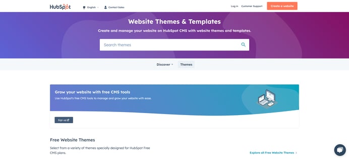
Creating a theme or a module in HubSpot’s template marketplace takes time, consideration, and planning. As a theme provider, you want to showcase and demonstrate the effort you have put into your work. It is important when filling out your listing information, one doesn't overpromise and underdeliver. Doing so can lead to eroded trust with the customer.
Customers will look to your listing to provide essential details to ensure they are making the right choice based on their needs. Optimizing your listing with images, video, client examples, content, and more will help give potential customers essential details to understand your theme. The following guide will help you use best practices when filling out a theme listing.
Section I: Your Listing Information
This is where you will name and categorize your theme so users can best find your listing.
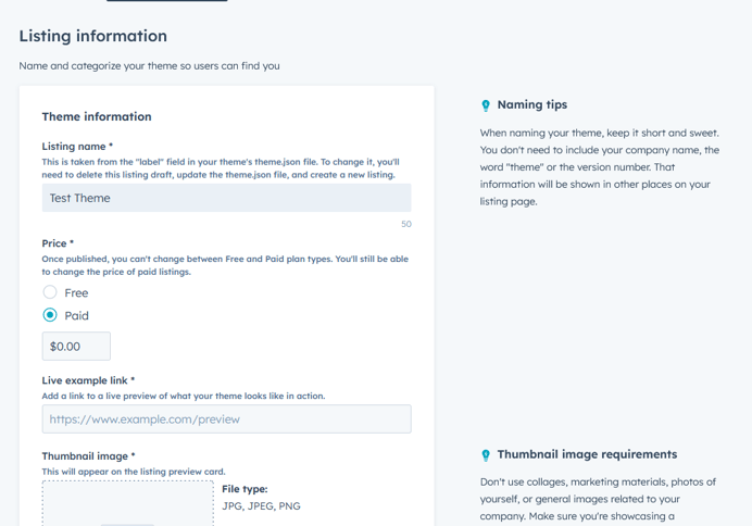
The listing information screen during the theme submission process.
Naming and Pricing
A theme name is an important part of the process. Any provider should set aside time to come up with an appropriate name. Your theme’s name should be a unique name, not too long, and really stands out. Here are some best practices for naming your theme:
- Do not use the words “theme” or “hub”
- Do not have a version number (the version number of the theme is located on your listing page)
- Do not name it after a business type in the marketplace listing name (business types can be found on the main listing page in the left-hand column at the top)
Once you have created a name for your theme, you will need to decide on a price point for your theme or if your theme will be available for free. Determining price is an important distinction; this choice is permanent and can not be changed once the theme is submitted. However, you will be able to make price adjustments to a paid theme, through an update, once published.
As a provider, you may find yourself in a scenario where you want to create a free version of your theme in the hopes a customer will try it and purchase a paid version. For this, you can suffix your theme with items like “Free, “Starter”, and “Pro”.
Live Example and Storefront Card
Your live example URL is a link, specifically a HTTPS link, to your demo site that must match as closely as possible to the theme. Make sure you have a demo navigation present within the template pages so a customer can see the full offerings of your theme.
The theme you submit will need a storefront card that will be displayed on HubSpot’s Template Marketplace main listing page. The storefront card should be an image that gives customers an initial insight into what your theme looks like before viewing your listing page. Take our customers’ word for it. Research has shown that the biggest thing a customer is looking for, when scrolling thememarketplace listings, is a storefront card that shows actual imagery from the theme. To help customers find what they’re looking for faster, we ask that a majority of the image (75% or more) depict the actual theme itself. Here are two examples of well-crafted storefront cards:
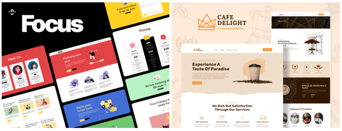
Focus by Stuff N Matters Inc. | Cafe Delight by MakeWebBetter
There should be as little marketing materials as possible (for example no photos of stock models) when a provider creates a storefront card. Please refrain from including the following in your storefront cards:
- Imagery of individuals (real or fictitious) posing, pointing, or holding items.
- Excessive marketing verbiage/slogans, text, or branding.
- Badges and/or banners containing information related to reviews and installs of your themes.
Section II: Theme Details
In this section of the listing process, you will get to tell the story of your theme and how the theme works through the use of video, imagery, and client examples.
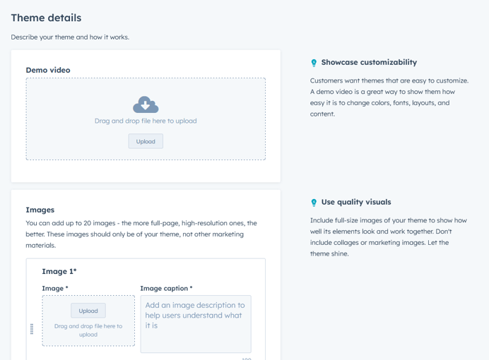
The theme details screen during the theme submission process.
Videos and Imagery
The newest version of the Template Marketplace introduced the ability to add a demo video, which will now show up in the first slot of a theme’s image slider. When it comes to the video itself, we recommend showing potential customers how easy it is to change colors, fonts, layouts, and content. Customers are often looking for themes that are easy to customize. The introduction of video in listings allows you to capture a potential customer’s attention faster with a 3-5 minute video that can express the ease of customization for your theme.
Additionally, your theme listing has the opportunity to display up to twenty images to better illustrate the capabilities of your theme. These images should be high-resolution, full-length screenshots of the pages and page templates a user can create using your theme. However, this is not the spot to include collages or marketing images. Make sure to also use captions to accurately describe your images; these will show up above the images in the ‘view all images’ modal.
Description, Features, and Client Examples
The theme description is where you can convey the features of your theme that make it unique. With only 10,000 characters available, we advise against using this space to mention how many pages and modules your theme contains. HubSpot automatically adds that information dynamically as part of the listing page. Summarize your theme's key selling points. Something important to note, if you do include hyperlinks in your description, make sure you check that they resolve to a live and correct URL before publishing.
The features section of the listing is the best spot to go into more detail about specific features with accompanying imagery. This is also the place to highlight the theme’s top features and functionality (which ideally have been alluded to in your description) that make it stand out above other listings. The images in this part of the listing can be more of a marketing nature.
Note: The following tips about client examples only apply to themes and are not available in the individual module listing flow.
The client examples in the listing are real-world examples. Mock-ups of potential implementations of a theme should not go in this section but rather be placed among the 20 images in the slider mentioned above. We ask that you make sure you have permission to include images of a client’s website in your listing before publishing on our marketplace.
Section III: Category
In this section, you will choose types and features that best categorize your theme for various filtering options within the Template Marketplace.
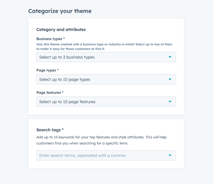
The theme categorization screen during the theme submission process.
Business Types, Page Types, and Page Features
You can select up to two business types to best categorize a theme listing. If a theme falls into more than two business types, you can list the rest of the relevant business types as search tags at the bottom of the category tab.
You can select up to ten page types and page features to further categorize a theme. If possible, it is best to select the full ten for each. Please refrain from selecting something that does not apply to your theme. For example, if a theme does not contain a slider, it would be misleading to list “slider” as a page feature.
Note: An individual module submission does not have business types, page types, or page features.
Instead, when submitting a module listing, you will define template types and categories. It is important to note that these are not defined within the listing but instead defined in the module editor of the design manager.
Search Tags
Search tags are up to fifteen keywords identifying your top features and style attributes that will best help customers find your theme when using specific search terms. These are the same search tags where you can list the other business types (beyond the two from the business types section) as mentioned above. There are a few best practices to follow when deciding on search tags.
Do not
- Use the word “theme” or “module”.
- Use the name of another provider.
- Use tags that do not reflect the theme being listed.
- Use the HubSpot name.
- Use more than 2-3 words.
- Use subjective language like “best” or “top rated”.
Section IV: Support
It is important for potential customers to know how they can contact you. In this section, avoid overpromising your support services. It is important to be honest and accurate with business hours and estimated response times.
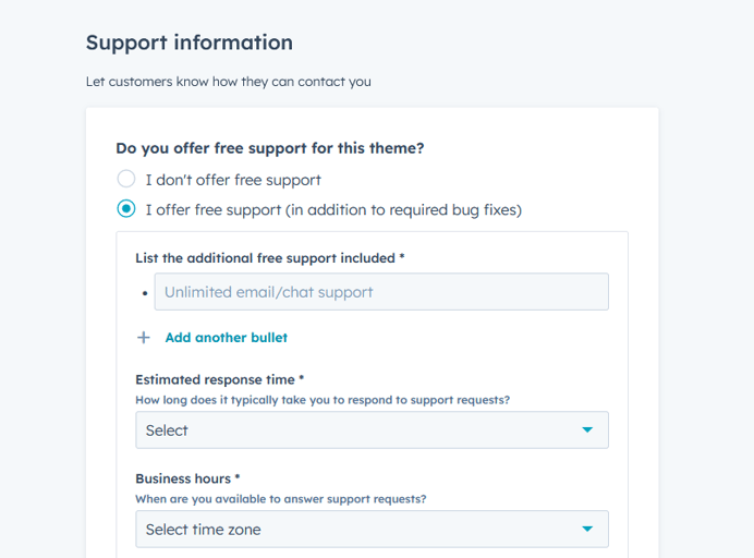
The support information screen during the theme submission process.
Support Offering
In this area of the support section, you can specify whether or not you provide free support. If free support is not provided, you will not be prompted with extra fields to fill out, but if you do offer free support, there are some extra fields to look at. Here is where honesty is the best policy.
For additional free support items, this is where you should add things like unlimited email support, but this is not the spot to put your support email address. Also, try and be specific with what is actually supported, for example:
- Free website consultation is available.
- Additional support hours can be purchased.
For provider response time, business hours, and support languages, we ask that you please provide only accurate information. For example, if you are only available on certain days of the week, do not choose every day as an option for customers to contact your support team.
Support Channels, Self-Service Resources, Terms of Service (TOS), and Privacy
For provider support channels (i.e. Live Chat or Facebook Messenger), make sure you are only listing what you or your team support directly.
For self-service resources, it’s important to note:
- Setup Documentation URL: No home page or contact page. This needs to be linked to documentation on how to use the theme in question.
- HubSpot Community Forum URL: This particular field could be used in the event you have previously created a forum post to a "Support" thread for your business. Also, you could link to your profile URL on the HubSpot forums or connect.com.
For the last part of the support section you are asked to provide links to the most up-to-date privacy policy and terms of service (TOS). You need to list your own Privacy and TOS links and not HubSpot's.
Last Step: Review and Submit
Now that you have this amazing theme listing all laid out, it is time to submit your theme to the Template Marketplace for review. You should take advantage of the ‘preview listing’ option before submitting for review. You can do so by clicking the “Preview Listing” button. You’ll then be able to view your listing as if you were a prospective customer in the template marketplace.
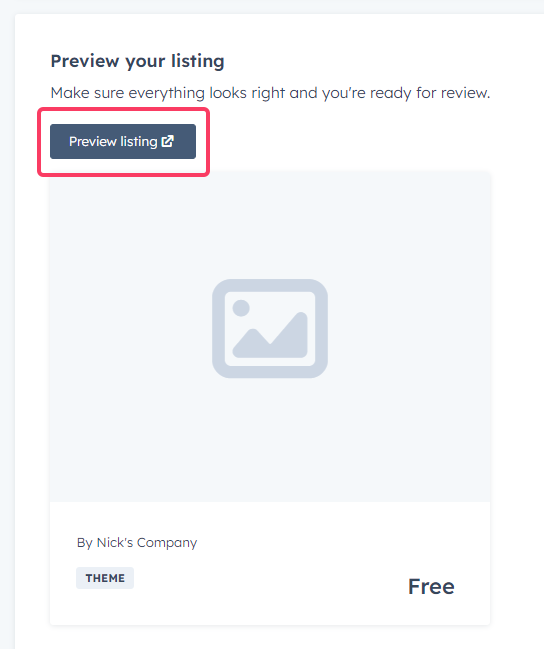
The preview listing button during the theme submission process.
Also, make sure to check out the HubSpot theme listing requirements, marketplace compliance, and branding guidelines for further best practices. The Ecosystem Quality Team will review listings in the order they were received and will follow up directly via email should any changes be required.
Bonus: Leverage HubSpot’s Resources
Have a technical question? Check out HubSpot CMS Developer Documentation or read how to get the most out of the HubSpot developer community. Want to know the latest development changes? Read the HubSpot Developer Changelog. We want your theme to be a success, so please reach out and ask for help.

