Your CMS Hub website is a presentation and interactivity layer for your CRM, meant for your prospects and customers to interact with. There's no greater example of this than that you can create a logged in experience for your customer, enabling 2 way communication, gating of special resources, and managing of your shared information. Tying your logged in experience to the experience your users see throughout the rest of your site helps your customers take advantage of the familiarity of design, and reduces the need to create special assets.
What ties your whole website together normally is your site's header and footer. This means your header and footer are a great way to tie both the logged-in and logged-out experiences together. You need your users to be able to navigate both the public and private parts of your website easily.
Logged out customers need:
- A way to log in.
- Access to the public pages on your site.
Logged in customers need:
- A way to log out.
- Manage their preferences/settings where relevant.
- Access to any private content you want them to be able to see.
- Access to the public pages on your site.
We're going to solve this by creating 3 Navigation menus. One for all of your publicly accessible content. One for when the user is logged out. One for when the user is logged in. We're then going to modify the HubSpot theme boilerplate's menu module to support, and display menus based on if the user is logged in or not.
Before we get into it, if videos are more your thing these instructions are available in video form from the HubSpot Essentials for Developers: Getting Started with Memberships training.
Prerequisites
What you'll need to be able to follow along:
Creating the menus
Your first menu, you likely already have. This is the public main navigation for your site. It probably has links like "About us", "Contact us", "Pricing", "Services". Regardless of which of the 3 menus you're creating the instructions are the same, the main difference is the links themselves.
- Open website settings > navigation.
- Click the name of the currently selected menu. This opens a dropdown showing all of the advanced menus in your site. Click "Add menu".
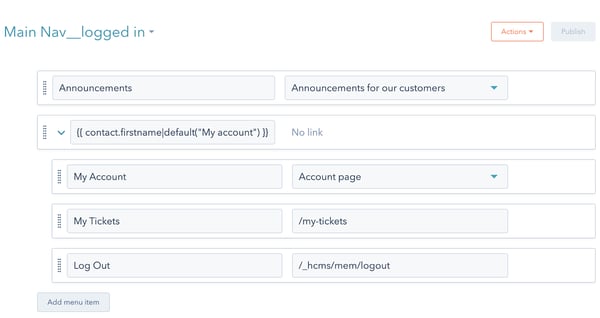
- Name your menu. I've named my 3 menus "Main Nav", " Main Nav__logged in", "Main Nav__logged out". You don't need to use those same names, but having names that are clear as to what they represent is important.
- Add your menu items. For your "Main Nav" menu those will be all of the publicly available pages. "Main Nav__logged in" will show nav items that are exclusive to logged in users, including a link to log out. "Main Nav__logged out" will show for users who are not logged in, commonly this would be a link to log in.
How to add a log in link to your menu
In your "Main Nav__logged out "
- Add a new menu item, choose "Add URL link".
- Set the label to "log in".
- Set the URL to
/_hcms/mem/login
- Add a new menu item, choose "Add URL link".
- Set the label to "log out".
- Set the URL to
/_hcms/mem/logout
How to add a Log out link to your menu
In your "Main Nav__logged in" menu you'll want to:
Modifying the menu module
We're going to modify the HubSpot Theme Boilerplate's menu module as it's a great starting point for a menu. First we'll add a field for turning on/off the menus for memberships. This is handy if you know you'll be adding the memberships functionality to your production site but are not yet ready for people to use it. We'll create a field group for the membership settings. Then we'll be adding menu fields to select our new menus.
Set up the module fields
1.Add a boolean field
This module may not always be used in a context where we want the menu to change based on being logged in. To retain that flexibility let's add a boolean field so the content creator can turn the feature on/off. We'll set the display of this field to toggle. The field controls a significant functional aspect of the module. Toggle in this case makes it more apparent.
View in GitHub.
[
{
"label": "Menu",
"name": "menu",
"type": "menu",
"default": "default"
},
{
"name": "display_membership_menus",
"label": "Display membership menus",
"required": false,
"locked": false,
"type": "boolean",
"help_text": "Display menus for logged in and logged out state",
"default": true
},
{
"label": "Max levels",
"name": "max_levels",
"type": "number",
"help_text": "Determines the number of menu tree children that can be expanded in the menu",
"display": "text",
"max": 3,
"min": 1,
"step": 1,
"required": true,
"default": 3
},
...
2.Add a field group for the memberships related settings
To keep things organized for the content creator we'll create a field group for these memberships features. We'll also use this group to hide the memberships features when they're not enabled.
View in GitHub.
...
{
"name": "display_membership_menus",
"label": "Display membership menus",
"required": false,
"locked": false,
"type": "boolean",
"help_text": "Display menus for logged in and logged out state",
"default": true
},
{
"name": "membership_menus",
"label": "Membership Menus",
"required": false,
"locked": false,
"type": "group",
"inline_help_text": "Links that will appear in the main navigation when logged in or logged out.",
"visibility": {
"operator": "EQUAL",
"controlling_field": "display_membership_menus",
"controlling_value_regex": "true"
},
"children": []
},
...
3.Add menu fields for the new menus.
We're going to add 2 new menu fields. You can get the menu ids to use as default values from the URL within advanced menus. https://app.hubspot.com/menus/<your_account_id>/edit/<menu_id>.
In my code snippets I'm leaving default off, since my menu id's will not match yours, but you just need to set the default value.
View in GitHub.
...
{
"name": "display_membership_menus",
"label": "Display membership menus",
"required": false,
"locked": false,
"type": "boolean",
"help_text": "Display menus for logged in and logged out state",
"default": true
},
{
"name": "membership_menus",
"label": "Membership Menus",
"required": false,
"locked": false,
"type": "group",
"inline_help_text": "Links that will appear in the main navigation when logged in or logged out.",
"visibility": {
"operator": "EQUAL",
"controlling_field": "display_membership_menus",
"controlling_value_regex": "true"
},
"children": [
{
"label": "Logged in Menu",
"name": "logged_in_menu",
"help_text":"This menu is displayed to the member if they are currently logged in.",
"type": "menu",
"default": "default"
},
{
"label": "Logged out Menu",
"name": "logged_out_menu",
"help_text":"This menu is displayed when not logged in. This menu will show for both non-members, and members who are logged out.",
"type": "menu",
"default": "default"
}
]
},
...
Add support for the fields to the module's HTML
We're going to modify the macro used to render nav menu items to enable us to re-use that code for our two new menu fields. We're then going to add a few if conditions to handle the different states for this menu. To finish it off we'll use HubL to render our new menus right in the main nav menu.
Update the menu_items macro to accept a menu_id
The macro already exists for rendering menu items, so all we need to do is make it so it gets the menu id from the macros parameters.
View on GitHub.
...
{% macro menu_items(menu_id) %}
{% set menu = menu(menu_id, "site_root").children %}
{% macro render_link_item(link, depth) %}
<li class="menu__item menu__item--depth-{{ depth }} {{ "menu__item--has-submenu" if link.children && depth < module.max_levels }} hs-skip-lang-url-rewrite">
{% if link.url %}
<a class="menu__link {{ "menu__link--toggle" if link.children && depth < module.max_levels }} {{ "menu__link--active-branch" if link.activeBranch }} {{ "menu__link--active-link" if link.activeNode }}" href="{{ link.url }}" {{ 'aria-haspopup="true" aria-expanded="false"' if link.children && depth < module.max_levels }} {{ 'aria-current="page"' if link.activeNode }} {{ 'target="_blank" rel="noopener"' if link.linkTarget }}>{{ link.label }}</a>
{% else %}
{% if link.children && depth < module.max_levels %}
<a class="menu__link menu__link--toggle" href="#" aria-haspopup="true" aria-expanded="false">{{ link.label }}</a>
{% else %}
<span class="menu__link">{{ link.label }}</span>
{% endif %}
{% endif %}
{% if link.children %}
{% if depth && depth < module.max_levels %}
<button class="menu__child-toggle no-button" aria-expanded="false">
<span class="show-for-sr">Show submenu for {{ link.label }}</span>
<span class="menu__child-toggle-icon"></span>
</button>
<ul class="menu__submenu menu__submenu--level-{{ depth + 1 }} no-list">
{% set depth = depth + 1 %}
{% for sublink in link.children %}
{{ render_link_item(sublink, depth) }}
{% endfor %}
</ul>
{% endif %}
{% endif %}
</li>
{% endmacro %}
...
Now when we use this macro we'll need to provide the menu id.
Add support for if membership menus are enabled.
Inside the nav element we'll add an if statement checking if the membership menus are enabled.
View on GitHub.
...
{# Desktop menu #}
<nav class="menu menu--desktop" aria-label="Main menu">
<ul class="menu__wrapper no-list">
{{ menu_items(module.menu) }}
{%- if module.display_membership_menus -%}
{%- endif -%}
</ul>
</nav>
{# Mobile menu #}
<nav class="menu menu--mobile" aria-label="Main menu">
<ul class="menu__wrapper no-list">
{{ menu_items(module.menu) }}
{%- if module.display_membership_menus -%}
{%- endif -%}
</ul>
...
Render the menus
Inside the if statement you just created, add two of the macro statements. Set the menu_id parameter for each to the module menu field.
...
{# Desktop menu #}
<nav class="menu menu--desktop" aria-label="Main menu">
<ul class="menu__wrapper no-list">
{{ menu_items(module.menu) }}
{%- if module.display_membership_menus -%}
{#- Memberships links -#}
{%- if request_contact.is_logged_in -%}
<!-- logged in -->
{{ menu_items(module.membership_menus.logged_in_menu) }}
{%- else -%}
<!-- logged out -->
{{ menu_items(module.membership_menus.logged_out_menu) }}
{%- endif -%}
{# End Memberships links #}
{%- endif -%}
</ul>
</nav>
{# Mobile menu #}
<nav class="menu menu--mobile" aria-label="Main menu">
<ul class="menu__wrapper no-list">
{{ menu_items(module.menu) }}
{%- if module.display_membership_menus -%}
{#- Memberships links -#}
{%- if request_contact.is_logged_in -%}
<!-- logged in -->
{{ menu_items(module.membership_menus.logged_in_menu) }}
{%- else -%}
<!-- logged out -->
{{ menu_items(module.membership_menus.logged_out_menu) }}
{%- endif -%}
{# End Memberships links #}
{%- endif -%}
</ul>
...
Final code
{# Module styles #}
{% require_css %}
<style>
{% scope_css %}
{# Menu items - top level #}
{% if module.styles.text.color.color %}
.menu__link {
color: {{ module.styles.text.color.color }};
}
.menu__child-toggle-icon {
border-top-color: {{ module.styles.text.color.color }};
}
.menu .menu__link:hover,
.menu .menu__link:focus {
color: {{ color_variant(module.styles.text.color.color, -40) }};
}
.menu__child-toggle-icon:hover,
.menu__child-toggle-icon:focus {
border-top-color: {{ color_variant(module.styles.text.color.color, -40) }};
}
.menu .menu__link:active {
color: {{ color_variant(module.styles.text.color.color, 40) }};
}
.menu__child-toggle-icon:active {
border-top-color: {{ color_variant(module.styles.text.color.color, 40) }};
}
.menu .menu__item--depth-1 > .menu__link--active-link:after {
background-color: {{ module.styles.text.color.color }};
}
{% endif %}
{# Menu items - submenus #}
.menu .menu__submenu {
{{ module.styles.drop_downs.border.border.css }}
{% if module.styles.drop_downs.background.color.color %}
background-color: rgba({{ module.styles.drop_downs.background.color.color|convert_rgb }}, {{ module.styles.drop_downs.background.color.opacity / 100 }});
{% endif %}
}
@media (min-width: 767px) {
.menu__submenu--level-2 > .menu__item:first-child:before {
{{ module.styles.drop_downs.border.border.css }}
{% if module.styles.drop_downs.background.color.color %}
background-color: rgba({{ module.styles.drop_downs.background.color.color|convert_rgb }}, {{ module.styles.drop_downs.background.color.opacity / 100 }});
{% endif %}
}
}
.menu__submenu .menu__link,
.menu__submenu .menu__link:hover,
.menu__submenu .menu__link:focus {
{% if module.styles.drop_downs.background.color.color %}
background-color: rgba({{ module.styles.drop_downs.background.color.color|convert_rgb }}, {{ module.styles.drop_downs.background.color.opacity / 100 }});
{% endif %}
{% if module.styles.drop_downs.text.color.color %}
color: {{ module.styles.drop_downs.text.color.color }};
{% endif %}
}
.menu__submenu .menu__child-toggle-icon,
.menu__submenu .menu__child-toggle-icon:hover,
.menu__submenu .menu__child-toggle-icon:focus {
{% if module.styles.drop_downs.text.color.color %}
border-top-color: {{ module.styles.drop_downs.text.color.color }};
{% endif %}
}
{% end_scope_css %}
</style>
{% end_require_css %}
{# Menu items #}
{% macro menu_items(menu_id) %}
{% set menu = menu(menu_id, "site_root").children %}
{% macro render_link_item(link, depth) %}
<li class="menu__item menu__item--depth-{{ depth }} {{ "menu__item--has-submenu" if link.children && depth < module.max_levels }} hs-skip-lang-url-rewrite">
{% if link.url %}
<a class="menu__link {{ "menu__link--toggle" if link.children && depth < module.max_levels }} {{ "menu__link--active-branch" if link.activeBranch }} {{ "menu__link--active-link" if link.activeNode }}" href="{{ link.url }}" {{ 'aria-haspopup="true" aria-expanded="false"' if link.children && depth < module.max_levels }} {{ 'aria-current="page"' if link.activeNode }} {{ 'target="_blank" rel="noopener"' if link.linkTarget }}>{{ link.label }}</a>
{% else %}
{% if link.children && depth < module.max_levels %}
<a class="menu__link menu__link--toggle" href="#" aria-haspopup="true" aria-expanded="false">{{ link.label }}</a>
{% else %}
<span class="menu__link">{{ link.label }}</span>
{% endif %}
{% endif %}
{% if link.children %}
{% if depth && depth < module.max_levels %}
<button class="menu__child-toggle no-button" aria-expanded="false">
<span class="show-for-sr">Show submenu for {{ link.label }}</span>
<span class="menu__child-toggle-icon"></span>
</button>
<ul class="menu__submenu menu__submenu--level-{{ depth + 1 }} no-list">
{% set depth = depth + 1 %}
{% for sublink in link.children %}
{{ render_link_item(sublink, depth) }}
{% endfor %}
</ul>
{% endif %}
{% endif %}
</li>
{% endmacro %}
{% for link in menu %}
{{ render_link_item(link, 1) }}
{% endfor %}
{% endmacro %}
{# Desktop menu #}
<nav class="menu menu--desktop" aria-label="Main menu">
<ul class="menu__wrapper no-list">
{{ menu_items(module.menu) }}
{%- if module.display_membership_menus -%}
{#- Memberships links -#}
{%- if request_contact.is_logged_in -%}
<!-- logged in -->
{{ menu_items(module.membership_menus.logged_in_menu) }}
{%- else -%}
<!-- logged out -->
{{ menu_items(module.membership_menus.logged_out_menu) }}
{%- endif -%}
{# End Memberships links #}
{%- endif -%}
</ul>
</nav>
{# Mobile menu #}
<nav class="menu menu--mobile" aria-label="Main menu">
<ul class="menu__wrapper no-list">
{{ menu_items(module.menu) }}
{%- if module.display_membership_menus -%}
{#- Memberships links -#}
{%- if request_contact.is_logged_in -%}
<!-- logged in -->
{{ menu_items(module.membership_menus.logged_in_menu) }}
{%- else -%}
<!-- logged out -->
{{ menu_items(module.membership_menus.logged_out_menu) }}
{%- endif -%}
{# End Memberships links #}
{%- endif -%}
</ul>
</nav>[
{
"label": "Menu",
"name": "menu",
"type": "menu",
"default": "default"
},
{
"name": "display_membership_menus",
"label": "Display membership menus",
"required": false,
"locked": false,
"type": "boolean",
"help_text": "Display menus for logged in and logged out state",
"default": true
},
{
"name": "membership_menus",
"label": "Membership Menus",
"required": false,
"locked": false,
"type": "group",
"inline_help_text": "Links that will appear in the main navigation when logged in or logged out.",
"visibility": {
"operator": "EQUAL",
"controlling_field": "display_membership_menus",
"controlling_value_regex": "true"
},
"children": [
{
"label": "Logged in Menu",
"name": "logged_in_menu",
"help_text":"This menu is displayed to the member if they are currently logged in.",
"type": "menu",
"default": "default"
},
{
"label": "Logged out Menu",
"name": "logged_out_menu",
"help_text":"This menu is displayed when not logged in. This menu will show for both non-members, and members who are logged out.",
"type": "menu",
"default": "default"
}
]
},
{
"label": "Max levels",
"name": "max_levels",
"type": "number",
"help_text": "Determines the number of menu tree children that can be expanded in the menu",
"display": "text",
"max": 3,
"min": 1,
"step": 1,
"required": true,
"default": 3
},
{
"label": "Styles",
"name": "styles",
"type": "group",
"tab": "STYLE",
"children": [
{
"label": "Text",
"name": "text",
"type": "group",
"children": [
{
"label": "Color",
"name": "color",
"type": "color",
"visibility": {
"hidden_subfields": {
"opacity": true
}
}
}
]
},
{
"label": "Drop downs",
"name": "drop_downs",
"type": "group",
"children": [
{
"label": "Text",
"name": "text",
"type": "group",
"children": [
{
"label": "Color",
"name": "color",
"type": "color",
"visibility": {
"hidden_subfields": {
"opacity": true
}
}
}
]
},
{
"label": "Background",
"name": "background",
"type": "group",
"children": [
{
"label": "Color",
"name": "color",
"type": "color"
}
]
},
{
"label": "Border",
"name": "border",
"type": "group",
"children": [
{
"label" : "Border",
"name" : "border",
"type" : "border"
}
]
}
]
}
]
}
]
Here's the full HTML + HubL for the module:
View on GitHub.
Here's the full fields json:
View on GitHub.
Now we have 2 different experiences depending on if the user is logged in or not. If you have pages that you only want to link to based on if the user is logged in or logged out, you now have that control.
Celebrate by adding some value to your memberships gated experience
You've now created an effective way to tie your logged in, and logged out experiences together. One of the profound benefits of this is, all of your existing site templates using this header are now usable for memberships templates because they contain the things that logged in users need easy access to.
