Properties used by all fields
All fields share a set of common properties. These are general fields, such as the field’s name or the help text that displays for content creators using the field in the module or theme.| Parameter | Type | Description | Default |
|---|---|---|---|
name | String | The field’s name, which you’ll reference when incorporating the field and its values in the module or theme. Cannot contain spaces or special characters. | richtext_field, date_field, etc. |
label | String | The text the content creator sees describing the field. May contain spaces. | Rich text field, Date field, etc. |
required | Boolean | Sets whether the field can be left blank in the editor. If true, content cannot be published without a value in the field. | false |
locked | Boolean | Sets whether the field is editable in the content editor. If true, the field will not appear in the content editor. | false |
type | String | The type of field. Field types are unique per field and can be found within the documentation for each field below. | |
inline_help_text | String | Text that displays inline below field’s label (limit 400 characters). Best used for information required to use the field. You can include the following HTML tags (other tags will be ignored on render): a, b, br, em, i, p, small, strong, span. | |
help_text | String | Text that displays in the editor within a tooltip on hover to assist the content creator (limit 300 characters). Best used for information that is supplementary but not required to use the field. You can include the following HTML tags (other tags will be ignored on render):a, b, br, em, i, p, small, strong, span. | |
id | String | The field’s unique ID, which is set by HubSpot. When building locally you do not need to specify this ID. | |
visibility | Array | Sets the field’s display conditions. For example, you can set a field to only display when another checkbox field has been selected. Learn more about visibility. | |
display_width | String | By default, fields are full-width in the editor. When two consecutive fields in the fields.json file are set to half_width, they will instead appear next to each other in the editor. | |
alias_mapping | Object | An alias for the field, which maps existing field values to a new location without breaking existing content. This can be helpful when needing to update a field that’s currently being used in live content, such as moving a field from the Content tab to the Styles tab. Learn more about alias mapping. |
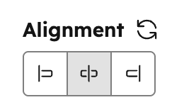
Alignment
Can be used in modules as a style field.
- JSON
- React
| Parameter | Type | Description | Default |
|---|---|---|---|
default | Object | Object containing horizontal_align and vertical_align:
| |
alignment_direction | String | Determines if only horizontal, only vertical, or both alignment controls should be shown. Can be:
| BOTH |
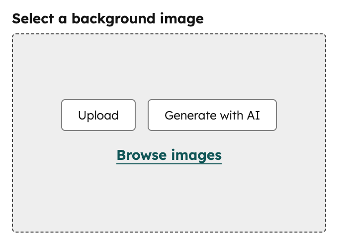
Background image
Can be used in modules as a style field.
.css property that returns CSS based on the field’s value. Learn more about the generated CSS property.
- JSON
- React
| Parameter | Type | Description | Default |
|---|---|---|---|
default | Object | Object containing the image src, background position and background size. | null |
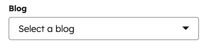
Blog
Can be used in modules.
- JSON
- React
| Parameter | Type | Description | Default |
|---|---|---|---|
default | ”default” / blog ID | Specifies which blog is selected by default. This parameter accepts arguments of either ‘default’ or a blog ID (available in the URL of the Blog dashboard). | null |
Boolean
Can be used in modules and themes as a style field.
true or false. Often it makes sense to make groups or fields conditional based on boolean fields. If you think you might need to provide more than two states in the future, a choice field may be a better option as you can grow into that with less effort should needs change later.
- JSON
- React
| Parameter | Type | Description | Default |
|---|---|---|---|
default | Boolean | Sets whether the default state of this field is true or false. | false |
display | String | Choose the visual display style for the field. Can appear as either a toggle or a checkbox. | checkbox |
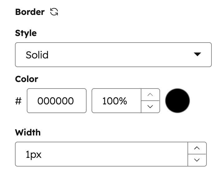
Border
Can be used in modules as a style field.
.css property that returns CSS based on the field’s value. Learn more about the generated CSS property.
- JSON
- React
| Parameter | Type | Description | Default |
|---|---|---|---|
default | Object | object with keys for border radius, top, bottom, left, and right sides. | {} |
allow_custom_border_sides | Boolean | When true, allows content creators to set borders on individual sides independently. | false |
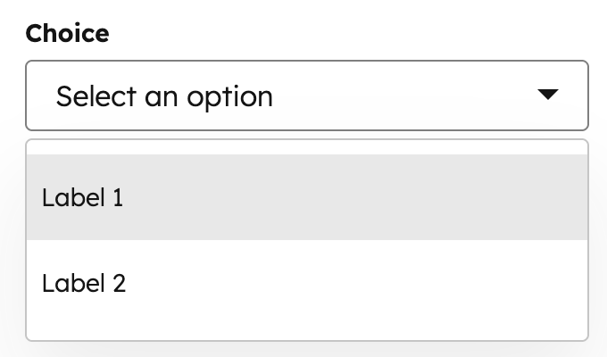
Choice
Can be used in modules and themes as a style field.
display property, you can set display the options in a dropdown menu, radio select, or checkboxes, or a range of buttons. Learn more about choice field display options below.
- JSON
- React
| Parameter | Type | Description | Default |
|---|---|---|---|
choices | Array | Array containing the selectable options, formatted as unique internal value followed by label. | [ [ "value 1", "Label 1" ], [ "value 2", "Label 2" ] ] |
default | Value | Sets the default selected value from the choice array. | |
multiple | Boolean | Optional field that enables multiple options to be selected when set to true. Set display to checkbox or select to configure whether the field displays as a list of checkboxes or a dropdown menu. | false |
display | String | Set the field’s appearance using one of the following values:
| "select" |
reordering_enabled | Boolean | When set to true, allows content creators to reorder the field’s options in the editor. To enable this, multiple must also be set to true. | false |
preset | String | Configures the button preset to use when display is set to buttons. For each preset, you’ll need to configure the choices labels to match a specific set of values. Learn more about these preset options below. |
Choice button presets
To configure a choice field to display buttons instead of a dropdown menu, checkboxes, or radio selects, you can use any of the presets below. Each preset allows for a specific set of option labels, which you’ll need to include in thechoices array. These labels cannot be customized.
- JSON
- React
| Preset | Choice labels | Example |
|---|---|---|
case | none | title | upper | lower | 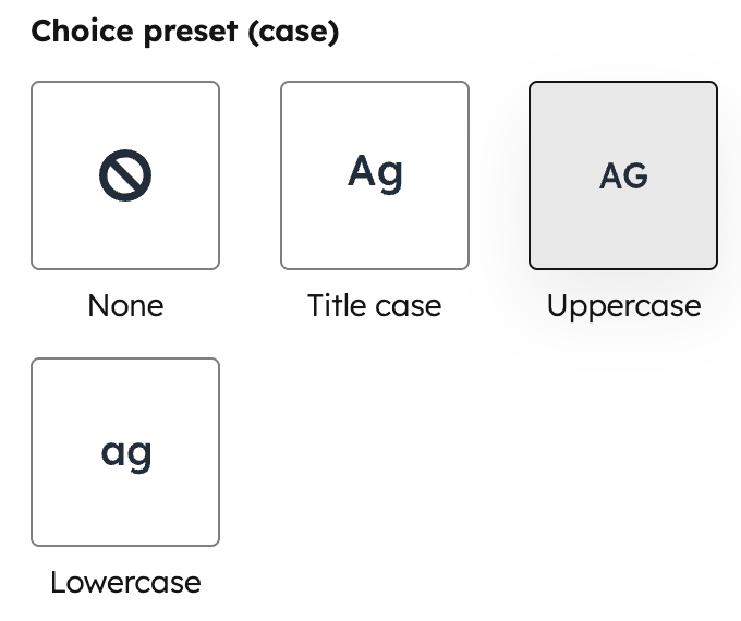 |
expand_icon | caret | plus | chevron | 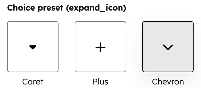 |
icon_background_shape | none | square | rounded | circle | 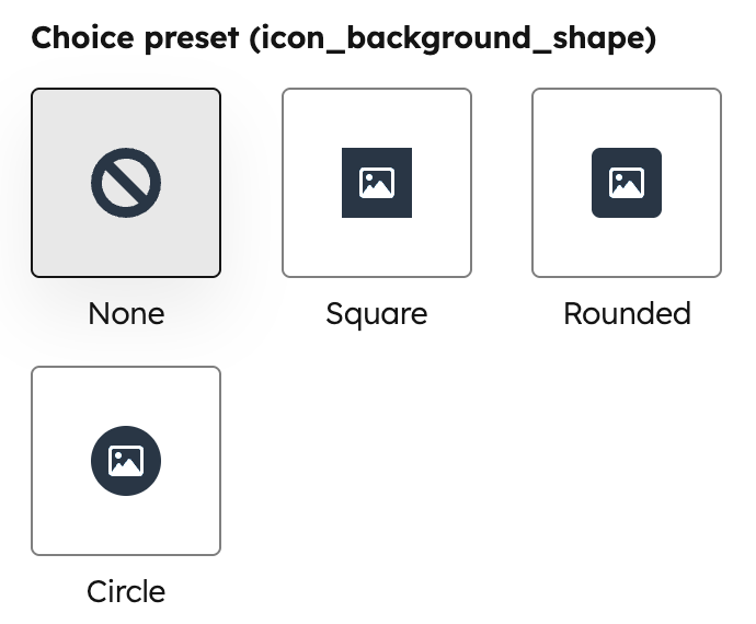 |
icon_size | small | medium | large |  |
layout | cards | tiles | minimal | 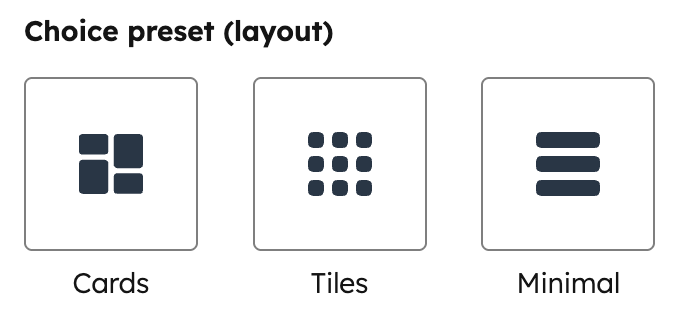 |
social_icon_background_shape | none | square | rounded | circle |  |
social_icon_size | small | medium | large | 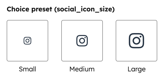 |
Color
Can be used in modules and themes as a style field.
show_opacity to true.
- JSON
- React
| Parameter | Type | Description | Default |
|---|---|---|---|
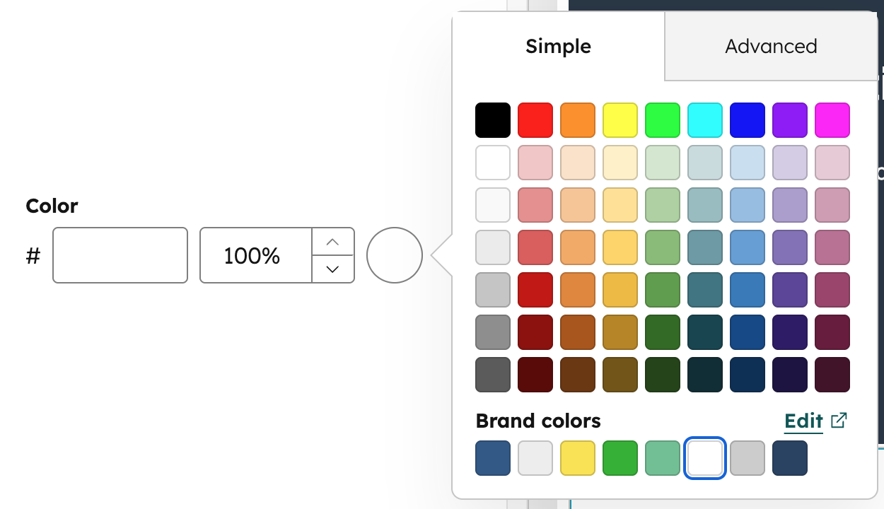
default | Object | Sets the default selected color and opacity. | { "color" : "#ffffff", "opacity" : 100 } |
show_opacity | Boolean | Sets whether opacity input is shown.
| undefined |
limited_options | Array | An array of strings that hides the default color grid and overrides the favorite colors list (the “Favorites” label becomes “Available colors”). Values in the array must be either a hex code or a color hex value at any inheritance path. | undefined |
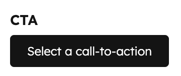
CTA
Can be used in modules.
- JSON
- React
| Parameter | Type | Description | Default |
|---|---|---|---|
default | String | The default selected CTA, specified by ID. CTA IDs can be found in the URL when editing a CTA in HubSpot. | null |
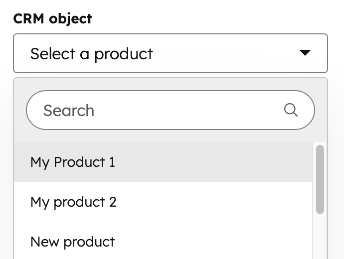
CRM object
Can be used in modules.
module.fieldname.properties returns the properties fetched from this object instance. This makes it so you don’t need to use the crm_object() function to get the data for the selected object instance.
module.fieldname.id returns the object instance ID.
- JSON
- React
| Parameter | Type | Description | Default |
|---|---|---|---|
object_type | String | Type of CRM Object the user can pick from. Supported CRM Object Types | |
properties_to_fetch | Array | Array of property names associated with the object type in string form (e.g., "hs_cost_of_goods_sold"). Use this to limit the information available to the page to just what you need. | |
default | Object | The ID of the default selected object instance (e.g., contact or company ID). | null |
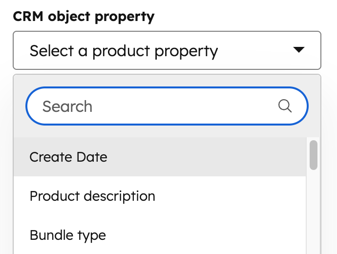
CRM object property
Can be used in modules.
- JSON
- React
| Parameter | Type | Description |
|---|---|---|
object_type | String | Type of CRM Object the user can pick from. Learn more about supported CRM object types. |
default | Object | Contains the default property to display. |
{{ module.fieldname.property }}: returns the property’s internal name.{{ module.fieldname.property_definition.label }}: returns the property’s label.{{ module.fieldname.property_definition.type }}: returns the property type (e.g., string).
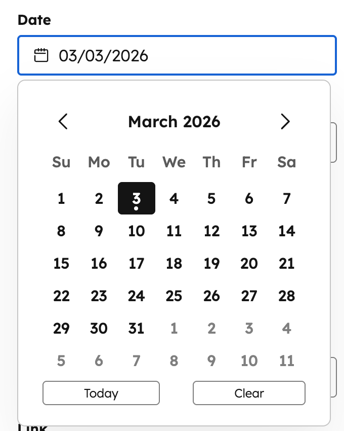
Date
Can be used in modules.
- JSON
- React
| Parameter | Type | Description | Default |
|---|---|---|---|
default | Timestamp | The Unix Epoch timestamp for the date and time you want to default to. Leave this null to allow the date and time picker to start the content creator at the current date and time in the picker. | null |
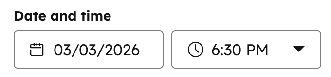
Date and time
Can be used in modules.
- JSON
- React
| Parameter | Type | Description | Default |
|---|---|---|---|
default | Timestamp | The Unix Epoch timestamp for the date and time you want to default to. Leave this null to allow the date and time picker to start the content creator at the current date and time in the picker. | null |
step | Number | The minute increment for the time picker (e.g., 15 shows options every 15 minutes). |
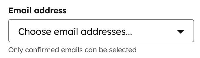
Email Address
Can be used in modules.
- JSON
- React
| Parameter | Type | Description | Default |
|---|---|---|---|
default | Array | Array of email address strings. | null |
allow_custom_email_addresses | Boolean | When set to false, users won’t be able to add custom email addresses. |
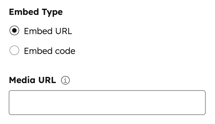
Embed
Can be used in modules.
- JSON
- React
| Parameter | Type | Description | Default |
|---|---|---|---|
supported_source_types | Array | Supported source types for either oEmbed URLs (oembed), HTML embed code (html), or Media Bridge (media_bridge). | ["oembed", "html"] |
supported_oembed_types | Array | Supported oEmbed type including "photo", "video", "link", and "rich". Does not apply to the supported_source_types of html | [ "photo", "video", "link", "rich" ] |
supported_media_bridge_providers | Array | Array of provider IDs that determine which Media Bridge providers are available to select content from.Note: This param will also be populated when installing a Media Bridge Provider Application. | |
resizable | Boolean | When set to false, users won’t be able to resize the embed in the editor. | true |
show_preview | Boolean | When set to false, the embed preview is hidden in the editor. | true |
type | String | This parameter is always set to "embed" | "embed" |
default | Dict | An array containing the "source_type" parameter. This parameter has one string based value from the options provided in the "supported_source_types" parameter. | oembed |
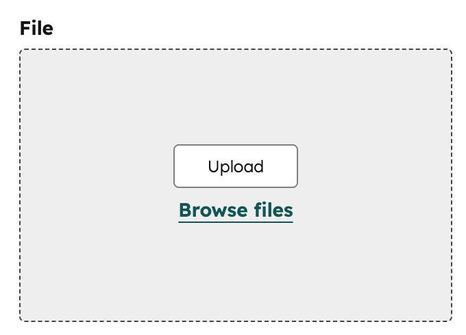
File
Can be used in modules.
- JSON
- React
| Parameter | Type | Description | Default |
|---|---|---|---|
default | String | File URL. | null |
picker | String | The type of files to display in the dropdown menu, sourced from the file manager or document manager, depending on the option. Can be one of: "file", "document", "image", "video", "audio". | file |
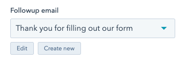
Followup email
Can be used in modules.
simple_email_campaign_id parameter.
- JSON
- React
| Parameter | Type | Description | Default |
|---|---|---|---|
default | String | Email ID | null |
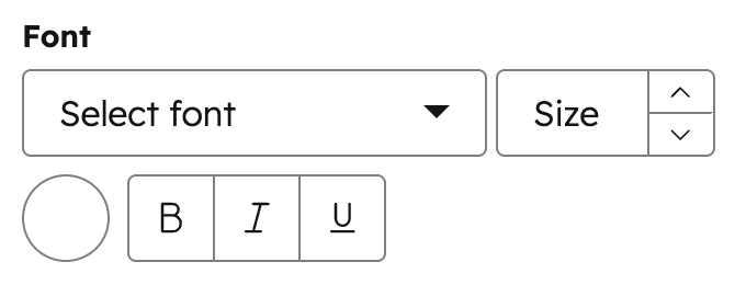
Font
Can be used in modules and themes as a style field.
- JSON
- React
| Parameter | Type | Description | Default |
|---|---|---|---|
default | Object | Font object with settings for size, sizing unit, color, and styles for bold, italic, and underline. | { "size" : 12, "size_unit" : "px", "color" : "#000", "styles" : { } } |
load_external_fonts | Boolean | HubSpot automatically loads the selected web font to the page if the font is selected and referenced by HubL in a stylesheet or in a module. Set this to false, if you are already loading the font to the page, that way the font won’t load twice. | true |
visibility | Object | Using the hidden_subfields nested object, you can set a boolean for which controls of the Font field to hide. Subfields include: font, size, bold, italic, underline, and color. | |
variant | String | If using a web font, the variant of the font you want to use. For example, to use the 700-weight version of a font, set this to "700". To use the 400-weight italic version of a font, set this to "400i". | |
limited_options | Array | Array of strings that overrides the list of all font options. Values in the array must be a hard-coded font name or a font name property at any inheritance path. For example theme.typography.body_text.name. | undefined |
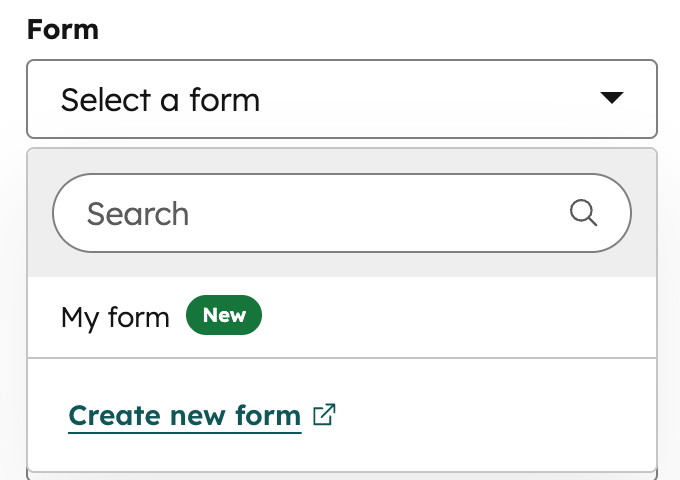
Form
Can be used in modules.
- JSON
- React
| Parameter | Type | Description |
|---|---|---|
default | Object | An object containing the form submission response details. Includes the following parameters:
|
disable_inline_form_editing | String | Set the disable_inline_form_editing property to true to hide all inline form editing controls in the form module. This includes the form fields, submit button text, data privacy and consent options, and CAPTCHA. |
required_property_types | Array | An array that specifies which forms can be selected based on the property types of the form fields. Values include: "CONTACT", "COMPANY", and "TICKET". |
support_all_webinar_types | Boolean | When set to true, the form will show a more generic webinar selector that enables selecting Microsoft Teams webinars in addition to GoToWebinar. The form field’s values will also change slightly to save webinar_id and webinar_source instead of gotowebinar_webinar_key. You’ll need to pass these more generic property values back into the Form tag alongside gotowebinar_webinar_key. |
embed_versions | Array | An array that specifies which forms can be selected based on the version of the form. Values include "v2" for legacy forms and "v4" for new editor forms. |
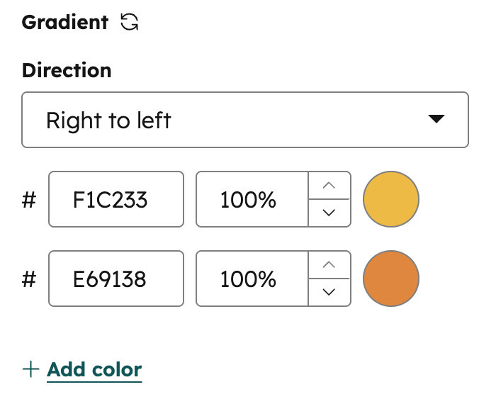
Gradient
Can be used in modules as a style field.
.css property that returns CSS based on the field’s value. Learn more about the generated CSS property.
- JSON
- React
| Parameter | Type | Description |
|---|---|---|
default | Object | Object containing side_or_corner and colors. |
colors | Array | Array of color stop objects. Each object contains a color object with r, g, b (0–255), and a (0–1) values. Supports up to 5 color stops. |
side_or_corner | Object | Determines the gradient direction. Contains optional horizontalSide ("LEFT" | "RIGHT") and verticalSide ("TOP" | "BOTTOM") properties. Omit either property for a purely horizontal or vertical gradient. |
HubDB Row
Can be used in modules.
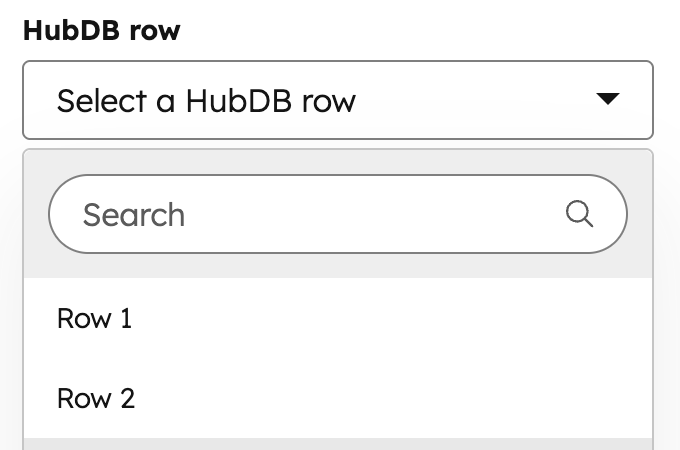
- JSON
- React
| Parameter | Type | Description | Default |
|---|---|---|---|
table_name_or_id | String | Number | The name or ID of the HubDB table. This field is required. | |
columns_to_fetch | Array | An array of column names to fetch from the table. If left blank, will return all columns in the table. | [] |
display_columns | Array | An array of column names to use in choice label. If left blank, will return only the first column in the table. | [] |
display_format | String | The format you would like the column data to display in the HubDB row selector using the percent symbol and number to designate a column. Ex: %0 (%1) would appear as Column0Value (Column1Value) | "" |
default | Object | Object containing “id” for setting the default hubdb row. | { "id" : null } |
HubDB Table
Can be used in modules.
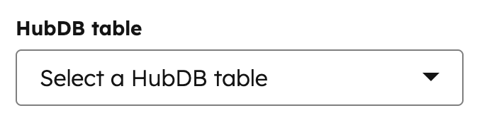
- JSON
- React
| Parameter | Type | Description | Default |
|---|---|---|---|
default | String | HubDB table ID | null |
Icon
Can be used in modules as a style field.
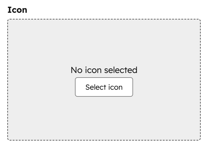
- JSON
- React
| Parameter | Type | Description | Default |
|---|---|---|---|
default | Object | The default icon to display. | |
icon_set | String | The FontAwesome icon set to use. Can be one of:
| fontawesome-5.0.10 |
Image
Can be used in modules as a style field. Only use image fields as style fields when the image is purely presentational and does not convey meaning. For background images, use the background image field instead.
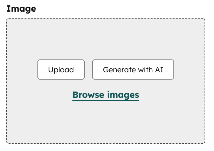
- JSON
- React
| Parameter | Type | Description | Default |
|---|---|---|---|
default | Object | Sets properties for image sizing, alt-text, and more. Can contain the following properties:
| { "size_type" : "auto", "src" : "", "alt" : null, "loading": "disabled" } |
responsive | Boolean | determines if the image is to act responsively or have a fixed height and width. | true |
resizable | Boolean | When set to false, users won’t be able to resize the image in the editor. | true |
show_loading | Boolean | Determines if the controls for choosing to lazy load the image are shown in the page editor. | false |
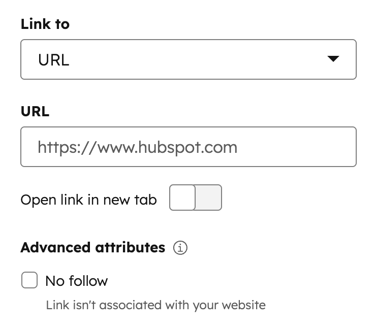
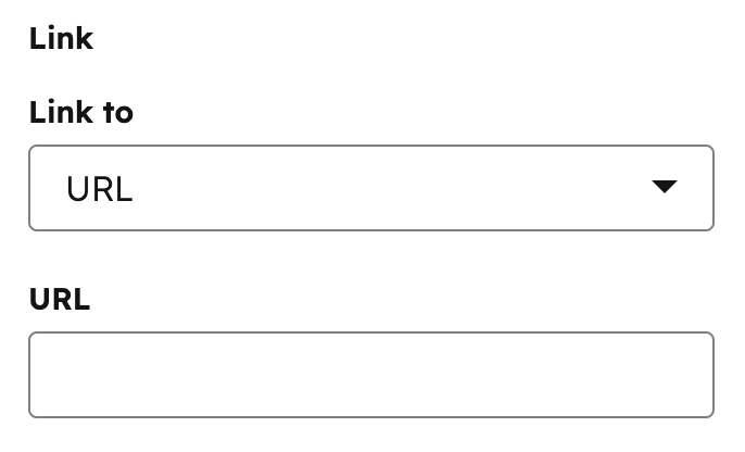
Link
Can be used in modules.
- JSON
- React
| Parameter | Type | Description | Default |
|---|---|---|---|
default | Object | The default URL and link open behavior. This object includes:
| { "url" : { "content_id" : null, "type" : "EXTERNAL", "href" : "" }, "open_in_new_tab" : false, "no_follow" : false, "sponsored" : false, "user_generated_content" : false } |
supported_types | Array | The types of links that content creators can select. Remove types from the list that you don’t want content creators to have access to set. Valid types include:
| [ "EXTERNAL", "CONTENT", "FILE", "EMAIL_ADDRESS", "BLOG", "CALL_TO_ACTION", "PHONE_NUMBER", "WHATSAPP_NUMBER", "PAYMENT" ] |
show_advanced_rel_options | Boolean | By default, content creators will only be able to select the no_follow option.When set to true, content creators can also select:
| false |
placeholder | String | Placeholder text shown in the link field when no value has been set. |
Logo
Can be used in modules.
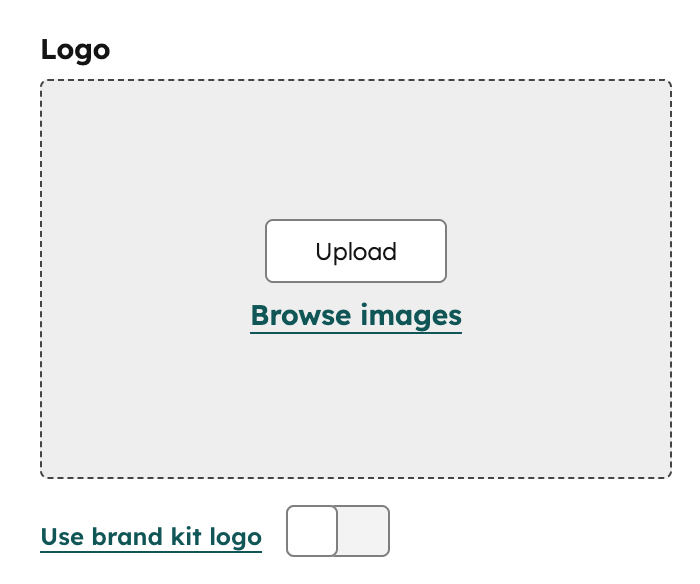
- JSON
- React
| Parameter | Type | Description | Default |
|---|---|---|---|
show_loading | Boolean | Determines if the controls for choosing to lazy load the image are shown in the page editor. | false |
default | Object | Logo object. If show_loading is set to true, you can include a loading property to set the image’s lazy loading options. Options include:
| { override_inherited_src: false, src: "", alt: null, width: null, height: null, loading: "disabled" suppress_company_name: false } |
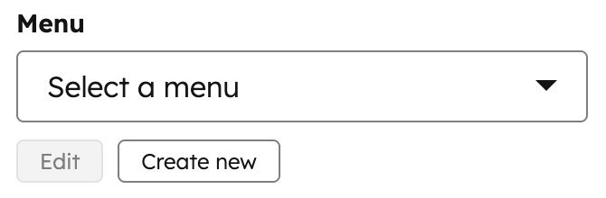
Menu
Can be used in modules.
- JSON
- React
| Parameter | Type | Description | Default |
|---|---|---|---|
default | Integer | The menu ID for the menu. The default value of null, defaults to the default menu under navigation. | null |
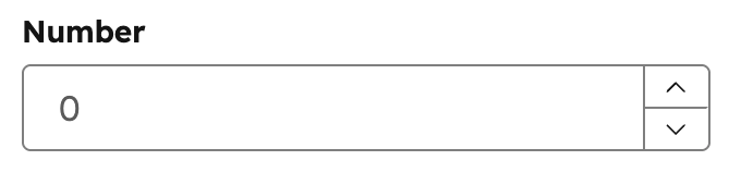
Number
Can be used in modules as a style field.
- JSON
- React
| Parameter | Type | Description | Default |
|---|---|---|---|
default | Number | A default number to be used. | null |
display | String | Controls the appearance of the number field in the editor. Accepted values: text (standard text input) or slider (a draggable slider control). | "text" |
min | Number | The minimum value allowed in the field. | |
max | Number | The maximum value allowed in the field. | |
step | Number | The increment amount when using the slider display or stepping controls. | |
prefix | String | Added as a prefix to the number field. | |
suffix | String | Added as a suffix to the number field. | |
placeholder | String | Adds a placeholder value to the field. |
Suffix and prefix parameters are for display purposes in the content editor and have no effect on the numerical value of the field.
Page
Can be used in modules.
- JSON
- React
| Parameter | Type | Description | Default |
|---|---|---|---|
default | Integer | A default page ID to be selected. | null |
Rich text
Can be used in modules.
- JSON
- React
| Parameter | Type | Description | Default |
|---|---|---|---|
default | String | string of content to be displayed supports HTML. Note: You cannot use the get_asset_url function within this default property. | "" |
enabled_features | Array | An array of items that allows you to configure the Rich Text Editor Toolbar and what options are available for content editors. |
Simple menu
Can be used in modules.
- JSON
- React
| Parameter | Type | Description | Default |
|---|---|---|---|
default | Array of objects | JSON structure for menu and menu children. | [] |
Spacing
Can be used in modules as a style field.
.css property that returns CSS based on the field’s value. Learn more about the generated CSS property.
- JSON
- React
| Parameter | Type | Description | Default |
|---|---|---|---|
default | Object | Sets the default spacing values.Contains padding and margin objects:
units to set the units that a content creator can use in HubSpot. Learn more about units below. | {} |
limits | Object | Sets the guidelines for min and max amount of spacing. Contains padding and margin objects:
units to set the units that a content creator can use in HubSpot. Learn more about units below. |
- You must include a
unitslist when setting aminormax. - The
unitsproperty supports the following unit types:%,ch,em,ex,in,lh,pc,pt,px,Q,rem,vh,vmax,vmin, andvw. - When a content creator edits all padding together, HubSpot will use the highest
minvalue and the lowestmaxvalue. In addition, only the units shared by all sides will be available to the content creator.
Tag
Can be used in modules.
- JSON
- React
| Parameter | Type | Description | Default |
|---|---|---|---|
default | String | The ID of the tag. | null |
tag_value | String | The output value. Can be one of:
| SLUG |
Text
Can be used in modules.
- JSON
- React
| Parameter | Type | Description | Default |
|---|---|---|---|
default | String | Text string. | "" |
validation_regex | String | A regex pattern used to validate the field value. If the value does not match the pattern, a validation error is shown in the editor. | "" |
allow_new_line | Boolean | When true, the text field expands to a textarea that supports multiple lines of input. | false |
show_emoji_picker | Boolean | When true, displays an emoji picker button in the field for content creators to insert emoji characters. | false |
Text Alignment
Can be used in modules as a style field.
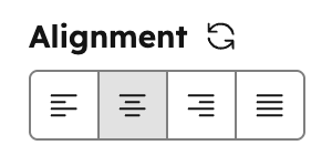
- JSON
- React
| Parameter | Type | Description | Default |
|---|---|---|---|
default | Object | Object containing text_align. | |
text_align | String | Determines the default alignment. Can be one of:
|
URL
Can be used in modules.
- JSON
- React
| Parameter | Type | Description | Default |
|---|---|---|---|
default | Object | URL object, with type, href and content ID (if content is a page or post on HubSpot) | { "content_id" : null, "href" : "", "type" : "EXTERNAL" } |
supported_types | Array | list of the types of links this field allows content creators to select. Remove types from the list that you don’t want content creators to have access to set. Types include:
| [ "EXTERNAL", "CONTENT", "FILE", "EMAIL_ADDRESS", "BLOG" ] |
Video
Can be used in modules.
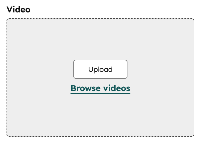
- JSON
- React
| Parameter | Type | Description | Default |
|---|---|---|---|
default | Object | Video object with settings, including:
| |
show_advanced_options | Boolean | Whether content creators can see advanced default options. | false |
conversion_asset object parameters:
| Parameter | Type | Description | Default |
|---|---|---|---|
type | String | The type of asset. Can be one of "FORM", "CTA", or "" | "" |
id | String | The ID of the Form or CTA type | "" |
position | String | Whether the conversion asset should be shown before the video starts or after it ends. Accepts either "PRE" or "POST". | "" |