
This article was authored by a member of the HubSpot developer community, Stuart Grant.
Discover how to build fast and modular HubSpot websites with Lit, Vite, and Storybook in this comprehensive guide.
Two years ago, I left my career building software in the pharmaceutical industry to start my own web solutions company, King Post Studio. I wanted to take almost a decade of professional software engineering experience and apply it to freelance website development. It would mark a return to what introduced me to programming, before I graduated high school, when PHP reigned (and according to many, still does). HubSpot was evangelized by my business associate at Razor Profiles LLC, with several clients in immediate need of enterprise solutions. As I became more familiar with HubSpot CMS development and the multitude of ways a theme can accrue technical debt and complexity, I knew there had to be a better way to manage and develop these themes.
The mission was clear – build snappy, elegant, and compelling HubSpot websites, with a modern stack, with as much extensibility and reusability of components as possible. The production bundle must be optimized for speed, with minimal dependencies managed through NPM. I wanted to use a library that supported reactive and modular development, but wouldn’t negatively impact SEO scores or performance. Libraries like React or Vue were options for more complex or stateful projects, but couldn’t guarantee good SEO results or optimal package size.
After experimenting with many approaches to HubSpot theme development, a client introduced me to Lit, a framework built on top of native web components. I felt the eureka moment brewing - this was the library I was looking for.
Lit and HubSpot was a match made in heaven, for several reasons:
- Lit provides a native way to develop components using JavaScript that are reactive, lightweight and modern. It is a modular library and development is similar to React and Vue, but is native to the browser and is SEO-friendly.
- Lit components pair well with HubSpot templates and modules because they can utilize slots to accept content from HubSpot’s CMS via HubL. This includes elements dependent on HubSpot scripts, like CTAs and forms.
- LitElement classes are highly extendable and customizable. A base component can be shared among many HubSpot themes, styled by either extending a new LitElement from the base class, or by CSS variables, or both.
- I can use Storybook, a UI toolkit, to develop the components rapidly and outside of the HubSpot feedback loop. I gain hot module replacement (HMR), and I can mock my HubSpot-rendered elements within my stories and yield the same results when deployed to production.
- With Vite, I can easily separate production-ready Lit components into multiple files to be managed by my HubSpot theme’s modules. Vite uses ESBuild to pre-bundle dependencies and is remarkably fast.
- Google maintains the Lit library and its associated tooling. It has excellent documentation and steady adoption, and updates are frequent and meaningful.
Before we get started, here is a list of links that will be referenced or are generally helpful for developing HubSpot themes with Lit.
Web Components Storybook Installation
Setting up a Lit-based HubSpot theme is straightforward - most of what you need is provided by Vite, Storybook and HubSpot out-of-the-box. The file structure below outlines everything you need to build themes with Lit - you can follow along with my HubSpot Starter repository.
There are two directories within a project, the component library and the HubSpot theme. The library uses Vite for accelerated development, the theme uses Webpack for the available HubSpot plugin and some tooling specific to deployment. You can refer to the READMEs for the lib and theme for more information on how to get started.
Here’s the breakdown: the dist folder contains your build output and will be consumed by the theme. The src folder is a collection of components, modules and the associated stories, plus some stylesheets to manage CSS variables. Next is the Storybook configuration folder, a package.json file and a vite.config.js file.
A quick note on setting up Storybook for Lit development - you can copy the configuration available in the shared repository, or you can use the following command to generate the necessary boilerplate:
Here is the vite.config.js configuration contents:
Note the lib.entry values: globals, components and hero-banner. These entries will provide our theme with all library contents, split up and optimized in size and purpose.
- The globals file contains all dependencies required to run the site. For this example, it provides all Lit imports that our components and modules use and assigns them to a global object.
- The components file is a collection of all base components needed for most pages. My example project includes a card, container and grid component, bundled together and available for use within any module or template.
- The hero-banner file is a module, meant to pair directly with a HubSpot module of the same name. Modules are bundled individually because of their potential size and complexity.
Let’s take a look at the globals.ts file:
This file makes it possible to generate our components and HubSpot modules without having to bundle Lit in every individual file that uses it. It includes all methods, classes and decorators used by the library - components can use window.Lit to access whatever they need to render properly. This guarantees that the main bundle and all HubSpot module.js files will be as small as possible.
Because we assign the Lit library to the window’s global object, it doesn’t have to be included in the components file or the individual modules. We will bring the file into the head of our HubSpot theme’s base layout.
Here’s a look at the library’s hero-banner.ts module:
The element is defined as the hubspot-hero-banner custom element. It has a wrapper class managed by the shadow DOM, an API that provides encapsulation for both markup and styles. The template has multiple slots for passing in content from the light DOM, a technique that integrates with HubL and content rendered by HubSpot, such as forms, CTAs, menus, rich text, and more. Because the slotted content is available at the initial load of the page, using slots wisely can maximize SEO benefit while providing a traditional framework for module development.
Styling Lit components can be tricky because of scoped styles, meaning that HTML elements provided in the component’s template can only be styled by CSS included with the component. One way to apply theme-specific styling within Lit elements is to use CSS custom properties (commonly referred to as CSS variables), which are inherited and applied from the root stylesheet. In the Hero Banner example, the .wrapper class’s CSS is scoped by the shadow DOM, but can be customized by CSS variables. Styling slotted content can be done normally.
The HubSpot theme for my projects is bundled and deployed via Webpack. Below is the webpack.config.js:
Here are the key details of the configuration:
- I use the HubSpot CMS Plugin to seamlessly integrate the theme’s deployment into my Webpack build process.
- I use esbuild-loader to drastically reduce build times over other plugins, such as ts-loader. This is a must-have for modern Webpack development.
- HubSpot
module.jsfiles act as individual entries separate from the main bundle and can directly accept their related library module.
The last detail is most important - the theme is strongest as an integration layer for the HubSpot CMS, not as the functional layer. It should focus on managing CMS content via HubL templating, not necessarily on scripting or styling modules, though there are exceptions. We’ll talk more about this in a moment, but first, let’s examine the main.ts file located in the theme’s JS directory:
The main.ts file will manage all globals, setting up Lit on the window object to be used by all components. It also imports our library’s base components file. Lastly, it manages the light DOM styles and CSS variables by importing the styles.css file. The Webpack configuration is set up to bundle and output one file for all included JavaScript, and another for all included CSS. These two files will be imported into the head of our HTML templates, like so:
In order to make Lit and your components immediately available after the initial load of your web pages, the bundled main.js code must be available at the head of the page structure, and it must be loaded synchronously. This improves web component load times and reduces layout shift and content flashing, which can negatively impact website performance and Lighthouse scores.
Now, take a look at this module.ts file for the Hero Banner module:
And the module.html:
The Webpack configuration recognizes the module.ts file as an entry point, bundling the imported library module into the HubSpot module. The template passes in the user’s content via slots - as mentioned above, slotting works for HubSpot forms, CTAs, menus, rich text, HubDB data, and more. In the example above, each slotted element will inherit styles that are available globally because they are part of the light DOM.
One adjustment must be made to the module’s meta.json:
Just like the main.js file, the component code must be available at the head of the page structure, and it must be loaded synchronously by setting the async property value to false.
I spend most of my time building components and modules in Storybook. If I am working closely with a client, I often deploy an interactive Storybook build and provide them with something to review.
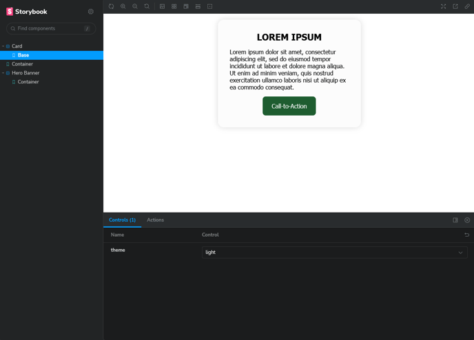
The image above is the typical output of a basic Storybook development environment. If an element has custom properties, such as a light/dark mode, built-in controls are available to make these components more interactive. Everything is built with HubSpot fields in mind - always consider how these modules and components will coordinate with HubL within the HubSpot CMS.
When I want to test a component in HubSpot, I can run Vite’s build –watch command concurrently with my theme’s Webpack process to rapidly prototype content-heavy modules and templates.
Here’s a look at the scripts within my HubSpot theme’s package.json:
The scripts listed above coincide with the aforementioned Webpack configuration. Any time a change is made in the project’s library, Vite will recreate the library’s dist output, and Webpack will run and deploy those changes to the HubSpot theme. Production deployment is as simple as using the HubSpot CLI’s upload command and pointing the dist to the appropriately named theme - in the example, it’s named LitTheme2023.
With this project structure, I spend the majority of my time developing the library’s components and modules in Storybook. There are an increasing number of projects where I complete component and module development without touching the HubSpot theme, leaving fields and HubL templating for last. When it’s time to wire the library to the theme, I run the two build processes concurrently, with the library listening for changes to the code and the theme publishing those changes to the HubSpot account. If you use the Design Manager’s preview feature, you can see module updates in real-time with mocked field data. I’ve included some helpful scripts for both the library and theme in the project’s package.json files.
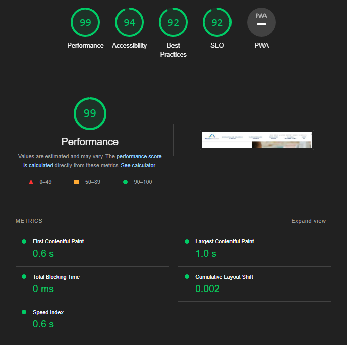
If HubSpot content is managed and optimized well in your templates, you can achieve delightful results from this workflow. Lighthouse scores don’t tell the whole story, but they are meaningful and act as a guide for what is reasonable to expect from a modern website. I’ve seen increased scores for all of my HubSpot websites since developing this process.
I’ve worked with dozens of HubSpot themes that have similar needs and processes, similar templates and modules. Sometimes, you’ll end up building things that should be shared with all projects, not just one. Building a white-label component library for import into theme-specific libraries is fairly simple, and it mirrors the same project structure as the one provided in the repository. I have my own private collection of components, modules, and mixins that I pull into projects, speeding up the development cycle significantly and allowing for continuous iteration and improvement.
While not included in the repository, the HubSpot starter theme I built can easily support CSS preprocessors or tools like TailwindCSS. My go-to for working with Lit is PostCSS, enhancing my CSS development process with whatever plugins I need, without incurring the bloat of a more opinionated library.
I hope this proves to be a useful strategy for creating clean, quick, modern HubSpot themes. I intend to continue refining and building upon my starter theme, so follow along and offer a star if interested. You can also follow me on my personal GitHub or LinkedIn - I’m available to answer questions or consult with you on a project.
