
This guide is intended for marketers who want to gain a basic understanding of HTML coding and how they can apply this knowledge when using HubSpot’s CMS Hub. We’ll review things you should establish before you begin your journey, areas where you can add code, the basics of HTML (HyperText Markup Language) and CSS (Cascading Style Sheet), and some more commonly used HubL variables, filters, and functions. After, we will step through the creation of a basic module that utilizes what we learn. Grab a cup of coffee or other preferred beverage and let’s dive in!
Design/branding standards
As a marketer, the company you work for may already have branding guidelines that help inform how content should look and feel. If not, we recommend creating some basic guidelines that can help establish branding consistency. If you want to learn more about building brand guidelines, we highly recommend checking out our Foundations: Building Brand Guidelines and Consistency course on our academy. There are also many tools available for managing your branding guidelines and if your company already utilizes one of those tools make sure to review your guidelines. If not, we recommend looking into a service like Figma for creating and maintaining your branding guidelines. If you are looking for inspiration to get started, check out our article on HubSpot's marketing blog for some examples of brand style guides.
The development workflow
Before you begin writing code, it's important to take a look at what is called your 'development workflow'. The term 'development workflow' may sound overly technical and complicated (especially if you are not a developer) but fear not, it's simply a way of saying the following:
- What will you use to write your code?
- How will we make sure our code works?
- How will we publish our code?
- What can we use to make sure we have a version history of the code we write?
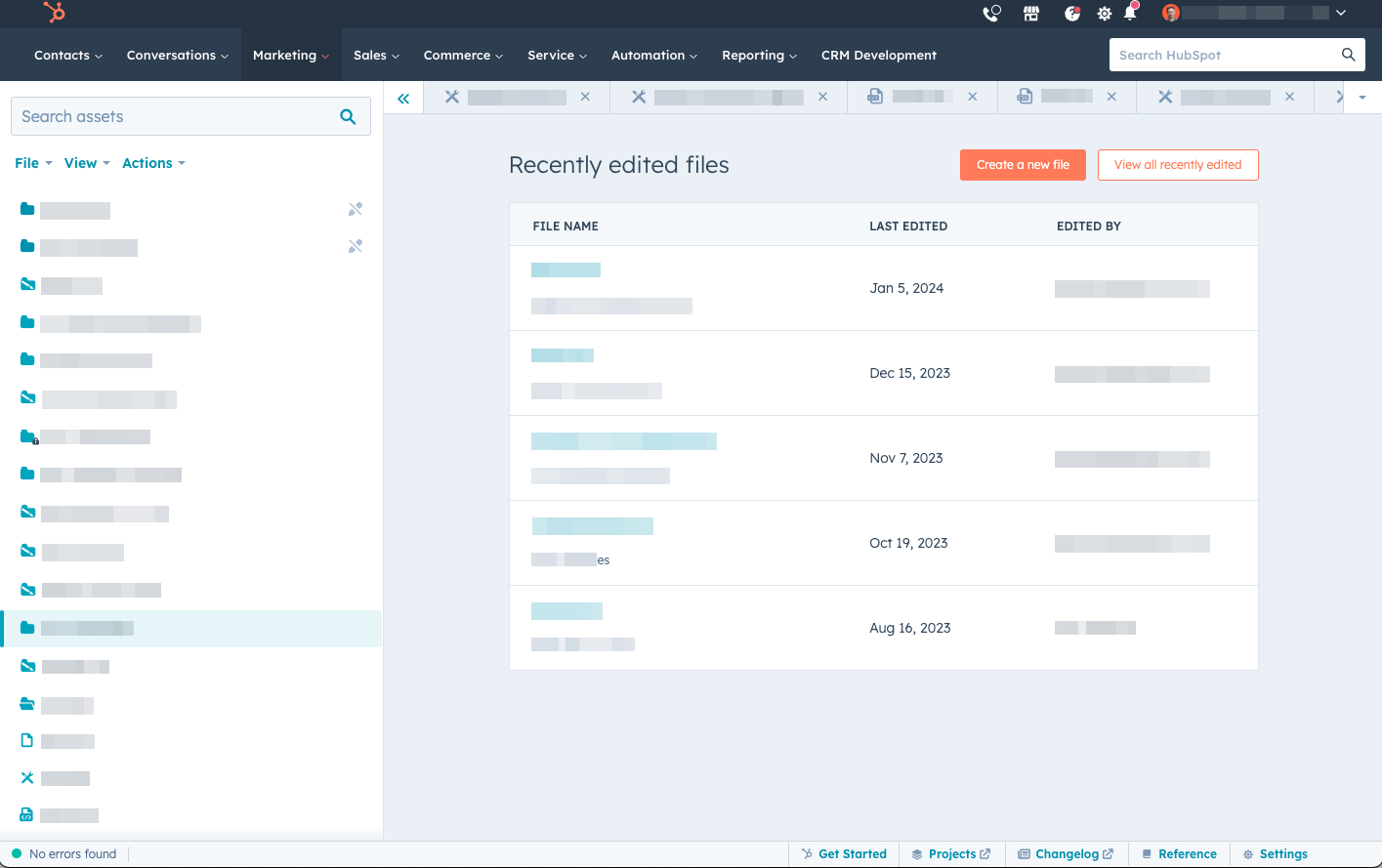
Answering these questions will help ensure a smoother, more effective setup when working with code. Now, those four questions above might seem like a lot to undertake but with HubSpot, we have you covered! HubSpot's Design Manager offers all you need to get started in your coding journey on CMS Hub. With our Design Manager, you can edit, preview, and publish your code. Our Design Manager also offers version history that saves your changes along the way allowing you to restore previous versions if the need arises. There are some additional areas within HubSpot aside from the Design Manager where you can add code and we'll cover all of those, including the Design Manager, in the next section.
Note: If you have a dedicated team of designers and developers, we highly recommend that you have a lunch and learn with them to stay up-to-date on current workflows and ensure that the code you add will not cause problems later on. It's also an excellent opportunity to learn from each other and share ideas. The last thing you want to do is spend time working on code changes only to have it overridden later on due to existing developer workflows. I say this from personal experience and early learnings when I started coding.
HubSpot’s Design Manager
The Design Manager, as we talked about earlier, is an in-app tool that allows you to view, edit, and publish templates, themes, and modules within HubSpot that can later be used for content such as emails, website pages, and landing pages.
Local Development and the HubSpot CLI
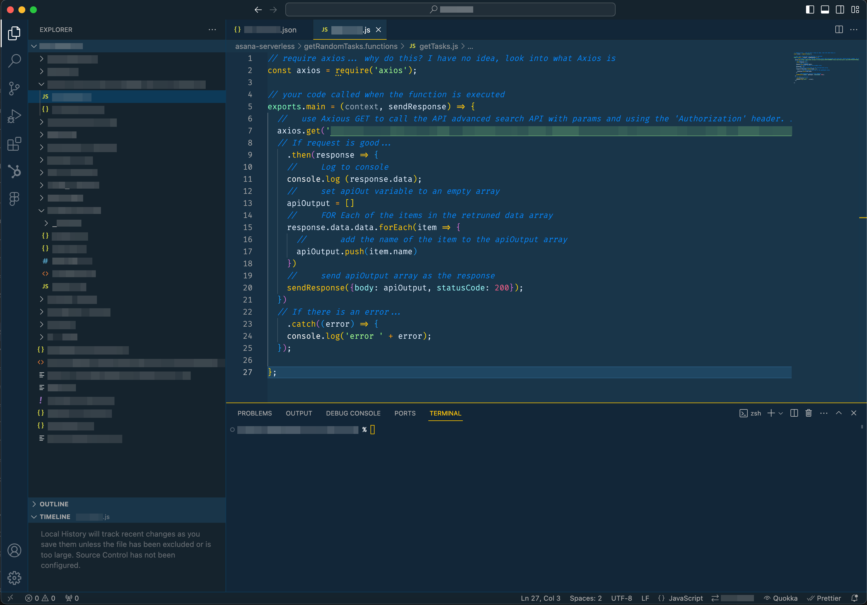
If you are like me, a marketer turned developer, or you have more technical skills, HubSpot does offer a CLI along with an official HubSpot VS Code Extension for Visual Studio Code to help streamline local development.
Website page and blog post editors settings tab
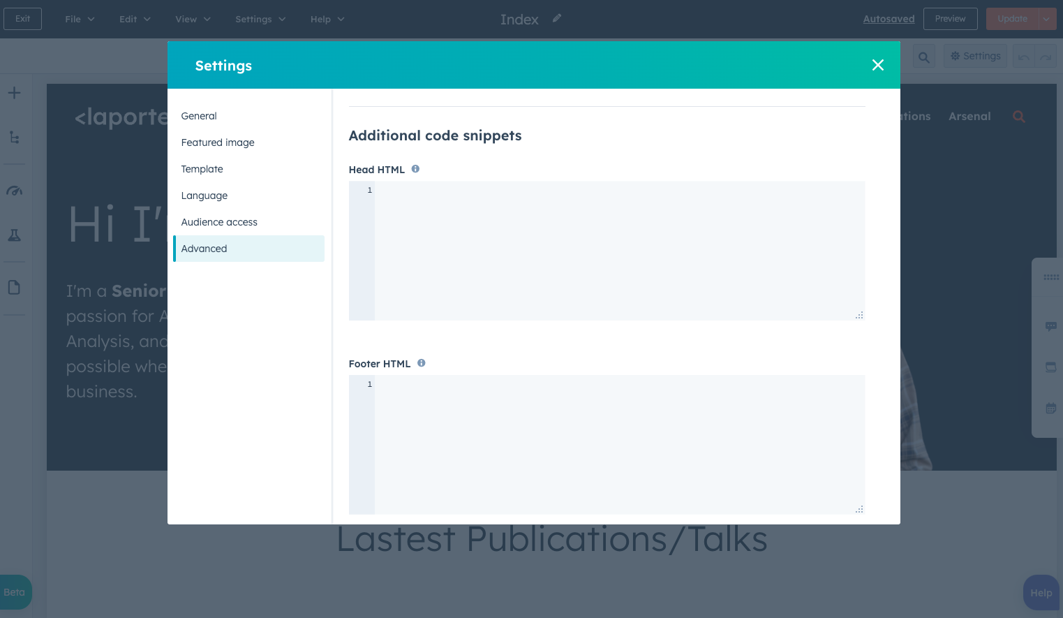
On every website and landing page, under the Settings tab in the Advanced Options section, there are two areas to enter code. This code will only be added to the specific page (or post) that you are editing.
- Header HTML: Raw HTML snippets, embed codes, or tracking JavaScript that will be added within the
<head>tag on the page. - Footer HTML: Raw HTML snippets, embed codes, or tracking JavaScript that will be added right before the
</body>tag on the page.
For blog posts, there is only a spot for adding code to the Head HTML within the settings tab. If you are unfamiliar with what <head> and </body> are, don’t worry, we will be covering these later on in the article.
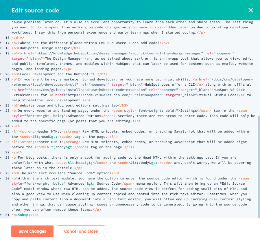
The Rich Text module’s “Source Code” option
Within the rich text module, you have the option to enter the source code editor which is found under the Advanced > Source Code menu option. This will then bring up an “Edit Source Code” modal window where raw HTML can be added. The source code view is perfect for adding small bits of HTML and also a good view to use when cleaning up content copied and pasted into the rich text editor. Sometimes, when you copy and paste content from a document into a rich text editor, you will often end up carrying over certain styling and other things that can cause styling issues or unnecessary code to be generated. By going into the source code view, you can often remove these items.
Website Settings
Within your website settings area, which can be accessed by clicking the cog wheel then navigating to Website > Pages > Templates tab, there is an HTML section that includes areas for Site header HTML and Site footer HTML where you can add code that will be applied across all of your pages (website, blog, and landing) on your website. This area is perfect for additional tracking scripts in which HubSpot does not have a native integration. HubSpot offers native integrations for:
- Google Analytics 3*
- Google Analytics 4
- Google Tag Manager
- AdRoll
*Starting July 1, 2023, Google is replacing Universal Analytics with Google Analytics 4. To avoid losing data synced to HubSpot, you'll need to switch to Google Analytics 4 prior to the change.
Now that we know all the areas where we can add code, let’s jump into some code.
If you are looking for a quick reference that you can download and keep handy, here's a great beginner’s guide to HTML and CSS for Marketers. We’ll review most of the content that is in there along with a few others. Let’s start out by learning the anatomy of HTML Elements.
HTML Elements are aspects of a webpage that contain data or content within your site. This is not to be confused with HTML Tags which are used to create HTML elements. Here's an example from the linked page about Elements to illustrate the anatomy of an HTML Element.
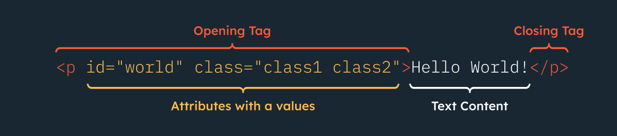
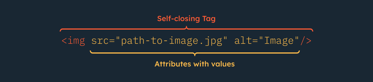
It’s important to note that not all tags in HTML will always have an opening and closing tag. Void Elements are considered self-closing and only have one tag associated with them. Below should be a familiar tag you may have seen a lot that corresponds to the image element.
There are also elements within HTML that are called Semantic Elements. Semantic elements are elements that clearly define the type of content they are used for. Some examples of semantic elements are heading tags, paragraph tags, and list tags.
You may also have noticed some of the illustrations above mention attributes. Attributes are used to extend the elements or adjust how they act. You can see a list of available attributes and the elements to which they can be applied to here. For this article, we’ll cover some common global attributes (attributes common to all HTML elements) that you should know.
Common Global Attributes
Attribute/Description
*id: The unique identifier (id) of the element. Element id's are always supposed to be unique per page and an element cannot have more than one id. One benefit of them being unique is that you can then link to specific areas on your page by adding #[idName] at the end of the URL.
*class: A CSS class is an attribute used to define a group of HTML elements. Multiple classes can be added to elements using a space and multiple elements can share the same classes. Both CSS and JavaScript can target elements by these classes.
style: CSS styling can be applied directly to the element using this attribute. CSS that is added at the element level with this tag has a chance to override styles applied elsewhere such as from a linked CSS file or an included <style> tag which we will discuss later on in this article.
*It’s important to note that while you can use CSS to style elements based on their id’s and classes, there is an order of specificity as to which CSS will come first. We discuss this further down in this article.
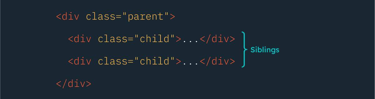
Parent, child, and sibling elements
These terms refer to the structuring and nesting of elements. Parent elements contain other elements inside of them. These nested elements inside of parent elements are called child elements. Sibling elements sit alongside each other. The image below illustrates these.
Below is a short list of commonly used HTML tags you may see within web development. Similar to our previous section, we have included some common attributes with some of these tags.
<!DOCTYPE html>
This tag must be at the top of all website pages. This informs the browser of the type of document it can expect to render.
HTML Comments Tag
Comments are notes that are not shown on your page but can be viewed when you look at a website's source code (on most browsers, this is done by right-clicking on the body of a page and selecting “view source”). They are often used to help provide additional context to developers on the site about functionality. It's common for developers or even third-party providers (such as Google Tag Manager) to add comments to code to make it easier to understand.
HTML Tag
This represents what is often called the “root” of your HTML page. The root is the topmost level of your page and every tag other than the doc type goes inside of this tag. A common attribute used with this tag is the lang attribute which informs the browser of the language in which the page is displayed. Learn more about the lang tag on Mozilla's docs.
Head Tag
This tag contains additional tags that provide metadata about your site and link to resources your page needs in order to render properly such as your website's CSS. This is also where Google recommends you add your tracking scripts for Google Analytics and Google Tag Manager. When using HubSpot’s native integrations, mentioned earlier in this article, this is where we also place those tags.
Title Tag
This controls the title of the page. This title can be seen at the top of the browser bar, a browsers page tab, or in search engine results. For example, the title of this page is: Coding for Marketers: Your Guide to Coding on HubSpot’s CMS Hub
Meta Tags
Meta tags contain the metadata for your pages such as the meta description which is used for display on search engine results. They can also contain open graph properties (think Facebook/Slack and how when you share an article, it pulls in an image from your page) and can even inform website crawlers whether to index a page or not. For a list of meta tags that Google Supports, check out their documentation here. We also offer a comprehensive article on the HubSpot blog about META tags.
Link Tags
Link tags can be thought of as the connectors that link your current page to external resources needed by the page (or website). Common uses for these are linking to your website's CSS Stylesheet, setting a favicon for your site, or specifying a canonical link for your content. This is not to be confused with the tag that is used to create links within content to other pages or websites, those links are called Anchor tags and we’ll cover those tags further down.
Style Tags
Before we explain style tags, it's important to understand that these should only be used as needed (for example in the case of critical CSS or styling specific unique elements for a page) and should be placed within the <head> tag. Style tags contain CSS that would be applied to the current page to which the tag is added.
Script Tags
Script tags are used to embed executable code on your website pages. Common uses for this tag are to link to javascript files or tracking codes like HubSpot’s tracking code. It is generally recommended to place script tags within the footer of your site (before your closing body tag, which we cover next). This is for a variety of reasons including performance (as websites tend to load top down so if your scripts take a bit to load, it can cause the rest of your page to load slower) and issues with scripts that are targeting elements on the page (as your javascript could load before the element it is targeting, therefore causing it to not work as intended).
Body Tag
The body tag contains all the content on your page and only appears once on your page. You will often see classes added to this tag for styling or javascript purposes. For example, on most blogs, you will likely see classes added to pages indicating the listing page or the post page like in our example below.
Header Tag
The header tag is primarily used to group the code that makes up your website's header. This is usually comprised of your logo, navigation menu, and CTAs. This is not to be confused with the <head> tag which contains the metadata of your site and links to resources used to make your site operational or the heading tags (h1, h2, h3) that are used for headings on your site. This tag is often near the top of a website after the opening <body> tag.
Section Tag
The section tag represents a standalone section(s) of a page that is more generic and does not have a semantic element that represents it. Think of sections like chapters in a book. Each chapter is its own section with a heading (in this case the chapter title). When applying this to a website, you would have different sections on your page to group content. Below is an example where we have outlined some sections that reside on the hubspot.com main website.
Div Tag
A div is one of the most commonly used HTML elements you will see within a webpage source code for structuring the page. These block-level elements act as containers for grouping your content which can be styled through the use of CSS with attributes like class or id. When a semantic element exists for your purpose, it's better to use that instead of a div. For example, when adding title text for a section of content, it’s best to use the next tag in our list (Headings - h1, h2, h3) instead of using a div.
H1, H2, H3 (Heading tags)
These tags are referred to as “Heading” tags and represent your page's headings. It is standard within web design to only have one <h1> tag within a page and use the rest to represent the text hierarchy. Search Engine Journal offers a great article that breaks down how to use headings properly for SEO if you are looking for more information.
Paragraph Tag
The paragraph tag is the most common tag you will see for text and represents a paragraph of content. This can be just regular text, or a combination of text, images, fields, and more.
List Tags
There are three different variations of list tags available for showing list-related content. These are unordered lists, ordered lists, and description lists (which contain both a term and the description for that term).
Anchor Tag
This tag allows you to create a link to other pages (either on your website or another website), files, email addresses, or even sections on your own web page (often referred to as “jump links”).
Image Tag
The image tag embeds an image that will be displayed on your webpage. With this element, it’s very important that you also use the alt attribute. As this attribute is needed for accessibility reasons when screen readers are used and describe to the reader what the image is. You can read more about accessibility in our developer documentation.
Span Tag
Similar to div elements the span tag acts as a container. However, this container is considered an inline-level element. These are primarily used for grouping content inside of other elements such as when individually styling a specific word within a sentence or heading. Just like with div elements the span element should only be used when semantic elements don't serve the same purpose.
Text formatting tags
The tags listed below are common tags used when formatting text. We have included a code sample after this list.
Strong tag
When writing content, sometimes you need to call out specific words and phrases. Using the <strong> tag will cause this content to be bold like this.
Emphasis and Italics Tag
While these two tags will produce the same result visually, the emphasis tag (<em>) should be used when the emphasis or importance of the text is being conveyed, while the italics tag (<i>) should be used purely for styling purposes.
Underline Tag
The underline (<u>) tag is used to indicate that text has a type of annotation that is not text-related. It’s very important to watch for the use of the underline tag as underlined text within webpages is often viewed as linked content within the page and can cause confusion.
Subscript Tag
The <sub> tag visually renders text as subscript and should only be used when you are expressing mathematical equations or other technical content where this usage is appropriate.
Superscript Tag
Much like the previous tag, the <sup> tag visually renders text as superscript and should only be used when representing ordinal numbers, denoting footnotes, expressing mathematical equations, or abbreviations with superior lettering.
CSS is code that you use to style the appearance of your website. How content looks on a page including its layout, colors, heading sizes, and more are all controlled through the use of CSS. There are three ways in which CSS can be incorporated into your HTML content.
- Linking to a stylesheet in your HTML via the
<link>tag - Using the
<style>tag - Using the
style=""attribute on an HTML tag. This one, much like the style tag and should only be used when absolutely necessary. This is due to CSS specificity which states that this attribute takes precedence over any styles assigned by other methods. There is only one exception to this rule and that is through using the!importantflag. More on that later.
When writing CSS, you assign values to CSS properties which tell the browser how to render the style of the elements. These properties are then assigned to selectors within the CSS. Common selectors that appear in CSS are elements (such as div, paragraph, and span tags), IDs, and classes. You can also use more advanced CSS selectors such as attributes, pseudo-elements, and pseudo-classes. You can read more about CSS selectors here. For our use case today, we’ll focus on using the more common ones. Let’s take a look at some sample CSS code below.
In our example above, our selector is our p element which correlates to our <p> html tag. We are then setting the font-size and color properties with the values of 1 rem (REMs are unit of measure that inform on the size of the object relative to the size of the root element which is often the <html> tag. More on REMs here.) and #000000 (this is the hexadecimal, usually referred to as ‘Hex Values’, representation of the color. More on hex values here).
Now that we know what CSS is and how you can apply it, lets dive a bit deeper into the CSS Box model which is a core component in understanding CSS and how it works when laying elements out on a page.
The CSS Box model
Typically when you view a webpage you see all the designs, layouts, and other stylistic elements that go on the page. What you dont see, is that every single element on a webpage is made up of four (4) boxes that work together to display them. Each of those boxes can be manipulated allowing you to adjust sizing and placement of the element on a page. Below illustrates the CSS Box model.
You can see we have our element placement and then surrounding our element we have boxes for padding, a border, and some margins. While these may not always be visibly present on an element, they are there. Each of those boxes have corresponding properties in CSS that you can use to adjust their settings.
display
Controls how the element is displayed on the page. There are multiple values you can assign to this property. We won’t be reviewing all of them that are available but below are some common values:
- block - this causes the element to sit on its own line by itself. Think of it link using the return/enter key when typing in a document.
- inline - causes the elements to sit next to each other on the same line and does not support setting a width or height on the element.
- inline-block - causes elements to sit next to each other but you can also set a width and height on them.
We have provided a Code pen below for you to view and use for playing around with the values above. If you are interested in creating more complex layouts, we encourage you to review CSS Tricks guide to using the flexbox model.
Note: The following properties are called “shorthand” properties. These are properties that allow you to set values for multiple properties related to them. For example, our first property of margin can be used instead of setting each property for the margin independently: margin-top, margin-right, margin-bottom, margin-left. The values will always go in a clockwise direction starting at the top.
margin
Sets the size of the margin used on the element. Margins are white-space that surround the outside of the element. Often times when centering an element on a page, you will see people set the left and right margins to be auto. This means the browser will automatically set the margins on the left and right on its own.
padding
Sets the amount of space added inside of the element surrounding the content. Notice the difference between this and using margins above.
border
Sets the border thickness, style, and color of an element. This is commonly used on tables within websites and the border sits between our margin and padding.
How does the browser apply styles to elements based on CSS
CSS is applied to elements through what is referred to as the cascade. The browser follows this cascading algorithm to determine which styles to apply to elements when multiple style rules exist. There are certain situations where you might have CSS code that references the same element and will end up competing with one another, often referred to as a “conflict” in CSS. Take for example the following:
Now if you only saw that first one, you would think when you add an H2 element to your content, its color would be black; however, due to a conflict in the CSS, the H2 would actually end up being red. The TLDR of what the algorithm states is that CSS is applied in the following order (highest priority to lowest):
- CSS that utilizes the
!importantflag will always be first. We’ll address the usage of this in the next section. - Inline CSS (via the “style” attribute)
- Within your CSS (either via the
<link>tag or<style>tag) your specification is more targeted to the element (usually through specifying classes or ids) - CSS code you write later down the page will overwrite code that is the same as earlier in the page. Our code sample above illustrates this. This also applies to the order in which the CSS is added to the page. For example, if you have a link to a CSS file in your
<head>element then reference some of that same code in a<style>tag with different properties on your page. The code that is referenced in the style tag will then take precedence over the code portion of the linked file.
Both Web.dev and Mozilla’s Web Docs are great resources that go into more detail about the cascading algorithm and we highly encourage you to read up on it if you are interested in learning more.
The !important flag in CSS
We talked about the !important flag briefly above. This flag is something that should be avoided whenever possible and should only be used when you are not able to modify the CSS code of a system you are using. Using this flag on a property is considered bad practice as when a property contains this flag, it will essentially override other properties that set a value to the same thing. For example, let's look at the same code from earlier just modified slightly:
In our earlier example, this code would cause our H2 to be red due to the cascading algorithm. When we set the important flag, we are signaling to the algorithm that the first value is more important and that it should ignore the other values when set. As you can imagine, when you overuse this, you can quickly cause a website to become problematic.
There are well over 100+ properties that are available in CSS. We won’t go through all of them, however, we will go over a brief list of the most common ones that are used when styling content.
CSS Comments
Much like HTML comments, CSS also has comments that can be used to help provide additional context for users. When writing comments (whether in HTML or CSS) it’s recommended to keep them concise and to the point. Comments within CSS can contribute to the overall size of your file so you wouldn't want to write a novel. Personally, I have left comments in CSS files for clients or others devs to help document sections of CSS code.
background
Sets the background style of an element, such as background colors and/or images. When using background images, you can also set positioning and repetition for them on this property. When applying backgrounds to elements, make sure to keep accessibility in mind. Learn more about color and contrast accessibility over at WebAIM.
border-radius
Sets the roundness of the edges of a border. If you have ever seen boxes with rounded corners on websites or circular headshot images of people, border-radius is often the property used to achieve this.
color
Sets the color of the text that is displayed within the element. This is another property where it is strongly recommended to keep accessibility in mind.
font styling properties
font-family
Set the font face, like fonts from Google Fonts, to be used for the text on our page.
font-size
Sets the size of the text-based content. You can use different units of measure but the commonly used ones are px (pixel) or rem which is the font-size of the root element of the document. By default, this is usually 16px unless explicitly stated in the CSS.
font-weight
Set the thickness (called weight) of the chosen font face. It's important to note that not all fonts have the same weights so if you are changing fonts on your site, make sure that you reference the available weights for your selected font. The default of this property is normal which equals a font weight of 400.
height
Sets the height of the element. You will often see this property set on things like icons or aspects of a site where content is made to be the same size. This does not include padding, borders, or margins that are set on the element.
max-height
Specifies the maximum height that an element can become vertically.
max-width
Specifies the maximum width that an element can become horizontally.
text-align
Specifies the alignment of the text within the element with values of left, center, right, and justify.
text-decoration
Sets the appearance of decorative lines with your text on your site with values including overline, line-through, underline (which is the most common you will see), and underline overline. It’s important to make sure when you are using this to not conflict with your text link styles which are usually underlined by default. Underlining text that is not a link can potentially confuse users who may click on it thinking it is a link when it's not.
text-transform
Sets the capitalization of text with values including uppercase, lowercase, and capitalization.
width
Sets the width of an element on your page. Similar to the height property, this does not include padding, borders, or margins that are set on the element.
Now that we have learned a bit about HTML and CSS, let's take our learnings one step further and see what we have available from HubSpot to enhance and transform our content.
You may or may not have heard of HubL. HubL is HubSpot’s extension of Jinjava which is a templating engine based on Jinja. Now, that may sound complicated after reading that sentence, but think of it as shortcuts you can use to pull in pre-defined data quickly without the need for writing complex code. HubL is run “serverside” which means HubSpot does all the rendering and running of the code on our end as opposed to having the user's browser do all the work. Typically in web development, things like HTML, CSS, and JavaScript, are interpreted by the user's browser and displayed to the user in what is called “client-side” rendering. To learn more, if you are interested in that sort of thing, about server-side vs client-side, we recommend checking out the following article from CloudFlare.
Now, let’s take a look at some of the more commonly used HubL delimiters, variables, functions, and filters that can help aid you in your content creation on HubSpot.
Delimiters are characters or symbols that separate data. A popular delimiter is a comma. You may have seen this in CSV files which stands for comma-separated values. HubL uses delimiters to differentiate where your HubL code starts and ends. Below are the different types of delimiters seen in HubL code:
- Statement delimiters
{% %}: Used to call modules, define logic, define variables, and more. - Expression delimiters
{{ }}: Prints values stored in variables. - Comment delimiters
{# #}: Used to provide additional context and direction for users. Unlike HTML and CSS comments, these comments are not visible to the end user in your code.
{{year}}
Prints the current year. This variable is perfect to use when adding a copyright year to the footer of your site.
Which then outputs:
2026
{{content.___}}
The content variable is what is called a dictionary (sometimes referred to as an array). This is a data structure that stores multiple data within it. This variable pulls in data about the content of your page which can then be accessed using dot notation. Think of dot notation much like shopping at a grocery store. If you are looking for Apples, you would first go to the store, then to the produce department, then their sections of apples and lastly, choose the apple you want. Using dot notation, you would translate this to something like storeName.produce.apples.fiji.
In our example below, we will use this post as our source of information. Explore the code and the corresponding output of that code.
Which then outputs the following:
Coding for Marketers: Your Guide to Coding on HubSpot’s CMS Hub
This guide is intended for marketers who want to gain a basic understanding of HTML, CSS, and HubL coding while showing how they can apply this knowledge when building on HubSpot’s CMS Hub.
https://www.hubspot.com/hubfs/Developer%20Blog/2024/coding-for-marketers/Coding%20for%20Marketers_%20Your%20Guide%20to%20Coding%20on%20HubSpot%E2%80%99s%20CMS%20Hub-base.jpg
https://developers.hubspot.com/blog/coding-for-marketers-your-guide-to-coding-on-hubspots-cms-hub
1707505287202
1709746651543
Setting custom variables
Just like our standard variables, you can also create your own custom variables (often referred to as "vars") using our statement delimiter and reference them later in your code with expression delimiters. These variables can reference a single piece of data or even multiple pieces of data within a dictionary (array).
Filters allow you to transform the way your data is displayed. They can be used to do a wide array of things with your HubL variables. Filters are often added onto a variable using a pipe | in the following way:
{{variable.name | filter}}
An interesting thing with HubL filters is that you can also chain filters together to apply multiple filters to a variable as seen in our example below.
{{variable.name | lowercase | title }}
Let's take a look at some of the more common filters used. If you want to see a full list of available filters along with properties for each filter, please visit the developer documentation on filters.
capitalize
Allows you to capitalize the first letter of the variable that is output. This is useful when you are pulling sentence-based data (like an alt description of an image or more) from a data source to output to a page.
title
Allows you to output whatever variable you have as title case which capitalizes the first letter of every word. This is best used on headers or titles for pages and posts.
lower
Allows you to output a variable as all lowercase letters.
upper
Does the opposite of lower and will output a variable as all uppercase letters.
format_date
As the name implies, this filter will help format epoch dates into an easy-to-read format. This filter is most commonly used with the content.___ variables when outputting created, updated, and published dates.
format_time
Much like the previous filter, this one will output just the time portion of the date.
format_datetime
If you wanted to output both the date and time, this would be the filter you would want to use.
between_times
This filter will help you to get the time between two different dates and times. It’s perfect for use on an event landing page when you want to show users how many days are left before an event starts.
pprint
This is commonly referred to as “pretty printing”. This filter allows for you to print the output of a variable dictionary. This is a perfect way to see what additional values you can output using dot notation. For example, below is the out for the {{page_meta | pprint}} of this page:
(ContentMeta: {
  "canonicalUrl" : "https://developers.hubspot.com/blog/coding-for-marketers-your-guide-to-coding-on-hubspots-cms-hub",
  "deferDynamicValues" : false,
  "featuredImageAltText" : "Coding for Marketers: Your Guide to Coding on HubSpot’s CMS Hub | AJ LaPorte",
  "featuredImageHeight" : 631,
  "featuredImageUrl" : "https://www.hubspot.com/hubfs/Developer%20Blog/2024/coding-for-marketers/Coding%20for%20Marketers_%20Your%20Guide%20to%20Coding%20on%20HubSpot%E2%80%99s%20CMS%20Hub-base.jpg",
  "featuredImageWidth" : 1200,
  "htmlTitle" : "Coding for Marketers: Your Guide to Coding on HubSpot’s CMS Hub",
  "linkRelCanonicalUrl" : "https://developers.hubspot.com/blog/coding-for-marketers-your-guide-to-coding-on-hubspots-cms-hub",
  "metaDescription" : "This guide is intended for marketers who want to gain a basic understanding of HTML, CSS, and HubL coding while showing how they can apply this knowledge when building on HubSpot’s CMS Hub. ",
  "metaKeywords" : "",
  "name" : "Coding for Marketers: Your Guide to Coding on HubSpot’s CMS Hub",
  "unescapedHtmlTitle" : "Coding for Marketers: Your Guide to Coding on HubSpot’s CMS Hub",
  "unescapedMetaDescription" : "This guide is intended for marketers who want to gain a basic understanding of HTML, CSS, and HubL coding while showing how they can apply this knowledge when building on HubSpot’s CMS Hub. "
})
As you can see, that is a lot of data but all of those values can be accessed using our dot notation!
Functions allow you to interact with other areas of your HubSpot account and pull/manipulate the data in order to output its contents. Within functions you are also able to supply additional parameters to configure the desired output. Sometimes, these functions will return data to you in what is referred to as an Array. This allows you to store multiple data items within one variable. For example you could have a variable called cars and within this variable have data about different cars such as [sedan, minivan, truck]. To access this data, you will need to use what is called a "for loop", which lets you “loop” through all the data in the variable. Below illustrates how a for loop works. Essentially, you are saying “For [items] within [variable], do something with that data and repeat this for each [item]”.
Let's take a look at some of the functions that can be utilized.
blog_recent_posts()
With this function, you can pull in a listing of the most recent blog posts from a particular blog hosted on HubSpot. By utilizing its available parameters, you can choose a specific blog and also the number of posts to pull back.
blog_recent_tag_posts()
Similar to the function above, this lets you go one step further and choose not only which blog to pull posts from, but you can also specify which tags in that blog to pull. This works great if you are building landing page campaigns and want to include specific categories of posts.
content_by_id() and content_by_ids([])
These functions operate similar to one another. By supplying either a single id (using content_by_id()) or an array of ids (using content_by_ids([])) you can pull data related to that content. You can find the id of the pages or posts in the url from the page/post editor. It’s important to note that these functions do require some processing to execute and are limited to only being able to be used 10 times on a page (see our product and services catalog for limits). Make sure if you are using them, you are not over using them as you don't want your site to take a performance hit.
resize_img_url()
One of the biggest things that users can do to optimize their website is to make sure that you are not loading larger images on your website than needed. This function allows you to enter in the url of an image hosted on your HubSpot portal (must not exceed 4096px) and set its dimensions. When the page is generated, it will resize your image saving you on overall image size.
today()
This function will output the start of today's date as a timestamp. You can use this in conjunction with the |format_date filter in order to output today's date.
unixtimestamp()
This will return a unix timestamp for the current time. This can be used in conjunction with the |format_datetime filter in order to output the current date and time.
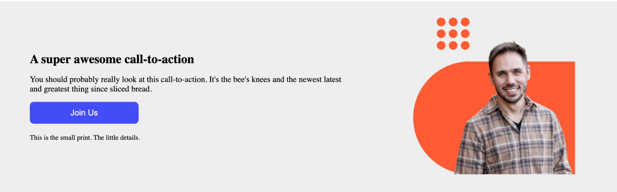
Now that we’ve learned about HTML, CSS, and some nifty HubL, let’s put all this learning together and walkthrough creating a simple “CTA Content Block” module for use on our pages that will contain some text, a call to action, and a background. Below is an example of our end result.
Note: The code for the following module is available on our Developer Relations Github Organization here. While we have provided this code, we encourage you to follow the tutorial below while using our code as a reference. Writing code by hand is a great way to apply the learnings from above.
Create a new module in the Design Manager
For this walkthrough, we’ll hop into our Design Manager and create a new folder that we can then use as a playground to try and build new things.
Go to File > New Folder and name your folder “[Your Name Here] Development Folder” adding your name in the proper place. This is so you can easily identify your folder in case many people are also using your Design Manager.
Now, with your folder selected in the left pane:
- Go to File and select New file in [Your Name Here] Development Folder
- From the drop-down menu select Components > Module and click Next.
- Choose Pages, Blog Posts, Blog Listings, and Local Module. This means we are creating a module that can be used on across these content types and can be unique on each page.
Let's now give our module the name of Dev Blog Sample CTA Content Block. You will notice you are only allowed to add in alphanumeric characters with the exception of a hyphen or underscore.
Click Create and we will then be brought to our Design Manager module screen.
Adding some fields to our module
We’re going to start by adding some fields to our module that we can then utilize later on in our module for content purposes. Let's add and rename some of the following fields to our module as shown below and add some default content to these fields:
- Rich Text Field renamed to Heading and Teaser Text
- CTA Field. We do not need to rename this one.
- Text Field renamed to Small Print
- Image Field. We do not need to rename this either.
Let's add some HTML and CSS to our module
Within our module editor screen, you will see three panes. We are only going to focus on two of those panes for our module: module.html (HTML + HubL) and module.css
In our module.html pane, let's add the following code below. We’ve added comments to this code to illustrate what each piece of code is for.
Now, in our module.css pane, we’ll add our CSS. We have also added comments in the CSS.
Now, let’s go ahead and click the preview button in the top right corner. You should now see a preview of your module like the one illustrated below.
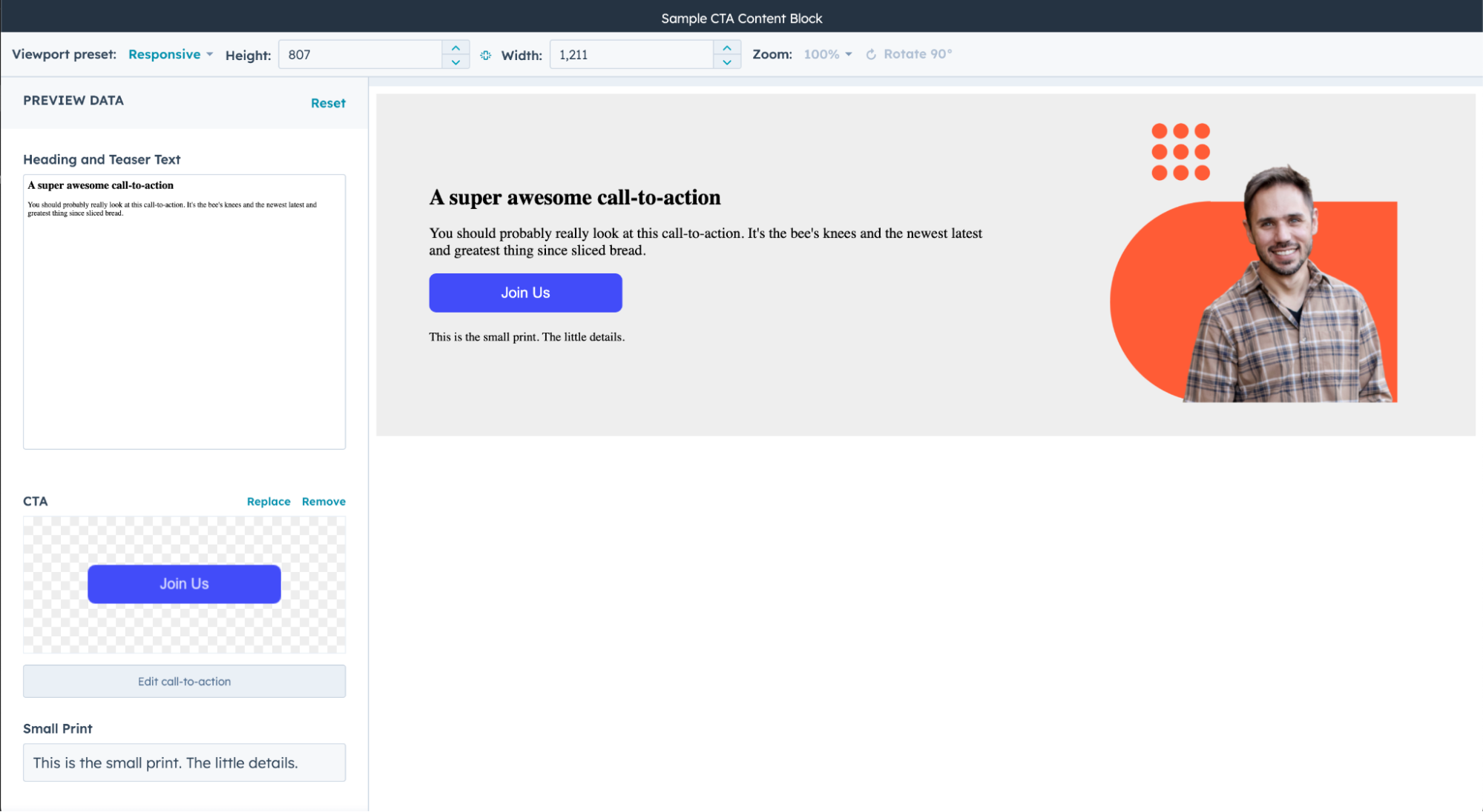
If your module preview doesn’t look like the one below, that's ok. Just re-review your code (this is commonly referred to as “debugging”) and see where any issues may be occurring. Then fix those areas, save, and re-preview it. Now that you’ve done this, play around with some of the other code we have listed above and come up with something nifty!
While this blog post has helped to hopefully start you on your journey building on HubSpot's CMS Hub, there is always more to learn. Below is a list of resources for you to dive further into the land of website development. I hope you enjoyed this blog and if you are looking to connect, you can find me on LinkedIn!
- HubSpot Academy's Building HubSpot CMS Modules (Free)
- MDN Reference Docs: HTML and CSS
- W3Schools: HTMLand CSS
- Envato Tuts+ YouTube: HTML & CSS for Beginners | FREE MEGA COURSE (7+ Hours!)
- CanIUse: Browser support tables for modern web technologies