CrmActionButton component renders a button that can execute a built-in set of CRM actions.
This type of component is useful for enabling your extension to interact with other CRM entities, such as records and engagements. To learn more about how CRM action components work together, check out the CRM action components overview.

Props
Variants
Using thevariant prop, you can set the color of the button.
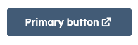
'primary': a dark blue button for the most frequently used or most important action on an extension. Each extension should only have one primary button.
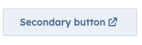
'secondary': a grey button to provide alternative or non-primary actions. Each extension should include no more than two secondary buttons.
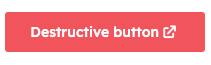
'destructive': a red button for actions that delete, disconnect, or perform any action that the user can’t undo. Button text should clearly communicate what is being deleted or disconnected. After a destructive button is clicked, the user should have to verify or confirm the action.