The Dropdown component renders a dropdown menu that can appear as a button or hyperlink. Use this component to enable users to select from multiple options in a compact list. This component includes sizing options.
x
import { Dropdown } from '@hubspot/ui-extensions';const Extension = () => { const ddOptions = [ { label: 'Clone', onClick: () => console.log({ message: 'Clone group' }), }, { label: 'Delete', onClick: () => console.log({ message: 'Delete group' }), }, ]; return ( <Dropdown options={ddOptions} variant="primary" buttonSize="md" buttonText="More" /> );};| Prop | Type | Description |
|---|---|---|
options Required | Object | The options included in the dropdown menu. For each option, include:
|
variant | 'primary' (default) | 'secondary' | 'transparent' | The type of dropdown button to display. 'primary' and 'secondary' will display a blue and grey button, respectively, while 'transparent' will display a blue hyperlink. |
buttonText | String | The button text. |
buttonSize | 'xs', 'extra-small' | 'sm', 'small' | 'md', 'medium' (default) | The size of the button. |
disabled | Boolean | When set to true, the dropdown button cannot be focused or clicked. Set to false by default. |
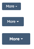
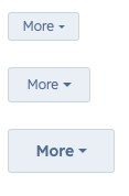
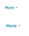
Using the variant and buttonSize props, you can set the type of button along with its size.
-
'primary'buttons with size set to'xs','sm', and'md'respectively:![dropdown-buttons-primary]()
-
'secondary'buttons with size set to'xs','sm', and'md'respectively:![dropdown-buttons-secondary]()
-
'transparent'buttons with size set to'sm'and'md'respectively:![dropdown-buttons-transparent]()