Last modified: August 22, 2025
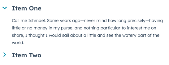
The Accordion component renders an expandable and collapsable section that can contain other components. This component can be helpful for saving space and breaking up extension content.
| Prop | Type | Description |
|---|---|---|
title | String | The accordion’s title text. |
defaultOpen | Boolean | When set to true, the accordion will be open on initial page load. The open prop takes precedence over this prop. |
disabled | Boolean | When set to true, the accordion’s state cannot be changed. Set to false by default. |
open | Boolean | Controls the accordion’s open state programmatically. When set to true, the accordion will open. Takes precedence over defaultOpen. |
onClick | () => void | A function that will be invoked with the accordion title is clicked. This function receives no arguments and its returned value is ignored. |
size | 'xs', 'extra-small' | 'sm', 'small' | 'med', 'medium' (default) | The size of the accordion title. |