Standard components
SearchInput | UI components
Learn about the SearchInput component for enabling search in UI extensions.
Last modified: August 22, 2025
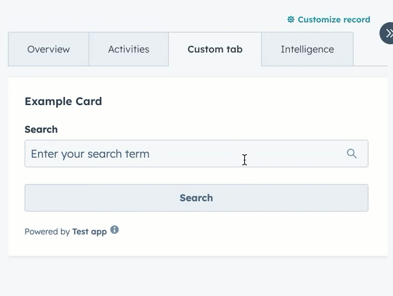
The SearchInput component renders an input field that enables users to search. The component doesn’t provide search functionality out of the box, but includes props for managing input state and validation.
| Prop | Type | Description |
|---|---|---|
label | String | The label text to display for the input. |
name | String | The unique identifier for the input. |
value | String | The value of the input. |
placeholder | String | Text that appears in the input when it has no value set. |
tooltip | String | Text that will appear in a tooltip on hover next to the input label. |
required | Boolean | When set to true, displays a required field indicator. |
readOnly | Boolean | When set to true, the field is not editable. |
description | String | Instructional message to help understand the purpose of the input. |
error | Boolean | When set to true, renders the error state and shows validationMessage as an error. |
validationMessage | String | The text to show under the input for error or success validations. Will appear below the input. Learn more about validation messages. |
getValidationMessage | (value: string) => string | null | Called to validate the input value and display a validation message. Depending on the width and length of message, the message display may appear above or inline with the input. |
onChange | (value: string) => void | A callback function that is invoked when the input value changes. |
onInput | (value: string) => void | A callback function that is invoked every time the field is edited by the user. |
onBlur | (value: string) => void | A function that is called when the field loses focus. |
onFocus | (value: string) => void | A function that is called when the field gets focused. |
clearable | Boolean | When set to true, shows a clear button to clear the input. Default is true. |
Validation messages
Using thevalidationMessage and getValidationMessage props, you can implement validation into the search input. By default, validationMessage will render as a green success message. When the error prop is true, the message will render as red and the search input will include a red border.
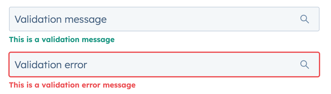
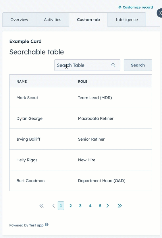
Table search example
The example below creates a searchable table.