Last modified: August 22, 2025
Use the Modal component to render a pop-up overlay containing other components. Like the Panel component, you’ll include the Modal component in an overlay prop within a Button, LoadingButton, Link, Tag, or Image component.
To see an example of using overlays, check out HubSpot’s Overlay example project.
To format the modal, you’ll use the following subcomponents:
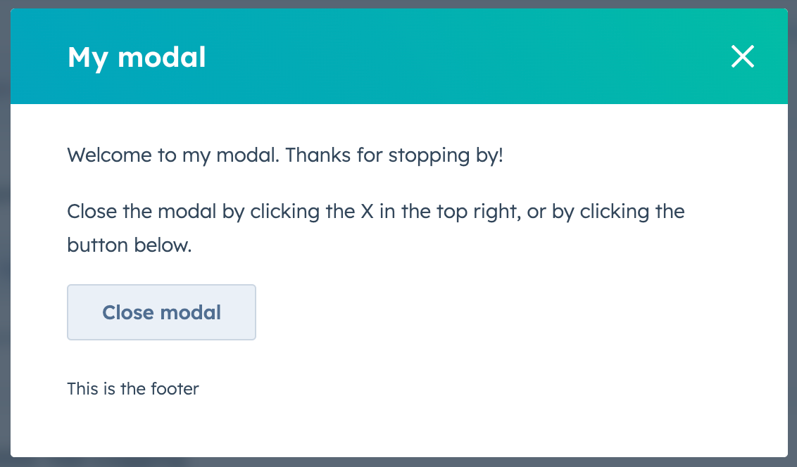
ModalBody(required): contains the main content of the modal.ModalFooter: an optional component to format the footer section of the modal.
.gif)
| Prop | Type | Description |
|---|---|---|
id | String | The unique identifier for the modal. |
width | 'small', 'sm' (default) | 'medium', 'md' | 'large', 'lg' | The width of the modal. |
title | String | The title of the modal, displayed at in the modal’s top bar. |
variant | 'default' (default) | 'danger' | The type of modal. See the variants section for more information. |
aria-label | String | The modal’s accessibility label. |
onOpen | () => void | A function that will be invoked when the modal has finished opening. |
onClose | () => void | A function that will be invoked when the modal has finished closing. |
Opening and closing modals
By default, HubSpot handles opening the modal when the user clicks the parent Button, LoadingButton, Link, Tag, or Image component. A close button will also be included in the top right of the modal.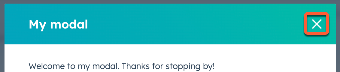
Button, LoadingButton, Link, Tag or Image with an onClick event that triggers the closeOverlay action. To use this action, you’ll need to include the actions argument in hubspot.extend() as seen in the example code below.
Learn more about opening and closing overlays.
Please note:
- You can only have one modal open at a time. Opening a modal while another is already open will cause the first one to close.
- A
Modalcan be opened from aPanel, but aPanelcannot be opened from aModal.
Variants
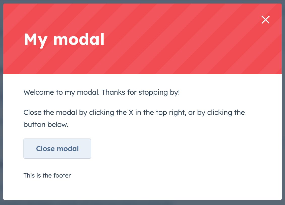
Use thevariant prop to configure the style of modal.
By default, the modal will include a blue colored top bar where the title displays.
variant to 'danger'.
Usage examples
- Use the default variant to prompt a user to enter a new set of customer details for the current contact record.
- Use the danger variant to confirm when a user wants to delete a deal record.
Guidelines
DO: use this type of overlay for short messages and confirmations. If you want a more lightweight way to communicate a message to the user, check out the Alert component. DO: use the danger variant to confirm destructive actions that cannot be undone. The text should clearly communicate what is being deleted, and the confirmation button should be explicit about the action. For example, never use the word “Okay” to confirm the deletion of an item. Instead, use “Delete”. Learn more about overlays, including when to use aModal or a Panel.