Since releasing drag and drop page editing and a new page editor UI in late 2019, we’ve shifted our focus on polishing the user’s experience in the page editor. We have now rolled out some updates to the UI that make for a smoother page editing experience.
Page editor UI updates:
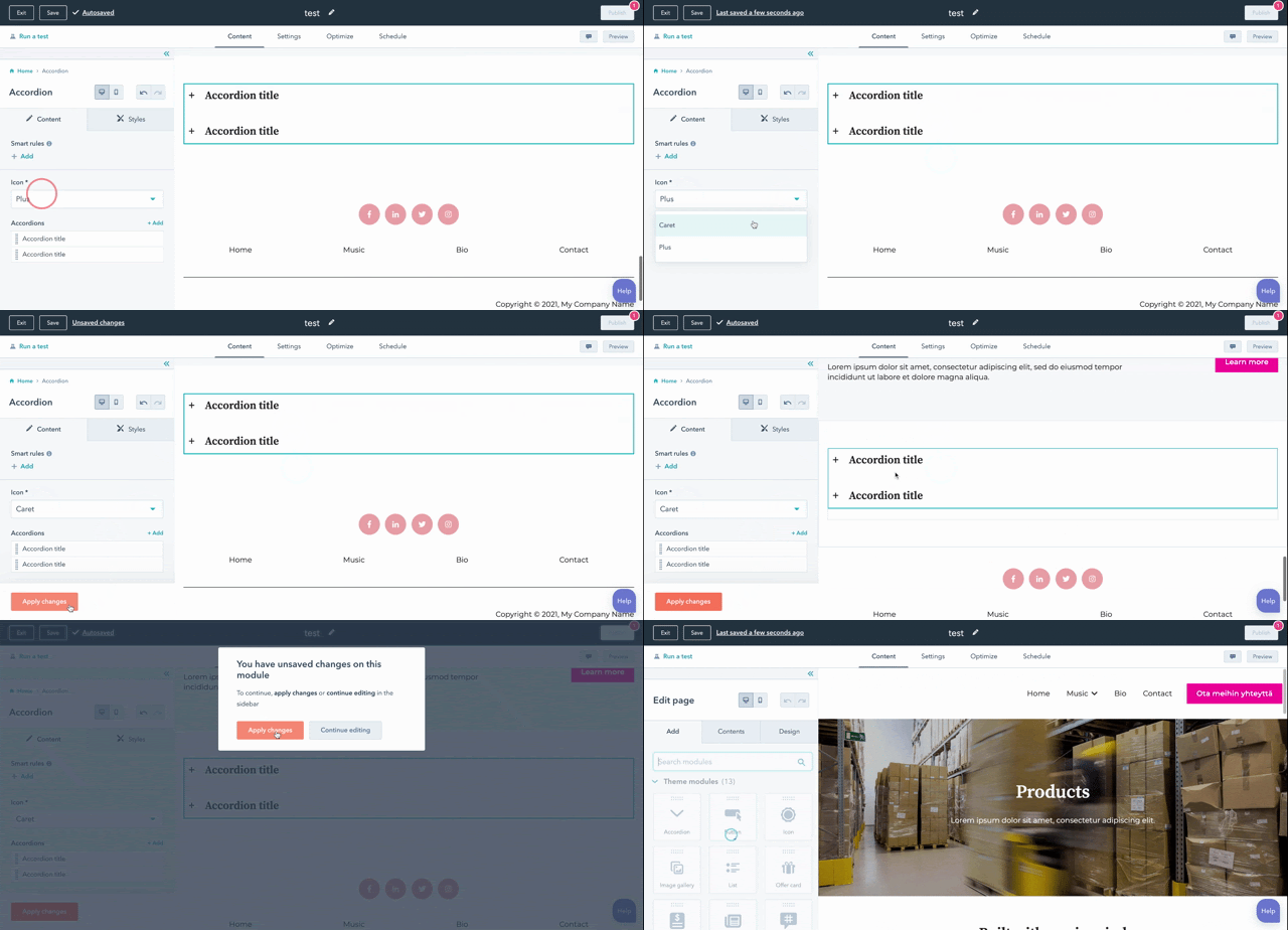
Apply changes button will now only appear when a page refresh is needed.

When the user updates a module that we can apply to the page without a refresh, we auto-apply the changes and show a confirmation message that changes were applied and saved. Conversely, when a user makes a module update that requires the page editor to refresh to show those changes on the page, the “Apply changes” button slides in so that the user can apply their changes.
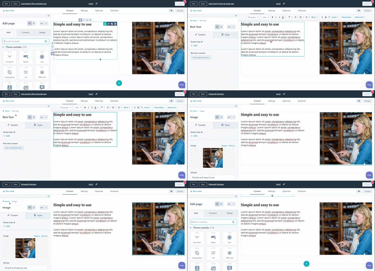
Breadcrumbs help you navigate through the edit sidebar.

When you drill into editing modules, you’ll have a breadcrumb trail along the top of your edit sidebar to quickly get you back home.
Adjustments to hover states and lines when editing modules on the page.

Before, when hovering over the preview pane of the page editor, you’d see blue hover overlays over with dark outlines delineating each module and container. While that was helpful in showing the user how their page was built, it was intrusive and overwhelming. With reduced lines and hover states, the drag and drop interface has a cleaner feel, and allows the user to more easily see how their page looks in real life.
Consistency between toolbars for modules and containers.

Before, modules and containers had their own toolbar styles. This update makes those toolbars the same, as they contain the same set of options and help the user understand what options are available at a glance for different parts of their page. The styling brush option was also removed from the toolbars.
Have questions or comments? Join the conversation over on the community forums here.