Modern websites are responsive, they need to look and function well on mobile as well as they do on desktop. It is now possible to provide alternate theme styles for mobile.
What's happening?
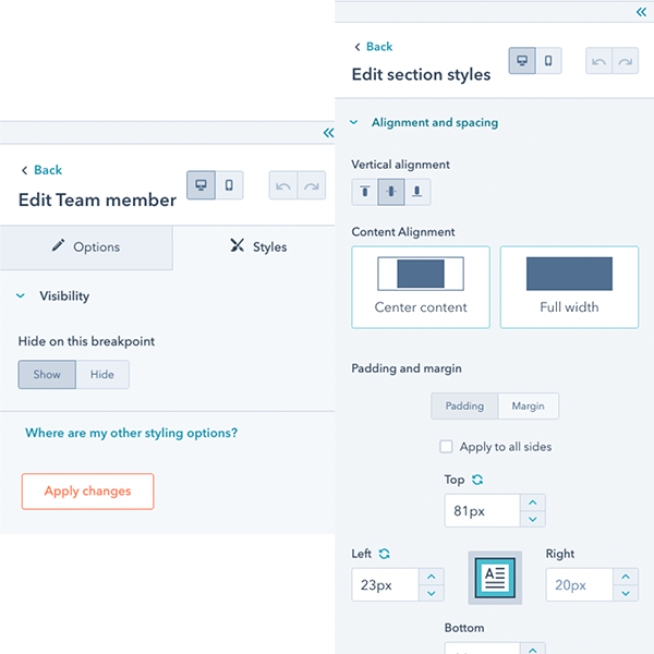
Developers and marketers can now control the mobile experience of pages by setting certain styles to apply to mobile separately from desktop. In addition you can hide toggle the visibility of specific modules based on mobile or desktop. Developers can set defaults through code in dnd_areas and they're changeable by marketers through the page editor.
At this time we only support mobile and desktop breakpoints.
We've also updated our default themes to enable websites using those themes to take advantage. This also means if you use the default themes as a starting point for your next project, you will get this functionality.
To learn more about the responsive breakpoints functionality see our developer documentation.
When is it happening?
This is available now in all HubSpot accounts with access to themes.
How does this affect the ongoing themes challenge?
We are releasing this functionality after the start of the theme challenge. We do not feel it would be fair for us to judge themes differently based upon a theme using or not using this functionality. As a result Judges will be ignoring this functionality during scoring.
We do encourage everyone to take advantage of this feature though. You can certainly submit your theme with this feature or update your submitted theme later to include it.