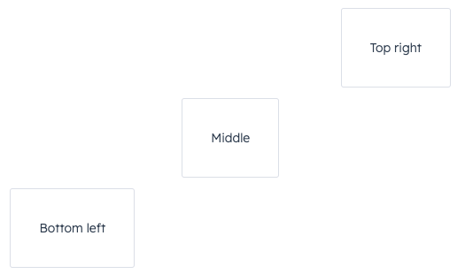
Box component renders an empty div container for fine tuning the spacing of components. Commonly used with the Flex component.
Props
You only need to use
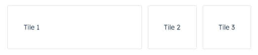
Box as a wrapper for components that you want to adjust. For example, if you wrap one component in a Box with a flex value, only that one component will have its width adjusted based on the available empty space.
Usage examples
Using numbers in flex
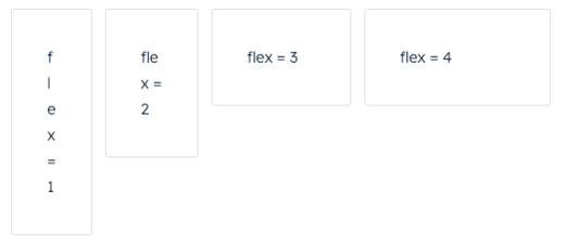
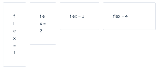
Use theflex prop in a Box component to assign any extra spacing to components using either a default value (e.g. auto) or a specific number. When using a number, the components will be distributed based on the ratio of their assigned numbers. This also means that, when assigning a flex value for only one Box, you can use any number, because any number by itself will result in all available space being assigned to that Box.
For example, the four tiles below take up an increasing amount of space based on their flex values.
Using alignSelf
Use thealignSelf prop to override alignment rules for individual Box components.