The TextArea component renders a fillable text field. Includes props to customize the size of the field along with maximum number of characters and resizability.
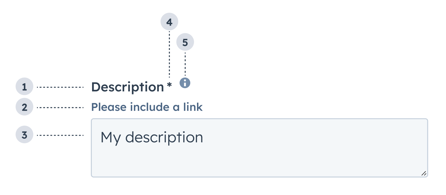
- Label: the field’s label.
- Description: the text that describes the field’s purpose.
- Value: an entered value.
- Required field indicator: communicates to the user that the field is required for form submission.
- Tooltip: on hover, displays additional information about the field.
Props
Usage example
A field where salespeople can leave comments after meeting a new client.
Guidelines
- DO: make label and description text concise and clear.
- DO: indicate if a field is required.
- DO: include clear validation error messages so that users know how to fix errors.
- DO: include placeholder text to help users understand what’s expected in the field.
- DO: indicate if there is a character limit.
- DON’T: use this field for short values, such as names, numbers, and dates.
- DON’T: use placeholder text for critical information, as it will disappear once users begin to type. Critical information should be placed in the label and descriptive text, with additional context in the tooltip if needed.
Last modified on March 30, 2026