The Flex component renders an empty div container set to display=flex. When wrapped around other components, it enables those child components to be arranged using props. Flex can contain other Flex or Box components.
import { Flex, Tile } from "@hubspot/ui-extensions";
const Extension = () => {
return (
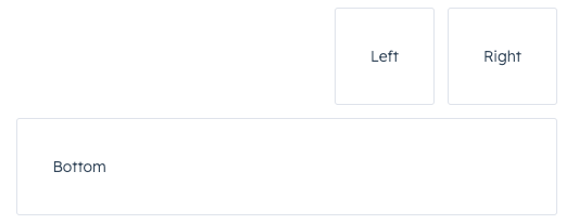
<Flex direction={"row"} justify={"end"} wrap={"wrap"} gap={"small"}>
<Tile>Left</Tile>
<Tile>Right</Tile>
<Flex direction={"column"}>
<Tile>Bottom</Tile>
</Flex>
</Flex>
);
};
Props
Usage examples
Horizontal layout
To arrange components horizontally, set direction to row. Then, use justify to configure the horizontal distribution. By default, components will stretch across the container if justify is not specified.
|
justify={‘between’} |
|
justify={‘around’} |
|
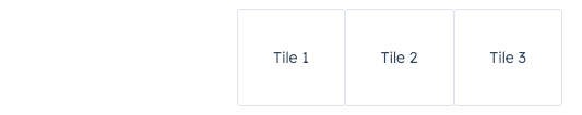
justify={‘start’} |
|
justify={‘center’} |
|
justify={‘end’} |
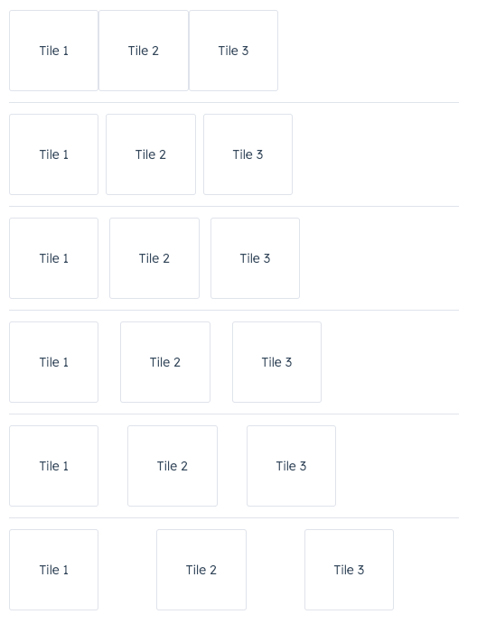
Wrap
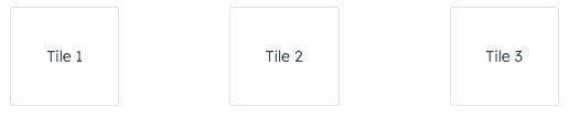
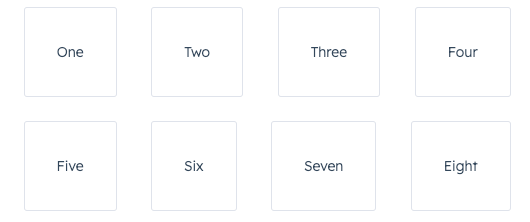
By default, components in a row will be arranged on one line when possible. Use the wrap prop to wrap components onto new lines when needed.
<Flex direction={"row"} justify={"between"} wrap={"wrap"} gap={"medium"}>
  <Tile>One</Tile>
  <Tile>Two</Tile>
  <Tile>Three</Tile>
  <Tile>Four</Tile>
  <Tile>Five</Tile>
  <Tile>Six</Tile>
  <Tile>Seven</Tile>
  <Tile>Eight</Tile>
</Flex>;
Vertical layout
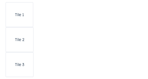
To arrange components vertically, set direction to column, then use the align prop to distribute them. By default, components will stretch across the extension container width when align is not specified.
|
align={‘start’} |
|
align={‘center’} |
|
align={‘end’} |
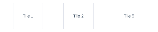
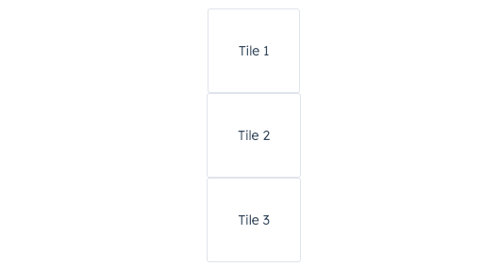
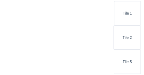
Spacing
In the Flex component, you can use the gap prop to apply even spacing between the tiles. This prop will apply spacing equally for both row and column directions.
<Flex direction={"row"} justify={"start"} gap={"flush" | "extra-small" | "small" | "medium" | "large" | "extra-large"}>
  <Tile>Tile 1</Tile>
  <Tile>Tile 2</Tile>
  <Tile>Tile 3</Tile>
</Flex>;
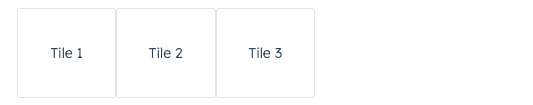
Using Flex in Flex
You can wrap child Flex components with Flex to set more specific rules for individual components. A child Flex component will not inherit props specified in the parent Flex component, so you’ll need to repeat any props you’ve previously defined to maintain them.
<Flex direction={"row"} justify={"end"} wrap={"wrap"} gap={"small"}>
  <Tile>Left</Tile>
  <Tile>Right</Tile>
  <Flex direction={"column"}>
    <Tile>Bottom</Tile>
  </Flex>
</Flex>;
Last modified on March 29, 2026