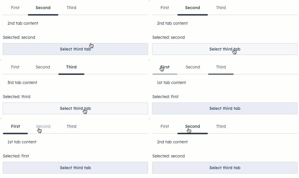
Tabs component allows you to group related content into clickable tabs, with each Tab child component creating a new tab. Options are provided for visual variants, tooltip configuration, and more.
Props
<Tabs> props
<Tab> props
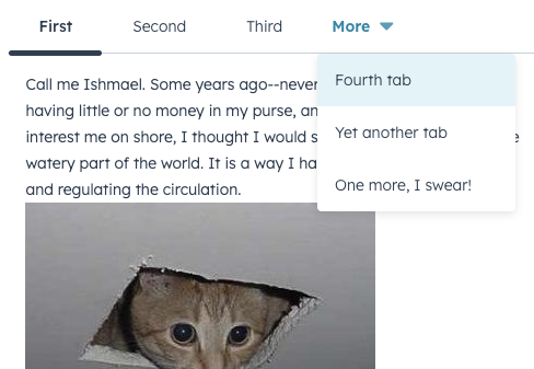
Once there are enough tabs to exceed the width of the container, HubSpot will automatically put overflowing tabs into a More dropdown menu, which users can click to select from the remaining tabs.
Variants
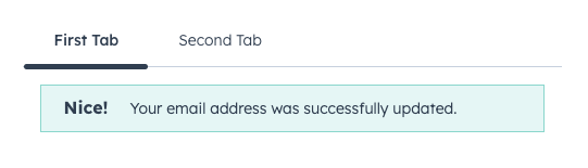
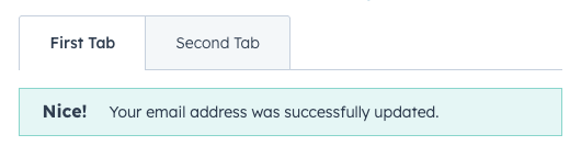
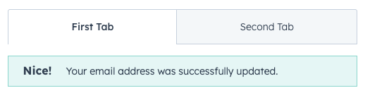
Thevariant prop provides two options for tab styling: default and enclosed.
fill prop to true to configure the tabs to take up the full width of the container.
Tooltips
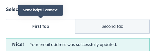
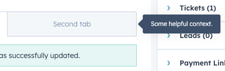
Use thetooltip prop to add tooltips to tabs on hover. By default, the tooltip will appear above the tab, but you can use the tooltipPlacement prop to configure it further.
Controlling tabs via React state
In addition to being able to switch tabs by clicking on each tab, you can also control tab select via React state using theselected and onSelectedChange props.