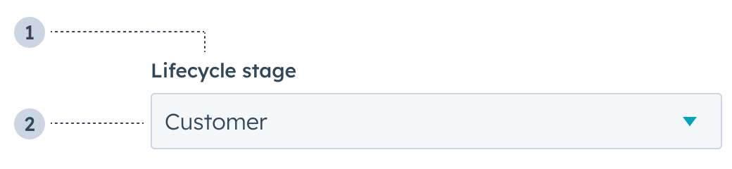
The Select component renders a dropdown menu select field where a user can select a single value. A search bar will be automatically included when there are more than seven options.
- Label: the label that describes the field’s purpose.
- Value: the field’s selected value.
Props
Variants
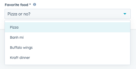
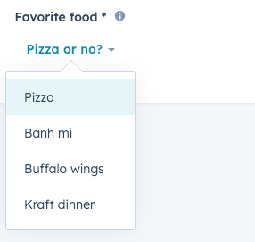
Using the variant prop, you can set the input to be one of two styles:
input (default): a standard dropdown menu.
transparent: a hyperlink dropdown menu.
Usage examples
Use this type of field when there are a range of set options to choose from, such as:
- A list of products that can be purchased.
- A list of office locations to ship to.
- A list of delivery options for a vendor.
Guidelines
- DO: make label and description text concise and clear.
- DO: indicate if a field is required.
- DO: include clear validation error messages so that users know how to fix errors.
- DO: include placeholder text to help users understand what’s expected in the field.
- DON’T: use this component when you want users to be able to select multiple options. For multiple options, use the MultiSelect component.
- DON’T: use placeholder text for critical information, as it will disappear once users begin to type. Critical information should be placed in the label and descriptive text, with additional context in the tooltip if needed.
Last modified on March 29, 2026