The ToggleGroup component renders a list of selectable options, either in radio button or checkbox form.
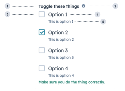
- Group label: the text that displays above the group of checkboxes.
- Tooltip: on hover, displays additional information about the field.
- Unchecked checkbox: an unselected checkbox.
- Option label: the text that displays next to the checkbox.
- Option description: the text that displays below the option label to describe the option.
Props
Variants
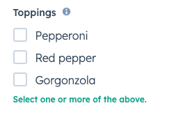
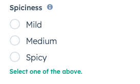
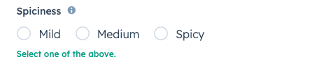
By default, the toggle group will render as a vertical list of checkboxes. Using the toggleType prop, you can set the options to display as checkboxes or radio buttons. You can also use the inline prop to stack options horizontally.
toggleType='checkboxList' (default)toggleType='radioButtonList'Usage examples
- A radio button list to enable salespeople to select one of four sales packages for a new customer.
- A checkbox list to enable customer support reps to select several options of swag to send to a delightful customer.
Guidelines
- DO: use this component when the user has a small selection of items to choose from. For longer lists of options, consider using the Select component instead.
- DO: keep label options concise when possible.
- DON’T: use toggle groups to display long lists of options.
Last modified on September 11, 2026