
2025.1 project, but the chart component implementation would be similar for projects on version 2025.2 or 2026.03.
Learn more about creating custom charts with UI extensions by watching this video on the HubSpot Developers YouTube channel.
On this page:
data: an object containing the chart data, with additionaloptions. Learn more about data formatting.axes: an object that specifies for thexandyaxes, with additionaloptions. Learn more about configuring axes.options: an object that specifies options for the chart, such as showing data labels and tooltips. Learn more about chart options.
Formatting data
Data should be provided to a chart component in an array of objects containing key-value pairs, matching the following format{string: number | string}. Data will be displayed in the order it’s provided to the component, so you will need to sort data beforehand if necessary. For example, to display data over time in a LineChart, you should sort the data in ascending/descending order of your datetime axis field before passing it to the chart component.
- A chart can only graph one dataset, so you’ll need multiple charts if you’re working with multiple datasets.
- For performance and readability, it’s recommended for a chart to include no more than a few hundred entries, depending on the data. When working with larger datasets, it’s important to consider the information you want to convey with the chart. You’ll likely encounter issues with visual clarity before you encounter performance issues. For example, a
BarChartwith hundreds of bars on it will likely not be readable even if it renders quickly. - Chart components do not support nested fields in data. Rather, all fields will need to be stored at the same level. For example, the following data format is not supported because it introduces a secondary level of data in the
typefield.
datetime values
For charts that include datetime data, you can use the following formats:- Unix millisecond timestamp (
1758791725) - ISO 8601 timestamp (
2025-09-25T09:15:25+0000) - ISO 8601 date (
2024-09-25)
Data options
It’s recommended to pre-format your data into human-readable text so that it doesn’t need any additional relabeling. However, if there are times when you can’t pre-format certain values in your data, you can include anoptions field in the data prop to set propertyLabels. Including options will slightly change the way you format data:
- When only including a dataset array, you’ll format the
dataprop asdata={dataArray}. - When including
options, you’ll need to format thedataprop as an object containing bothdataandoptionsfields as shown below. Inoptions, you’ll include apropertyLabelsobject, which then contains an object for each field and labels for each value.
dealstage and user_id values.
Configuring axes
Theaxes prop configures the chart’s axes. Charts can have two axes (x and y), and each axis is configured by a field and fieldType parameter. By default, the field value will be used as the axis label, but you can also include a label parameter to set it separately.
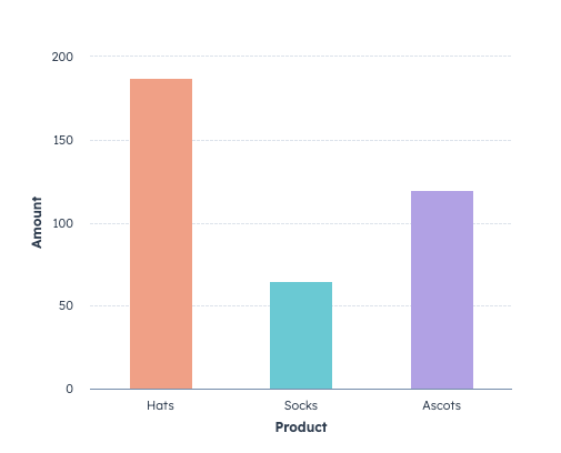
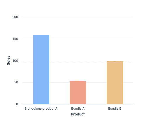
The following bar chart displays sales data by type of product and count of sales. To add visual clarity, each bar is assigned a different color via the
groupFieldByColor parameter in options.
Stacking
Use thestacking axes option to stack data by group. For example, the following bar chart displays the number of deals by deal stage. The data also includes the sales rep who owns each deal. To visually distinguish sales reps in each column, stacking has been set to true.
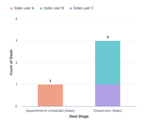
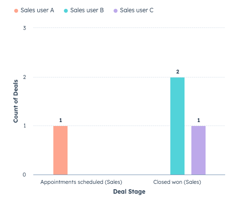
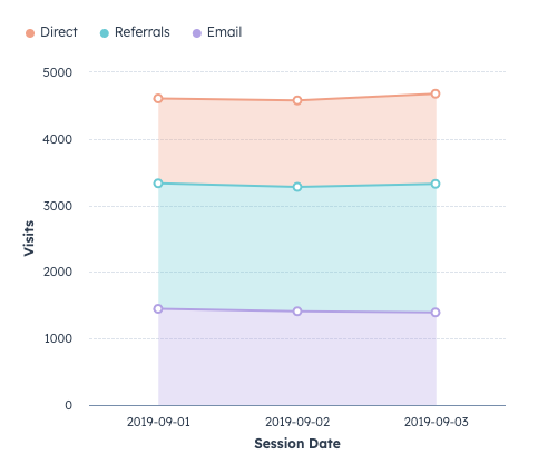
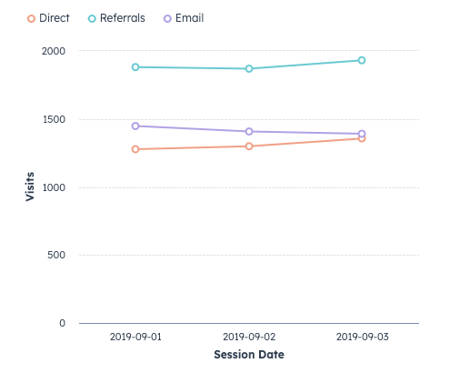
Chart options
Using theoptions prop, you can configure a chart with options such as displaying a chart title, legend, data labels, or specifying the color list.
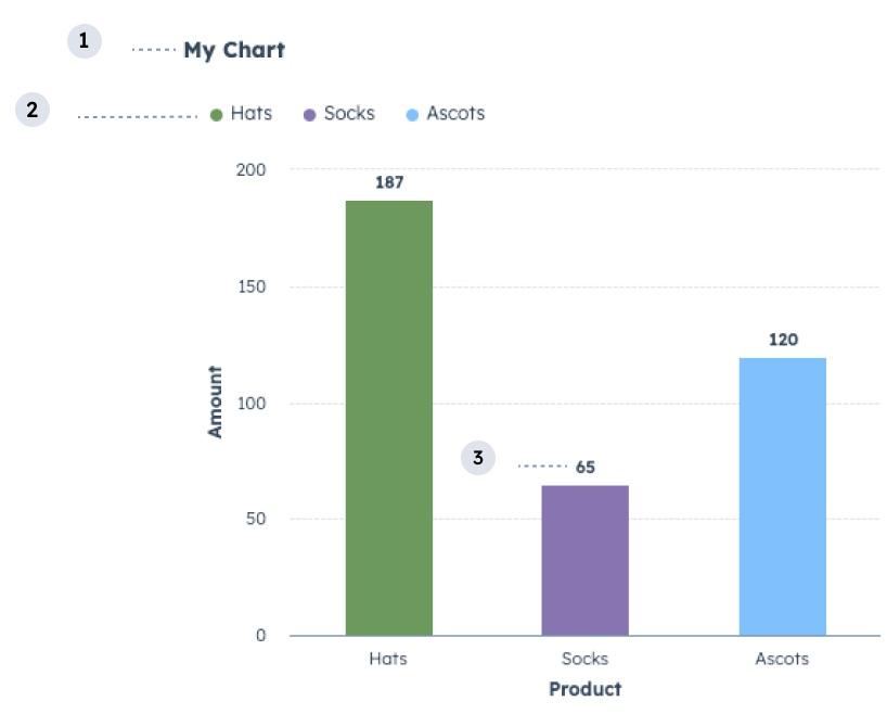
- Title: the title of the chart.
- Legend: lists the data categories with their corresponding color for readability.
- Data labels: labels for data points.
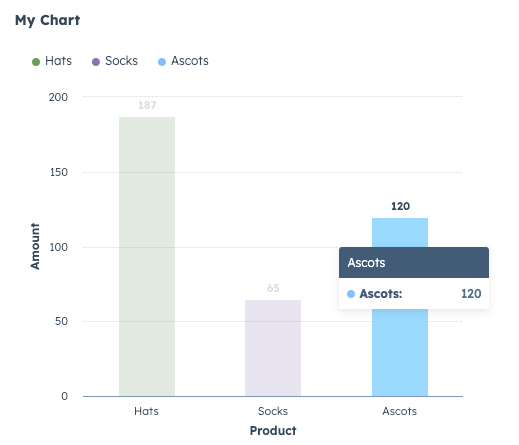
- Tooltips: displays details for data points on hover.
Colors
By default, HubSpot will apply colors to chart bars or lines using a default set of colors whengroupFieldByColor is specified in axes options. You can customize these colors in two ways:
- To customize the order of colors selected by HubSpot, include the
colorListfield in the top-leveloptionsprop, then specify the colors you want to prioritize. - To apply colors to specific values of the field specified in
groupFieldByColor, include thecolorsfield within the axesoptions.
Product field using groupFieldByColor. The three colors (darkGreen, blue, darkPurple) will be applied first, then the standard color order will be applied to any additional bars.
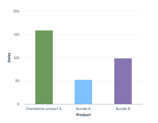
colors field in the axes options. In colors, you’ll need to specify each value from the groupFieldByColor field to assign a color to.
Default color set
Below are the available colors in their default order.| Color | Hex value | Swatch |
|---|---|---|
orange | #fea58e |  |
aqua | #51d3d9 |  |
purple | #bda9ea |  |
yellow | #f5c78e |  |
pink | #ea90b1 |  |
blue | #81c1fd |  |
green | #a4d398 |  |
darkOrange | #c3705c |  |
darkAqua | #009ca2 |  |
darkPurple | #8775b2 |  |
darkYellow | #bb915b |  |
darkPink | #b05c7d |  |
darkBlue | #468cc4 |  |
darkGreen | #6b9a5b |  |
Design guidelines
- DO: title your data categories with human-readable text so they are easy to understand.
- DO: use sentence-casing for the data categories and chart title (only first letter capitalized).
- DO: sort your data in ascending/descending order of your x-axis field to prevent unordered rendering prior to passing it to a charting component. If you intend to display information over time (such as in a LineChart), your data will be displayed in the order you provide it.
- DO: display the chart legend if you’re graphing more than one category of data. This prevents your users from having to rely only on color to identify different data on your chart.
- DO: for readability, use larger surfaces to showcase charts, such as the record page middle column. Avoid using charts with many data points on smaller surfaces such as the preview panel or sidebar.
- DON’T: use more than 14 data categories unless it cannot be avoided for your use case.
- DON’T: use the same colors to indicate different data categories.