The Link component renders a clickable hyperlink. Use links to direct users to a web page, another part of the HubSpot app, or use them as buttons.
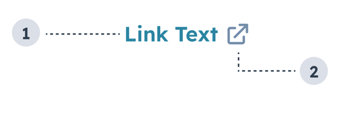
- Link text: text that describes where the link leads.
- External link icon: included when setting
external to true. and indicates that the link will open in a new tab. Automatically included when the link leads to a page outside of the HubSpot app.
import { Link } from "@hubspot/ui-extensions";

const Extension = () => {
  return (
    <Link
      href={{
        url: "https://www.wikipedia.org",
        external: true,
      }}
    >
      Wikipedia
    </Link>
  );
};
Props
| Prop | Type | Description |
|---|
href | Object | Sets the link’s URL and open behavior. Contains the following fields:url (string): the URL that will open on click.external (boolean): set to true to open the URL in a new tab and display an external link icon. By default:- Links to HubSpot app pages will open in the same tab and will not include an icon.
- Links to non-HubSpot app pages will open in a new tab and include the icon.
|
onClick | () => void | A function that is invoked when the link is clicked. The function receives no arguments and its return value is ignored. |
overlay | Object | Include a Modal or Panel component in this object to open it as an overlay on click. Learn more about using overlays. |
preventDefault | Boolean | When set to true, event.preventDefault() will be invoked before the onClick function is called, preventing automatic navigation to the href URL. |
variant | 'primary' (default) | 'light' | 'dark' | 'destructive' | The color of the link. See the variants section for more information. |
Variants
Using the variant prop, you can set the following styling:
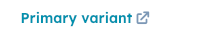
'primary': the default blue (#0091ae).
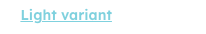
'light': a white link that turns to a lighter shade of blue on hover (#7fd1de).
'dark': a darker shade of blue (#33475b).
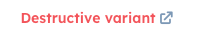
'destructive': a red link (#f2545b).
Usage examples
- Use the default
'primary' variant when you want to link to another page or contact record in HubSpot.
- Use the
'light' variant when you want to include a link on a dark background.
- Use the
'dark' variant to include a link in an alert.
- Use the
'destructive' variant when the link results in an action that can’t be undone by the user, such as deleting contact property information.
Guidelines
- DO: space out links so that users can tell when they’ll be navigation to a different place.
- DO: make link text concise and contextual.
- DO: use the
'destructive' variant sparingly and only when the action can’t be undone.
- DO: always open links to pages outside of the HubSpot app in a new tab (
external: true).
- DON’T: crowd multiple links together.
- DON’T: use the
'dark' variant outside of alerts.
Last modified on January 28, 2026