The TextArea component renders a fillable text field. Includes props to customize the size of the field along with maximum number of characters and resizability.
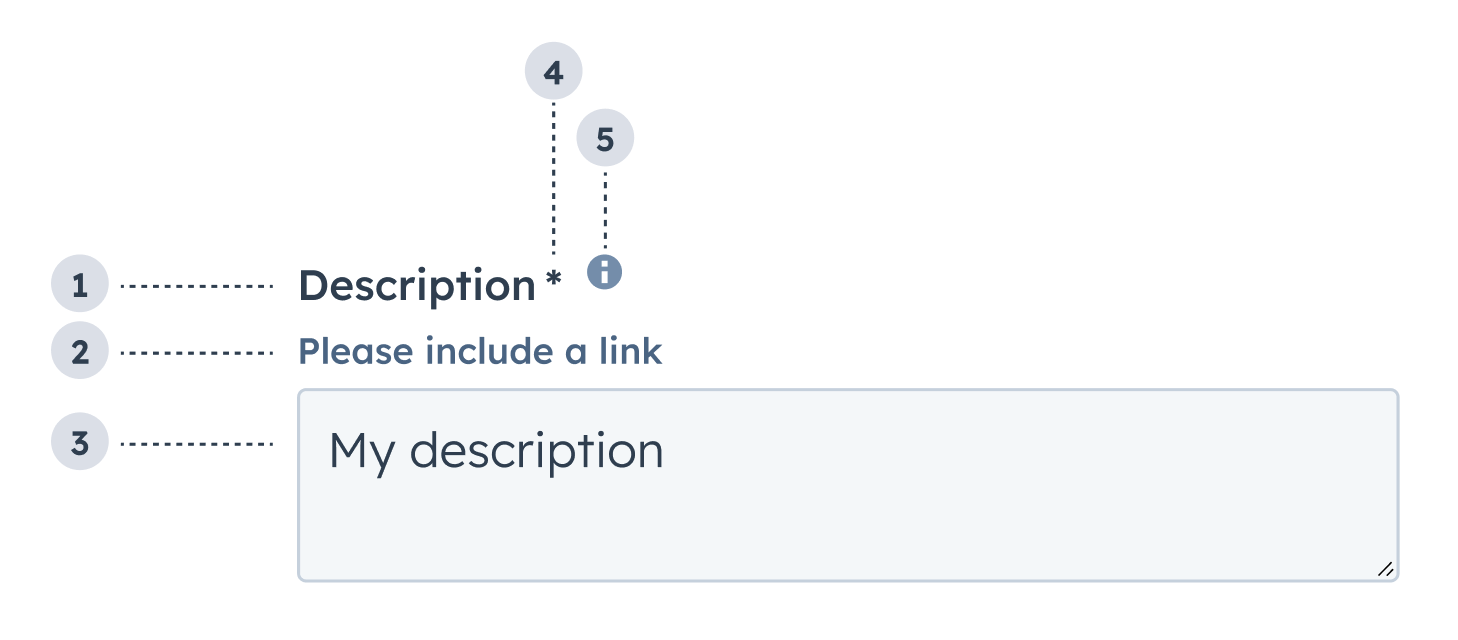
- Label: the field’s label.
- Description: the text that describes the field’s purpose.
- Value: an entered value.
- Required field indicator: communicates to the user that the field is required for form submission.
- Tooltip: on hover, displays additional information about the field.
import { TextArea } from "@hubspot/ui-extensions";
import { useState } from "react";

const Extension = () => {
  const [description, setDescription] = useState("");
  const [validationMessage, setValidationMessage] = useState("");
  const [isValid, setIsValid] = useState(true);

  return (
    <Form>
      <TextArea
        label="Description"
        name="description"
        tooltip="Provide as much detail as possible"
        description="Please include a link"
        placeholder="My description"
        required={true}
        error={!isValid}
        validationMessage={validationMessage}
        onChange={value => {
          setDescription(value);
        }}
        onInput={value => {
          if (!value.includes("http")) {
            setValidationMessage("A link must be included.");
            setIsValid(false);
          } else {
            setValidationMessage("Valid description!");
            setIsValid(true);
          }
        }}
      />
    </Form>
  );
};
Props
| Prop | Type | Description |
|---|
cols | Number | The visible width of the text field in average character widths. |
description | String | Text that describes the field’s purpose. |
error | Boolean | When set to true, validationMessage is displayed as an error message if provided. The input will also render its error state to let the user know there’s an error. If left false (default), validationMessage is displayed as a success message. |
label | String | The text that displays above the input. |
maxLength | Number | The maximum number of characters (UTF-16 code units) that the user can enter. If not specified, maximum length is unlimited. |
name | String | The input’s unique identifier. |
onBlur | (value: number) => void | A function that is called and passes the value when the field loses focus. |
onChange | (value: number) => void | A callback function that is called with the new value or values when the list is updated. |
onFocus | (value: number) => void | A function that is called and passed the value when the field gets focused. |
onInput | (value: number) => void | A function that is called and passes the value when the field is edited by the user. Should be used for validation. It’s recommended that you don’t use this value to update state (use onChangeinstead). |
placeholder | String | Text that appears in the input when no value is set. |
readOnly | Boolean | When set to true, the checkbox cannot be selected. Default is false. |
required | Boolean | When set to true, displays a required field indicator. Default is false. |
resize | 'vertical' | 'horizontal' | 'both' (default) | 'none' | Sets whether the text field is resizable, and if so, in which directions. |
rows | Number | The number of visible text lines for the text field. |
tooltip | String | The text that displays in a tooltip next to the label. |
validationMessage | String | The text to display if the input has an error. |
value | String | The value of the input. |
Usage example
A field where salespeople can leave comments after meeting a new client.
Guidelines
- DO: make label and description text concise and clear.
- DO: indicate if a field is required.
- DO: include clear validation error messages so that users know how to fix errors.
- DO: include placeholder text to help users understand what’s expected in the field.
- DO: indicate if there is a character limit.
- DON’T: use this field for short values, such as names, numbers, and dates.
- DON’T: use placeholder text for critical information, as it will disappear once users begin to type. Critical information should be placed in the label and descriptive text, with additional context in the tooltip if needed.
Last modified on January 28, 2026