ButtonRow component renders a row of specified Button components. Use this component when you want to include multiple buttons in a row.
When the number of included buttons exceeds the available space, the extra buttons will be presented as a Dropdown style button, which you can configure using the dropDownButtonOptions prop.
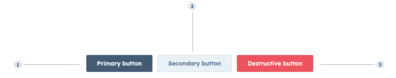
- Primary button: only use one per extension.
- Secondary button: only use with a primary and/or destructive button.
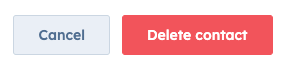
- Destructive button: only use for actions that are destructive, paired with a secondary button.
Props
| Prop | Type | Description |
|---|---|---|
children Required | ||
disableDropdown | ||
dropDownButtonOptions | ||
testId |
Dropdown variants
Buttons that exceed available space will be presented in one Dropdown style button. You can use thedropDownButtonOptions prop to customize its appearance. This prop takes an object that can include size, text, and variant fields. The size and variant fields use the same options available for those props in the Dropdown component.
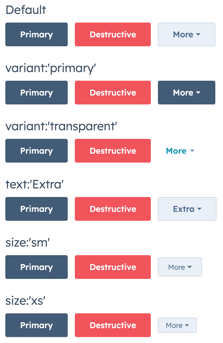
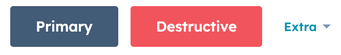
dropDownButtonOptions to configure multiple options.
Usage examples
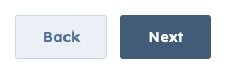
- A
'primary'and'secondary'button in a row to progress through a multi-step form.
- A
'destructive'and'secondary'button in a row to confirm and cancel a contact deletion.
Guidelines
- DO: include a secondary button with a destructive button to allow users to cancel the action.
- DON’T: use multiples of the same button type in a row. For example, don’t include more than one primary button in one row.
- DON’T: use more than two secondary buttons in a single extension.
- DON’T: use more than three buttons in a row.