
UI extension components (BETA)
 Sales Hub
- Enterprise
 Service Hub
- Enterprise
When building a UI extension, you'll include any number of HubSpot-provided components to render the extension's UI. There are three types of components to select from:
- Standard components: raw components that can be used for both internal and external data. These components do not fetch data on their own, but are more flexible in their implementation.
- CRM data components: out of the box components that can fetch/display only HubSpot data. These components enable easy visualization of account data, including properties, associations, and reports. They also automatically handle permissions, input validation, conditional properties, and more. These components can only be placed in the middle column of CRM records.
- CRM action components: out of the box actions related to CRM records, engagements, and more. Includes three components and a set of actions that each can perform. For example, use these actions to create new records, schedule meetings, and navigate to other HubSpot pages.
Components are included in the UI Extensions SDK, and should be imported at the top of your jsx or tsx file. Standard components are imported from '@hubspot/ui-extensions' while CRM data and CRM action components are imported from '@hubspot/ui-extensions/crm'.
npm i @hubspot/ui-extensions in the extensions directory.
Below are the currently available UI extension components:
Standard components
- Accordion
- Alert
- Button
- Button row
- Description list
- Divider
- Dropdown
- Empty state
- Error state
- Form
- Heading
- Image
- Inputs:
- Layout components:
- Link
- List
- Loading spinner
- Panel
- Progress bar
- Statistics
- Step indicator
- Table
- Tag
- Text
- Tile
CRM data components
- Overview and filtering
- Association pivot
- Association property list
- Association table
- Data highlight
- Property list
- Report
- Stage tracker
- CRM statistics
CRM action components
Below, learn about each type of component and how to include it in an extension.
Standard components are imported from @hubspot/ui-extensions.
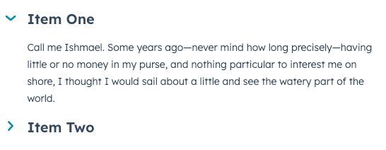
The Accordion component renders a collapsable accordion section that can contain other components.
title string (required)
The accordion's title text. |
defaultOpen boolean
Defines default open behavior on page load. When set to The |
disabled boolean
When set to |
open boolean
For controlling the accordion's open state programmatically. When set to |
onClick function
A function that will be invoked with the accordion title is clicked. This function receives no arguments and its returned value is ignored. |
size string
The size of the accordion title. Can be one of:
|
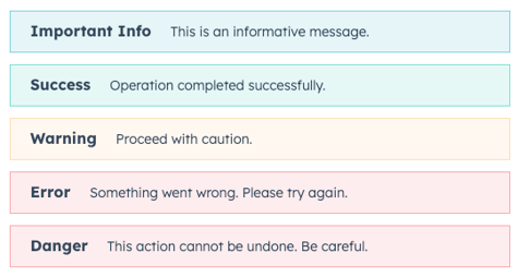
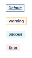
The Alert component renders a single alert.
title string (required)
The bolded title text of the alert. |
variant string
The color of the alert. The following variants are available:
|
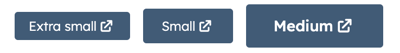
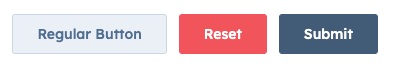
The Button component renders a single button. The button text is passed into the component like a standard HTML element, rather than through a prop.

href string
Navigates to a URL on button click. When a button includes both |
onClick function
A function that will be invoked when the button is clicked. It receives no arguments and it's return value is ignored |
disabled boolean
Set to |
variant string
Sets the color variation of the button. Values include:
|
size string
Sets the size of the button. Values include:
|
type string
Sets the HTML attribute
|
The ButtonRow component renders a row of button components. In ButtonRow, you'll specify individual Button components.
disableDropdown boolean
Disables the dropdown list of buttons that appears when child button expand beyond horizontal space ( |
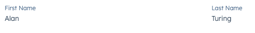
The DescriptionList component renders pairs of labels and values. It also contains a DescriptionListItem subcomponent.
direction stringThe direction that the label and value pairs are displayed. By default, the value is set to column. You can also set the direction to row. |
label string (required)The text to display as the label. |
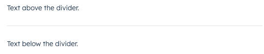
The Divider component renders a divider for spacing out components.
distance string
The space between the divider and the content above and below it. Can be one of:
|
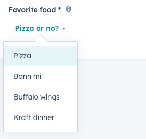
The Dropdown component renders a dropdown menu that can appear as a button or hyperlink. Includes sizing options.
options object (required)
The options included in the dropdown menu. For each option, include:
|
variant string
The type of dropdown button to display. Values include:
|
buttonText string
The text on the button. |
buttonSize string
The size of the button. Values include:
|
The EmptyState component sets the content that appears when the extension is in an empty state.
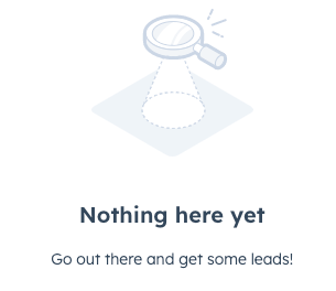
flush boolean
When set to |
imageWidth number
The max-width for the image container |
layout string
Sets the layout direction for the content. Can be either |
reverseOrder boolean
When set to |
title string
The text for the title header. |
The ErrorState component sets the content of an erroring extension.
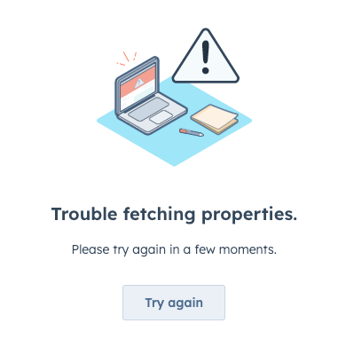
title string
The text of the title header. |
type string
The type of error image that will be shown. Can be one of:
|
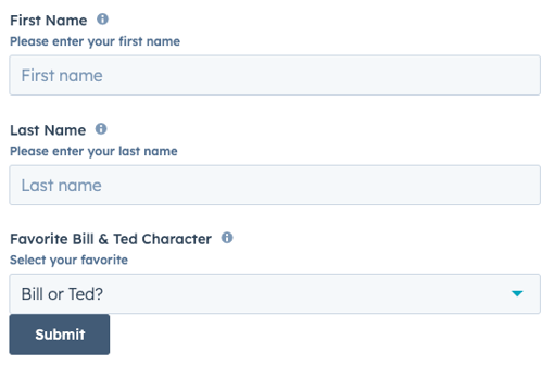
onSubmit function
The function that is called when the form is submitted. It will receive a |
preventDefault boolean
When set to |

The Image component renders an image.

src string (required)
The URL of the image to display. |
alt string
The alt text for the image. |
href string
If provided, will be used as the href that will be opened in a new browser tab on click. |
onClick function
A function that will be called when the image is clicked. This function will receive no arguments and any returned values will be ignored. |
width number
The pixel width of the image. |
height number
The pixel height of the image. |
The Checkbox component renders single checkbox input. If you want to display multiple checkboxes, you may want to use ToggleGroup instead, as it comes with extra logic for handling multiple checkboxes and radio buttons.
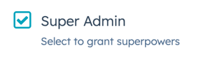
value string
The checkbox value. This value is not displayed on the card, but is passed on the server side when submitted, along with the checkbox name. |
name string
The checkbox's unique identifier. |
checked boolean
When set to |
initialIsChecked boolean
When set to |
readonly boolean
When set to |
description string
The string that displays below the checkbox. |
aria-label string
The checkbox's accessibility label. |
variant string
The size of the checkbox. Values include:
|
inline boolean
When set to |
onChange function
A callback function that is called when the checkbox is selected or cleared. Passes the new value.
|
The DateInput component renders an input field where a user can select a date.
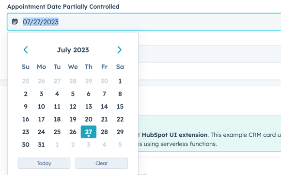
name string (required)
The input's unique identifier, similar to the HTML input element |
label string (required)
The text that displays above the input. |
required boolean
When set to |
value object
The value of the input. Must include the year, month, and day:
|
readOnly boolean
When set to |
description string
Displayed text that describes the field's purpose. |
tooltip string
The text that displays in a tooltip next to the label. |
error boolean
When set to |
validationMessage string
The text to show if the input has an error. |
onChange function
A callback function that is invoked when the value is committed. Currently, this occurs on |
onBlur function
A function that is called and passes the value when the field loses focus. |
onFocus function
A function that is called and passed the value when the field gets focused. |
min object
Sets the earliest valid date available using the following format:
|
max object
A Sets the latest valid date available using the following format:
|
minValidationMessage string
A function that is called and passed the value when the field gets focused. |
maxValidationMessage string
A function that is called and passed the value when the field gets focused. |
format string
Sets the date format the input will display. Can be one of:
|
timezone string
Sets the timezone that the component will use to calculate valid dates. Can be one of:
|
clearButtonLabel string
Sets the label of the button to clear the selected date. |
todayButtonLabel string
Sets the label of the button to select today's date. |
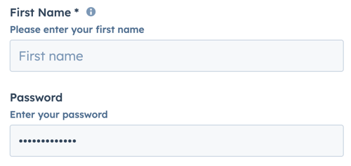
The Input component renders a text input field where a user can enter a custom text value.
name string (required)
The input's unique identifier, similar to the HTML input element |
label string (required)
The text that displays above the input. Required if |
required boolean
When set to |
value string
The value of the input. |
type string
The type of input. Can be either |
readOnly boolean
When set to |
description string
Displayed text that describes the field's purpose. |
tooltip string
The text that displays in a tooltip next to the label. |
placeholder string
Text that appears in the input when no value is set. |
error boolean
When set to |
validationMessage string
The text to show if the input has an error. |
onChange function
A callback function that is invoked when the value is committed. Currently, these are |
onInput function (required)
A function that is called and passes the value when the field is edited by the user. Should be used for validation. It's recommended that you don't use this value to update state (use |
onBlur function
A function that is called and passes the value when the field loses focus. |
onFocus function
A function that is called and passed the value when the field gets focused. |
The MultiSelect component renders a dropdown menu select field where a user can select multiple values. Commonly used within the Form component.
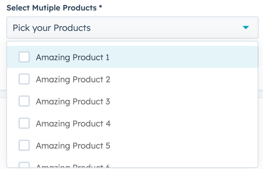
label string (required)
The text that displays above to the dropdown menu. |
name string (required)
The unique identifier for the select element. |
value array
The value of the select input. |
options array (required)
The options to display in the dropdown menu. |
required boolean
When set to |
readOnly boolean
When set to |
description string
Displayed text that describes the field's purpose. |
tooltip string
The text that displays in a tooltip next to the label. |
placeholder string
Text that appears in the input when no value is set. |
error boolean
When set to |
validationMessage string
The text to show if the input has an error. |
onChange function
A callback function that is invoked when the value is committed. |
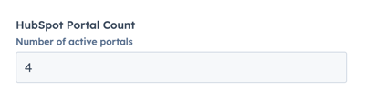
The NumberInput component renders a number input field.
name string (required)
The input's unique identifier, similar to the HTML input element |
label string (required)
The text that displays above the input. Required if |
required boolean
When set to |
value string
The value of the input. |
readOnly boolean
When set to |
description string
Displayed text that describes the field's purpose. |
tooltip string
The text that displays in a tooltip next to the label. |
placeholder string
Text that appears in the input when no value is set. |
error boolean
When set to |
validationMessage string
The text to show if the input has an error. |
onChange function
A callback function that is invoked whenever a valid number is entered. The function is invoked with the current numerical value of the input.
|
onBlur function
A function that is called and passes the value when the field loses focus. |
onFocus function
A function that is called and passed the value when the field gets focused. |
min number
Sets the lower bound of the input. |
max number
Sets the upper bound of the input. |
precision number
Sets the number of digits to the right of the decimal point. |
formatStyle string
Formats the input as a decimal point ( |
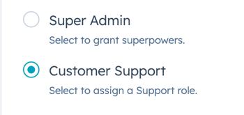
The RadioButton component renders a radio select button. If you want to include more than two radio buttons, or are building a form, it's recommended to use the ToggleGroup component instead.
value string
The radio button value. This value is not displayed, but is passed on the server side when submitted, along with the checkbox name. |
name string
The radio button's unique identifier. |
checked boolean
When set to |
initialIsChecked boolean
When set to |
readonly boolean
When set to |
description string
The string that displays below the radio button. |
variant string
The size of the checkbox. Values include:
|
inline boolean
When set to |
onChange function
A callback function that is called when the radio button is selected. Passes the new value.
|
The Select component renders a dropdown select input field where a user can select a single value. When there are more than seven selectable options in the input, the component will automatically include a search field. Commonly used within the Form component.
Using the variant prop, you can render the input with standard styling or transparent styling:
variant="input"(default):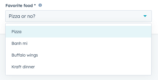
variant="transparent":
name string (required)
The input's unique identifier, similar to the HTML input element |
label string (required)
The text that displays above the input. Required if |
required boolean
When set to |
value string
The value of the input. |
readOnly boolean
When set to |
description string
Displayed text that describes the field's purpose. |
tooltip string
The text that displays in a tooltip next to the label. |
placeholder string
Text that appears in the input when no value is set. |
error boolean
When set to |
validationMessage string
The text to show if the input has an error. |
onChange function
A callback function that is invoked when the value is committed. Currently, these are |
options array
An array of options to display in the dropdown menu. Each object in the array contains:
|
variant string
The type of input, which controls its appearance. Values include:
|
The StepperInput component renders a number input field that can be increased or decreased by a set number. This component inherits many of its props from the NumberInput component, with an additional set of props to control the increase/decrease interval.
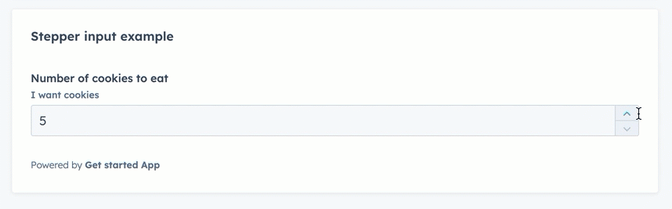
name string (required)
The input's unique identifier, similar to the HTML input element |
label string (required)
The text that displays above the input. Required if |
stepSize number
The amount that the current value will increase or decrease by. By default, set to |
maxValueReachedTooltip string
When the maximum value ( |
minValueReachedTooltip string
When the minimum value ( |
min number
Sets the lower bound of the input. |
max number
Sets the upper bound of the input. |
required boolean
When set to |
value string
The value of the input. |
readOnly boolean
When set to |
description string
Displayed text that describes the field's purpose. |
tooltip string
The text that displays in a tooltip next to the label. |
placeholder string
Text that appears in the input when no value is set. |
error boolean
When set to |
validationMessage string
The text to show if the input has an error. |
onChange (value: number) => void;
A callback function that is invoked whenever a valid number is entered. The function is invoked with the current numerical value of the input.
|
onBlur (value: number) => void;
A function that is called and passes the value when the field loses focus. |
onFocus (value: number) => void;
A function that is called and passed the value when the field gets focused. |
precision number
Sets the number of digits to the right of the decimal point. |
formatStyle string
Formats the input as a decimal point ( |
The TextArea component renders a fillable text field. You can customize the size of the field along with maximum number of characters and resizability.
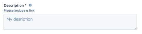
name string (required)
The input's unique identifier, similar to the HTML input element |
label string (required)
The text that displays above the input. Required if |
required boolean
When set to |
value string
The value of the input. |
readOnly boolean
When set to |
description string
Displayed text that describes the field's purpose. |
tooltip string
The text that displays in a tooltip next to the label. |
placeholder string
Text that appears in the input when no value is set. |
error boolean
When set to |
validationMessage string
The text to show if the input has an error. |
onChange function
A callback function that is invoked when the value is committed. Currently, these are |
onInput function (required)
A function that is called and passes the value when the field is edited by the user. Should be used for validation. It's recommended that you don't use this value to update state (use |
onBlur function
A function that is called and passes the value when the field loses focus. |
onFocus function
A function that is called and passed the value when the field gets focused. |
cols number
The visible width of the text field in average character widths. |
rows number
The number of visible text lines for the text field. |
maxLength number
The maximum number of characters (UTF-16 code units) that the user can enter. If not specified, the max length is unlimited. |
resize string
Sets whether the element is resizable, and if so in which directions. Can be one of:
|
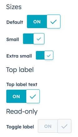
The Toggle component renders a boolean toggle switch that can be configured with sizing, label position, read-only, and more.
label string (required)
The toggle's label. By default, the label will display inline to the left of the switch. You can use the |
labelDisplay string
The display option for the toggle label. Values include:
|
checked boolean
When set to |
readonly boolean
When set to |
name string
The internal name of the toggle. |
size string
The size of the toggle. Values include:
Note that only |
onChange (checked: boolean) => void;A function that is invoked when the toggle is clicked. |
initialIsChecked boolean
When set to |
textChecked string
The text that displays on the toggle when checked. Default is ON. Extra small and small toggles will not display any text. |
textUnchecked string
The text that displays on the toggle when not checked. Default is OFF. Extra small and small toggles will not display any text. |
The ToggleGroup component renders a list of selectable options.
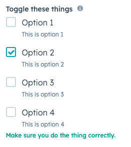
name string (required)
The unique identifier for the toggle group element. |
label string (required)
The label that displays above the toggle group. |
toggleType string (required)
The type of toggle group. Can be one of:
|
error boolean
When set to |
options array (required)
An array of options to display in the dropdown menu. Each object in the array contains:
|
value string
The value of the toggle group.
|
onChange function (required)
A function that is called with the new value or values when it's updated.
|
required boolean
When set to |
tooltip string
Text that will appear in a tooltip next to the toggle group label. |
validationMessage string
The text to display if the input has an error. |
inline boolean
When set to |
variant string
The size variation of the individual options. Can be one of |
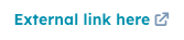
The Link component renders a clickable hyperlink.
href string
The URL that will be opened on click. Links to pages in the HubSpot account will open in the same tab, while non-HubSpot links will open in a new tab. |
variant string
The color variation of the link. Can be one of:
|
onClick function
A function that will be invoked with the link is clicked. The function receives no arguments and its return value is ignored. |
preventDefault boolean
When set to |
The List component renders a list of items. Each item in List will be wrapped in <li> tags. A list can be styled as inline, ordered, or unordered with the variant prop.
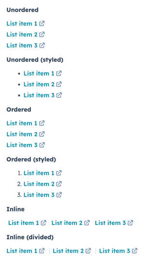
variant string
The type of list to render.
|
The Flex component renders an empty div container set to display=flex. When wrapped around other components, this enables those child components to be arranged using props. Flex can contain other Flex or Box components. Learn more about configuring UI extension layout.
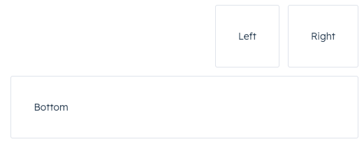
direction string
Arranges components horizontally or vertically by setting the main axis. Can be one of:
|
justify string
Distributes components along the main axis using the available free space. Can be one of:
|
align string
Distributes components along the cross-axis using the available free space. Can be one of:
|
alignSelf string
Distributes a child component along the cross-axis using the available free space. Use this prop for nested child
|
wrap string
Whether components will wrap instead of trying to fit on one line. Can be one of:
|
gap string
Sets the spacing between components. Can be one of:
|
The Box component renders an empty div container, and can be wrapped around Flex child components. Use this component to fine tune spacing of individual components. Learn more about configuring UI extension layout.
alignSelf string
Distributes a child component along the cross-axis using the available free space. Use this prop for nested child
|
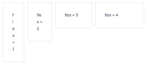
flex string
Distributes components based on the available empty space around them. Can be one of:
|
The LoadingSpinner component renders a spinner that indicates a loading state.
.gif?width=148&height=55&name=2023-05-26_13-38-56%20(1).gif)
label string
The text that displays next to the spinner. |
showLabel boolean
When set to |
size string
The size of the spinner. Can be one of:
|
layout string
The position of the spinner. Can be one of |
The Panel component renders a panel on the right side of the page and contains other components. The panel can be opened and closed by using onClick handles for Button, Link, Tag, and Image components. Learn more about how to open a panel in your UI extension. To see an example of incorporating a panel into an extension, check out HubSpot's Build a multi-step flow sample project.
The Panel component uses three subcomponents to control its design and content, which follows the general structure below:
<Panel>: the outermost container.<PanelBody>: the container that wraps the panel's content and makes it scrollable. Include only onePanelBodyperPanel.<PanelFooter>: a sticky footer component at the bottom of the panel. Include only onePanelFooterperPanel.
Please note:
- Panels must be a top-level component. They cannot be contained within other components, such as
Flex. - Only one panel can be open at a time. Opening a panel while another is already open will cause the first panel to close.
- If your
onClickfunction to open the panel is asynchronous, ensure that it returns a promise.
id string (required)
A unique ID for the panel. |
onOpen () => void;
A function that will be invoked when the panel has finished opening. |
onClose () => void;
A function that will be invoked with the panel has finished closing. |
width string
The width of the panel. Can be one of:
|
title string
The title that displays at the top of the panel. |
variant 'modal' | 'default'
The variant of the panel. The |
aria-label string
The panel's accessibility label. |
flush boolean
When set to |
The ProgressBar component renders a progress bar that shows a numeric and/or percentage-based representation of progress. The percentage is calculated based on the maximum possible value specified in the component.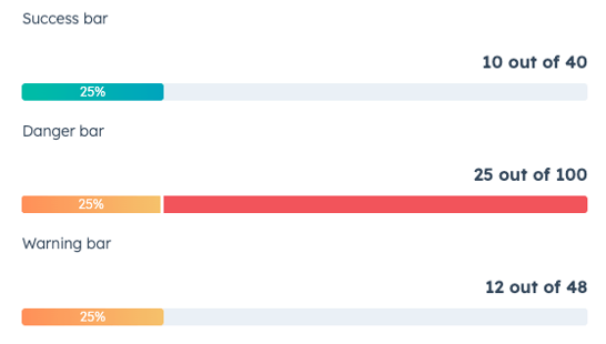
title string
The text that displays above the progress bar. |
showPercentage boolean
Whether the progress bar displays the completion percentage. |
value number
The number representing the progress so far. Defaults to |
maxValue number
The maximum value of the progress bar. Defaults to |
valueDescription string
The text that explains the current state of the |
variant string
The color that indicates the type of progress bar. Can be one:
|
The Statistics component renders data summaries via the StatisticsItem and StatisticsTrend child components.
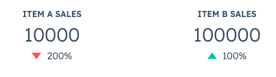
id string
The unique identifier |
label string
The item's label text. |
number string
The string to be displayed as the item's primary number. |
The StepIndicator component renders a horizontal indicator to show the current step of a multi-step process.
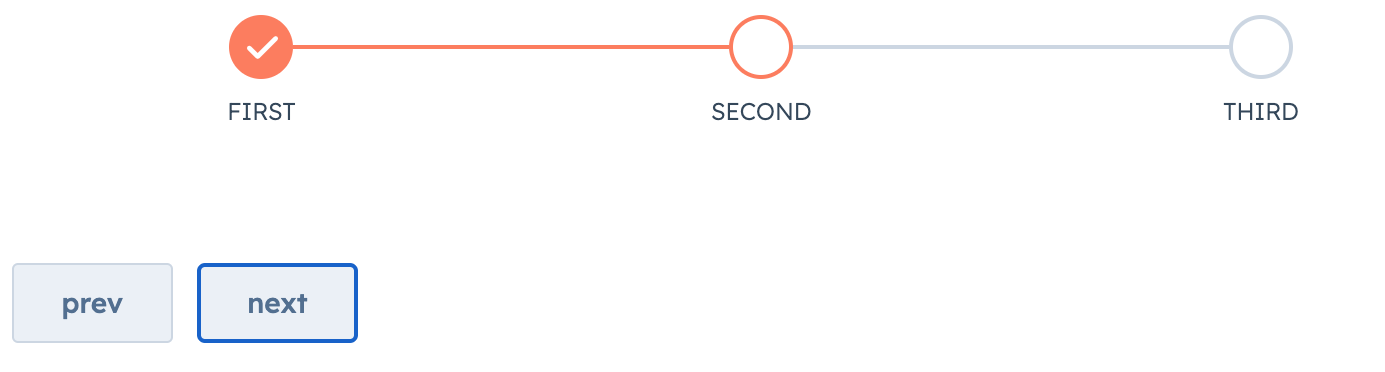
stepNames array (required)
An array containing the name of each step. |
currentStep number
The currently active step. |
direction string
The orientation of the indicator. Can be one of |
onClick function
A function that will be invoked when a step in the indicator is clicked. The function receives the current step index as an argument (zero-based). Use this to update the currently active step. |
circleSize string
The size of the indicator circles. Can be one of:
|
variant string
The visual style of the component. Can be one of:
|
The Table component renders a table. To format the table, you can use the following subcomponents:
TableHead: the header section of the table containing column labels.TableRow: individual table rows.TableHeader: cells containing bolded column labels. Use thesortDirectionandonSortChangeprops to make the table sortable.TableBody: container for the main table contents (rows and cells).TableCell: individual cells within the main body.
You can also configure pagination with the pagination prop.
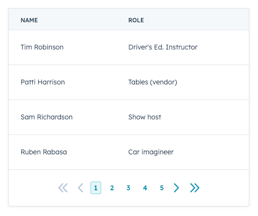
flush boolean
When set to |
bordered boolean
When set to |
paginated boolean
When set to |
⮑ pageCount string
The total number of pages available. |
⮑ onPageChange function
A function that will be invoked when the pagination button is clicked. It receives the new page number as argument.
|
⮑ showButtonLabels boolean
When set to |
⮑ showFirstLastButtons boolean
When set to |
⮑ maxVisiblePageButtons number
Sets how many page buttons are displayed. |
⮑ page number
Denotes the current page. |
align string
Align |
width string
Set the width of
|
Sortable tables
To add sorting functionality to a table, you can include the sortDirection and onSortChange props in the table's TableHeader components. To enable table data to dynamically reorder based on user input, you'll need to store your table data in variables rather than hard coding it into table cells. Below is an example of a sortable table with a static table footer.
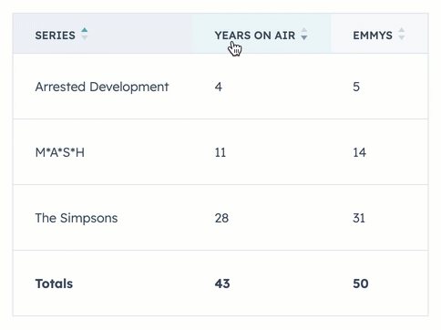
sortDirection string
Visually indicates with an arrow which way the rows are sorted. Values include:
|
onSortChange function
A function that will be invoked when the header is clicked. It receives a |
The Tag component renders a tag.
onClick function
A function that will be invoked when the tag is clicked. It receives no argument and its return value is ignored. |
variant string
The tag's color. The following variants are available: |
The Text component renders text with formatting options.
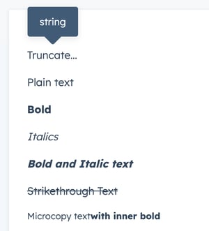
format object (required)
The type of formatting for the text. Format types include:
|
variant stringThe style of text to display. Can be either of:
|
inline booleanWhen set to |
truncate boolean | objectThis prop takes either a boolean or an options object:
To specify the maximum width of the text and the text that will appear in a tooltip on hover:
|
The Tile component renders a square tile containing other components.
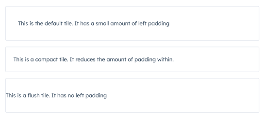
compact boolean
When set to |
flush boolean
When set to |
CRM data components can pull data directly from the currently displaying CRM record, including information about associated records and single object reports. These components can only be placed in the middle column of CRM records.
These components are imported from @hubspot/ui-extensions/crm.
In the CrmAssociationPivot and CrmAssociationTable components, you can filter the data to fetch only what's most relevant. Review the table below for available filtering options.
| Prop | Type | Description |
|---|---|---|
operator
| String | The filter's operator (e.g.
Learn more about filtering CRM searches. |
property
| String | The property to filter by. |
value
| String or number | The property value to filter by. |
values
| String or number | The property values to filter by when using an operator that requires an array, such as |
highValue
| String or number | The upper value to filter by when using an operator that requires a range, such as |
The CrmAssociationPivot component renders a list of associated records organized by their assigned association label. You'll specify the type of records that you want to appear along with table attributes such as pagination, sorting, and more. You can either return all labels or specify the labels to return.
objectTypeId string (required)
The numeric ID of the type of associated object to display (e.g., |
associationLabels array
Filters results by specific association labels. By default, all association labels will appear. |
maxAssociations number
The number of items to return in each association label group before displaying a "Show more" button. |
preFilters array
Filters the data by specific values of the associated records. Review the filtering options above for more information. |
sort array
The default sorting behavior for the table. In each sort object in the array, you'll specify the following:
|
The CrmAssociationPropertyList component renders a list of properties belonging to a record associated with the currently displaying record. For example, you can use this component to display properties of a company record from its associated contact record. You can edit these property values inline and will automatically save when leaving the field or pressing Enter.
properties array (required)
The list of properties to display from the associated record, up to 12. |
objectTypeId string (required)
The numeric ID of the type of associated object to display (e.g., |
associationLabels array
When provided, returns associated records that have all specified labels. |
filters array
Filters the data by specific values of the associated records. Review the filtering options above for more information. |
sort array
The default sorting behavior for the returned results. In each sort object in the array, you'll specify the following:
|
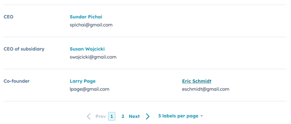
The CrmAssociationTable component renders a table of associated records with optional filtering, sorting, and search methods. You'll specify the type of records that you want to appear along with the properties to display as columns.
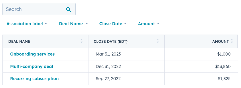
objectTypeId string (required)
The numeric ID of the type of associated object to display (e.g., |
propertyColumns array (required)
The properties to add as table columns. |
quickFilterProperties array
The properties that appear as filters above the table. When included, the "Association label" quick filter will always display. See note below for more details on this prop. |
associationLabelFilter boolean
When set to |
searchable boolean
Set to |
pagination boolean
Set to |
pageSize number
The number of rows to include per page of results. Include the |
preFilters array
Filters the data by specific values of the associated records. Review the filtering options above for more information. |
sort array
The default sorting behavior for the table. In each sort object in the array, you'll specify the following:
|
Please note: for quickFilterProperties:
- By default, four quick filters will display automatically depending on the object type.
- Contacts (0-1):
[ 'hubspot_owner_id', 'createdate', 'hs_lead_status', 'notes_last_updated' ] - Companies (0-2):
[ 'hubspot_owner_id', 'hs_lead_status', 'notes_last_updated', 'createdate' ] - Deals (0-3):
[ 'hubspot_owner_id', 'closedate', 'createdate', 'dealstage' ] - Tickets (0-5):
[ 'hubspot_owner_id', 'createdate', 'hs_pipeline_stage', 'hs_lastactivitydate' ]
- Contacts (0-1):
- Custom objects do not have default quick filters
- An empty array (
[]) will remove any default quick filters except for "Association label".
The CrmDataHighlight component renders a list of properties along with their values. You can use this component to surface important property data from either the currently displaying record or another specified record.
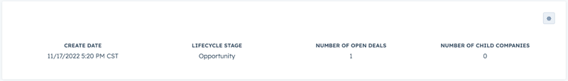
properties array (required)
The list of properties to display, up to four. By default, will show property data from the currently displaying record. Specify |
objectTypeId string
The numeric ID of the type of associated object to display (e.g., |
objectId string
The ID of the CRM record to display property data from. |
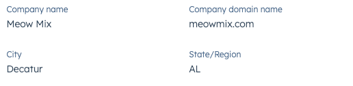
The CrmPropertyList component renders a list of properties along with their values. You can use this component to surface important property data from either the currently displaying record or another specified record. You can edit these property values inline and will automatically save when leaving the field or pressing Enter.
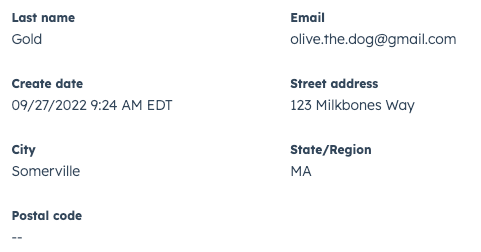
properties array (required)
The list of properties to display, up to 12. By default, will show property data from the currently displaying record. Specify |
direction string
The layout direction of the table. Can be one of:
|
objectTypeId string
The numeric ID of the type of associated object to display (e.g., |
objectId string
The ID of the CRM record to display property data from. |
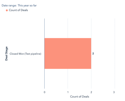
The CrmReport component renders a single object report, which can be filtered with the use prop to surface data based on the currently displaying record, its associations, or unfiltered.
By default, the report data will automatically filter for the currently displaying record, as long as there is an association between the displaying record and records included in the report. For example, using this component you can display a single object report that shows which deals closed this quarter. When viewing the report on a contact record, by default the report will only display data from deals associated with that contact.
This component requires you to specify the ID of the report to render. To get a report's ID:
- In your HubSpot account, navigate to Reports > Reports.
- Click the name of the report you want to display.
- In the URL, copy the number that is not your HubID.
reportId string
The ID of the single object report, which can be found in the URL when viewing the report. |
use string
Specifies how the report should be filtered based on its relationship to the currently displaying CRM record:
|
The CrmStageTracker component renders a lifecycle or pipeline stage progress bar and a list of properties. Available for contacts, companies, deals, tickets, and custom objects.
Use this component to show stage progress for the currently displaying record, or you can specify a record. You can also edit the property values inline and your changes will automatically save when leaving the field or pressing Enter.
objectId string
The ID of the record to display. If not specified, will default to displaying information for the currently displaying record. |
objectTypeId string
The ID of the type of record to display (e.g., |
properties array (required)
The names of the properties to display. You can specify up to four properties, but properties beyond that will be ignored. If omitted, a set of default properties will render, depending on the object type. |
showProperties boolean
Whether the show the list of properties below the stage progress indicator. When set to |
The CrmStatistics component renders data summaries calculated from the currently displaying CRM record's associations. For example, you can use this component to display data such as:
- The average revenue of all of a contact’s associated companies.
- The total number of times that a company has been contacted based on all of their associated tickets.
- The maximum number of days to close from all of a company's associated deals.
To render data, you'll specify the properties you want to read from the associated records along with the type of calculation to perform on the property values. For each property, you can also include filters to narrow down the records that are included in the calculation.
objectTypeId string (required)
The ID of the type of record to fetch data from (e.g., |
statistics array (required)
An array containing objects for each set of data to fetch. Each item in the array will contain:
|
CRM action components provide a built-in set of CRM-related actions, including adding notes to records, opening a one-to-one email composition window, creating new records, and more. Each component can perform the same set of actions, so which component to choose will depend on your needs and preferences. Check out the component design guidelines for additional guidance.
CRM action components are imported from @hubspot/ui-extensions/crm.
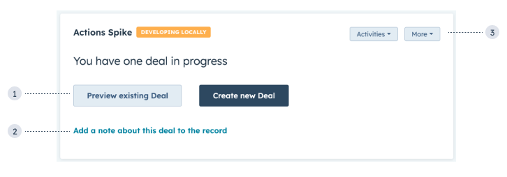
- CRM action buttons: buttons for previewing a CRM record or creating a new associated record.
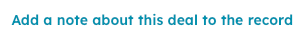
- CRM action link: a link for creating a new note on the deal record on click.
- CRM card actions: buttons in the top right of the card that contain lists of actions in dropdown menus.
Users can only take actions through these components when they have the proper permissions. For example, if a user doesn't have permission to create deal records, they won't be able to use a CRM action component to create a deal record. Instead, an error message will be generated and returned through an optional onError callback.
Each action requires an actionType and actionContext.
actionType: the type of action. See the available actions section below.actionContext: the CRM object and record context required for the action to be performed. For example, to include an action to open a preview sidebar for a specified record, you'll need to provide the record'sobjectTypeIdandobjectIdinactionContext. See the available actions for more information about what's required for each action.
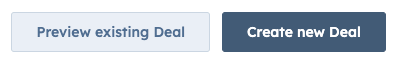
The CrmActionButton component renders a button that can execute a built-in set of CRM actions. See list of available actions for more information. This component can be used in extensions that are in either the sidebar or middle column.
actionType string (required)
The type of action for the button to perform. See list of available actions below. |
actionContext object (required)
An object containing the CRM object and record context for performing the action. See list of available actions below for required context values. |
variant string
Sets the color variation of the button. Values include:
|
size string
Sets the size of the button. Values include:
|
disabled boolean
Set to |
type array
Sets the HTML attribute
|
onError function
An optional callback that will be passed any error messages that were generated. Common errors include missing required context values or the user having insufficient permissions to perform an action. |
The CrmActionLink component renders a clickable link that can execute a built-in set of CRM actions. See list of available actions for more information. This component can be used in extensions that are in either the sidebar or middle column.
actionType string (required)
The type of action for the button to perform. See list of available actions below. |
actionContext object (required)
An object containing the CRM object and record context for performing the action. See list of available actions below for required context values. |
variant string
Sets the color variation of the button. Values include:
|
onError function
An optional callback that will be passed any error messages that were generated. Common errors include missing required context values or the user having insufficient permissions to perform an action. |
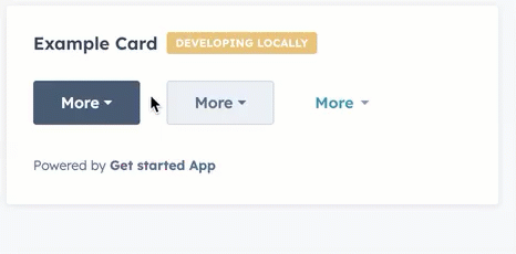
The CrmCardActions component renders a smaller standalone or dropdown menu button that can contain multiple CRM actions. See list of available actions for more information. This component can only be used in extensions that are in the middle column.
.gif?width=323&height=280&name=2023-08-29_15-08-37%20(1).gif)
type string (required)
The type of button to render:
|
⮑ options array
Array containing an object for each available action. See list of available actions below. |
actionContext object (required)
An object containing the CRM object and record context for performing the action. See list of available actions below for required context values. |
disabled boolean
Set to |
tooltipText string
Text that displays above the button on hover. |
The following actions are available for CRM action components:
The PREVIEW_OBJECT action opens a preview sidebar for the specified CRM record.
Requires the following actionContext:
objectTypeId: the CRM record's object type (e.g.,0-1for contacts). See full list of object IDs.objectId: the ID of the CRM record to preview.
The ADD_NOTE action opens a note composition window, enabling users to add a note to the specified CRM record.
Requires the following actionContext:
objectTypeId: the CRM record's object type (e.g.,0-1for contacts). See full list of object IDs.objectId: the ID of the CRM record.
The SEND_EMAIL action opens a one-to-one email composition window, enabling users to send an email to the specified contact or the contacts associated with the specified record.
Requires the following actionContext:
objectTypeId: the CRM record's object type (e.g.,0-1for contacts). See full list of object IDs.objectId: the ID of the CRM record to send the email to.
The SCHEDULE_MEETING action opens a window for scheduling a meeting.
Requires the following actionContext:
objectTypeId: the CRM record's object type (e.g.,0-1for contacts). See full list of object IDs.objectId: the ID of the CRM record to schedule the meeting with.
The OPEN_RECORD_ASSOCIATION_FORM action opens a side panel for creating a new record to be associated with another.
Requires the following actionContext:
objectTypeId: the type of CRM record to create (e.g.,0-2for companies). See full list of object IDs.association: an object containing information about the record that the new one will be associated with. This is typically the currently displaying record. Contains:objectTypeId: the type of CRM record to associate the new one with.objectId: the ID of the CRM record to associate the new one with.
The ENGAGEMENT_APP_LINK action navigates the user to a specific engagement on a CRM record timeline, such as a call or task.
Requires the following actionContext:
objectTypeId: the type of CRM record to navigate to (e.g.,0-2for companies). See full list of object IDs.objectId: the ID of the CRM record to navigate to.engagementId: the ID of the engagement, such as a task or note.external: optionally, set totrueto navigate to the engagement in a new browser tab.
The RECORD_APP_LINK action navigates the user to a specific CRM record.
Requires the following actionContext:
objectTypeId: the type of CRM record to navigate to (e.g.,0-2for companies). See full list of object IDs.objectId: the ID of the CRM record to navigate to.external: optionally, set totrueto navigate to the record in a new browser tab.includeEschref: optionally, set totrueto include a Back button in the top left corner of the opened CRM record to navigate the user back to the original record.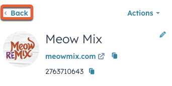
The PAGE_APP_LINK navigates the user to any page within the HubSpot account. Use this action when a user would need to navigate to a non-CRM record account page, such as the email tool.
Requires the following actionContext:
path: the URL path of the HubSpot page. This path is relative tohttps://app.hubspot.comand should begin with/.external: optionally, set totrueto navigate to the page in a new browser tab.
The EXTERNAL_URL action navigates the user to a website page in a new tab.
Requires the following actionContext:
href: the URL, which must begin withhttporhttps. When protocol is not specified, HubSpot will automatically prefix the URL withhttps.
Thank you for your feedback, it means a lot to us.